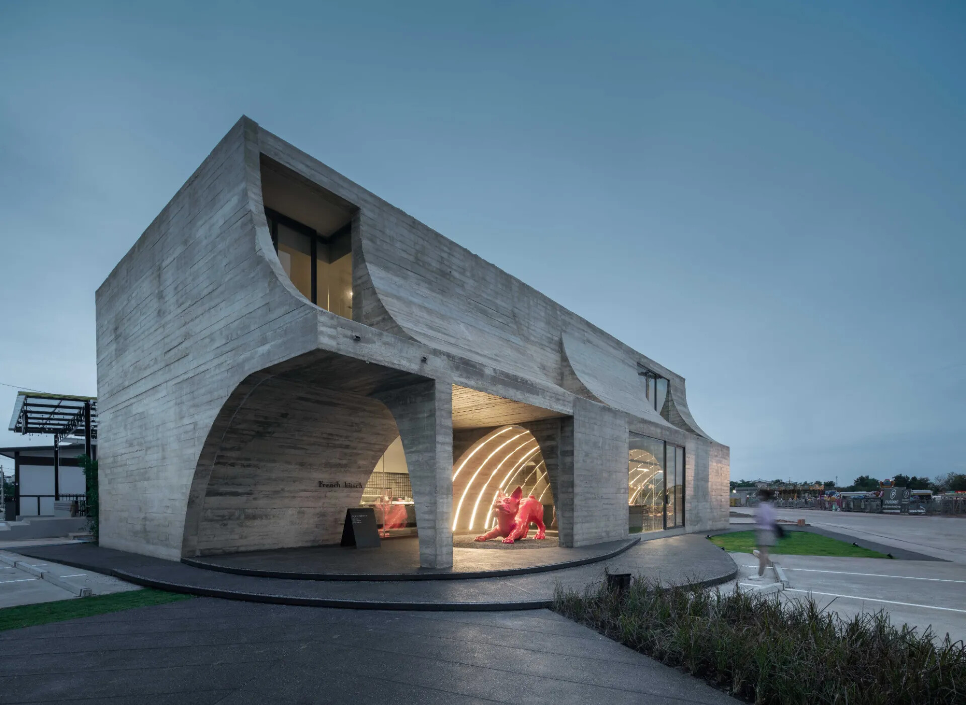
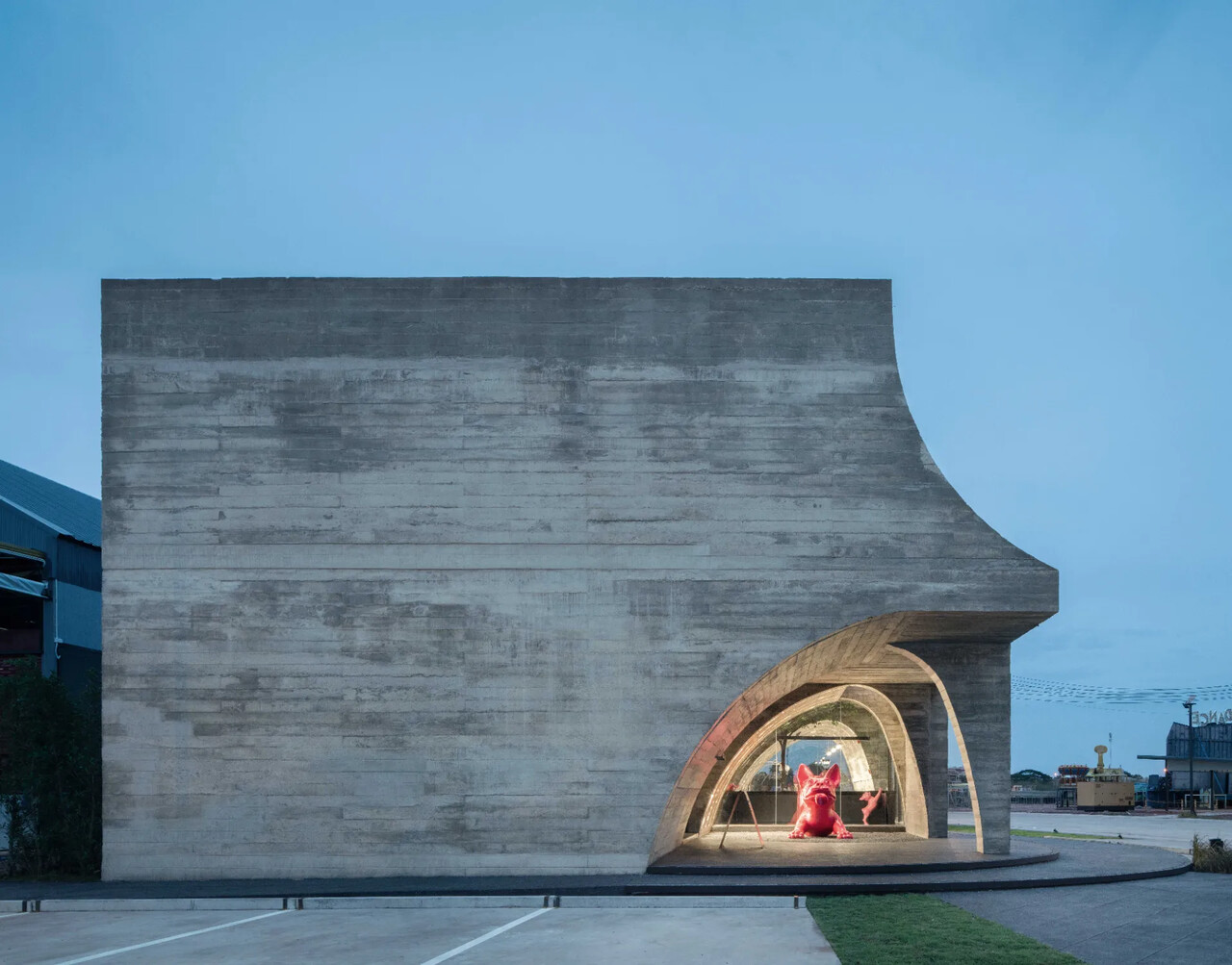
French Kitsch主要的設計概念是基於其名稱「French」和「Kitsch」的詮釋而展開。它除了是一家專業的法式糕點店外,因著業主對法國鬥牛犬的熱愛,也成為品牌識別的元素之一,為咖啡館形塑出既俏皮又優雅的形象。該設計主要強化「Kitsch」形象,這是一種透過建築元素和材質來欣賞不完美的藝術形式。
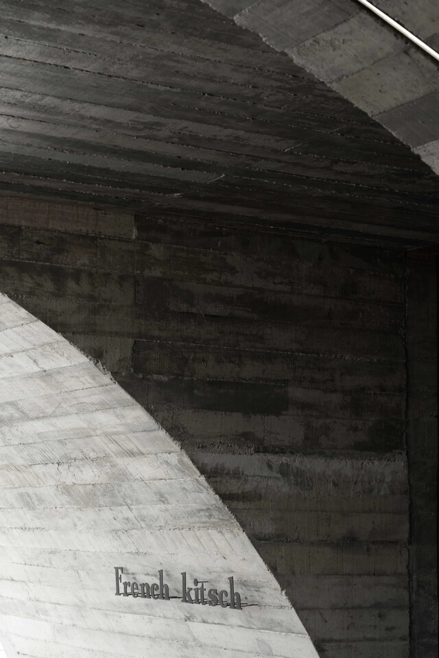
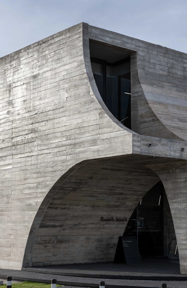
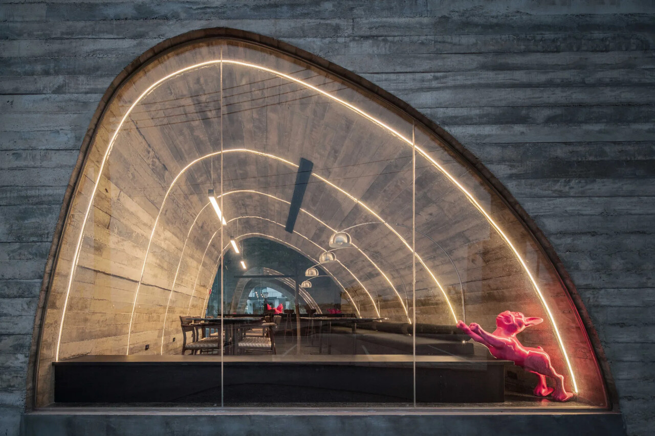
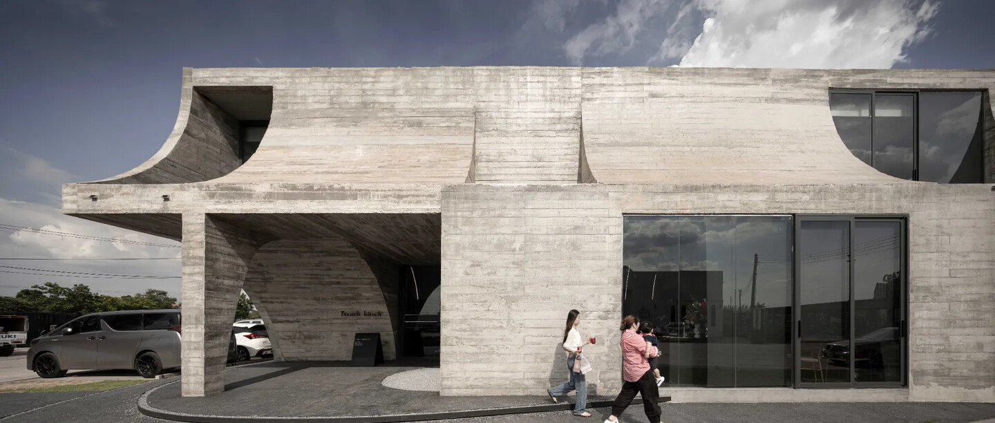
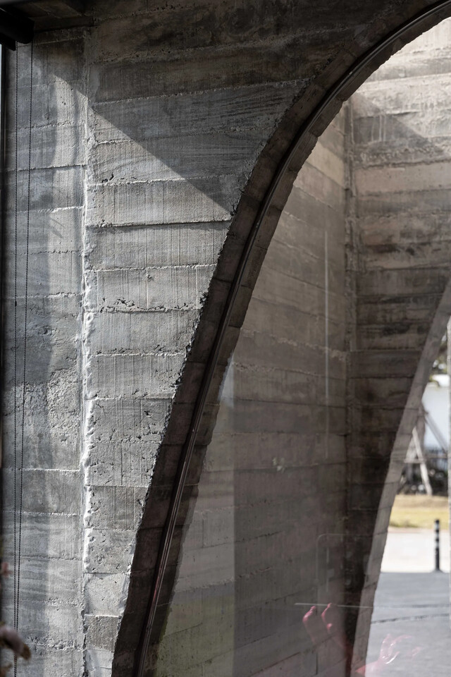
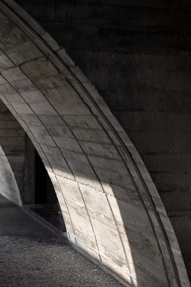
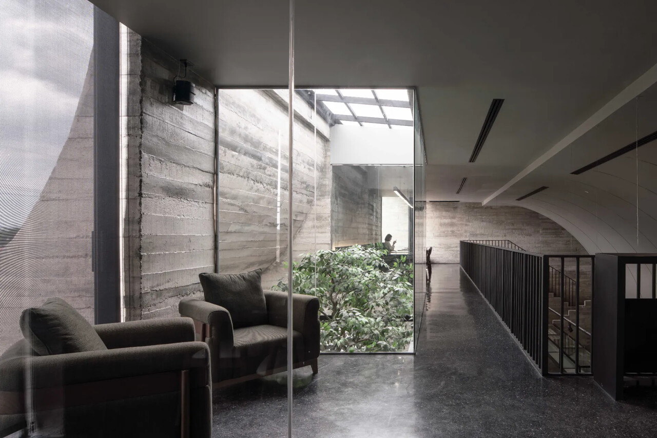
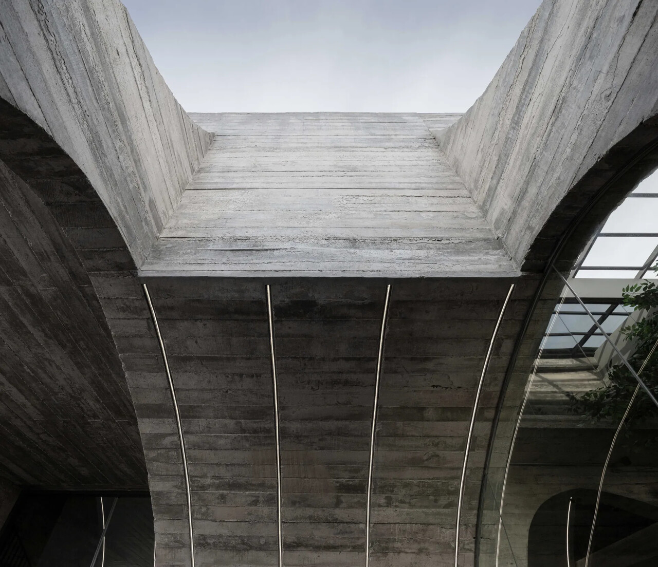
而設計概念參考了法國大教堂的建築元素,從細節發展出有節奏的拱形。在此設計中避免使其對稱,取而代之的是尺寸不一的不完美拱形來詮釋。這個始於一個完整比例的矩形體量設計,在透過第一層打磨對比第二層的反向,使其變得不完美。這些拱形量體在一樓以其現代古典的外觀歡迎著訪客,沿著路徑逐漸形成陰影,而當光線穿過拱形窗口反射在地面上,近似大教堂裡的玻璃。這個大型壯觀不完美的拱形延伸到二樓,創造了櫃台的連續空間,強調了櫃台的功能性。陽光透過二樓打磨的反向曲線空隙中,使其引入。
The French cathedral is taken as a primary reference to the design where rhythmic arches are developed. Instead of symmetrical arches, imperfect arches of different scales are used. The design started from a perfect rectangular mass which is made imperfect by carving out imperfect arches on the first level and inverted imperfect arches on the second level. On the first floor, these arches embrace visitors with their antique yet modern looks, creating shadow along the path and when light passes through the arched window, it creates reflection on the floor, similar to that of cathedral glass. The oversized imperfect arch also creates a continuous space from the counter to the second floor, highlighting the full-function counter, allowing it to be seen from both floors. On the second floor, voids are carved into the inverted curves, allowing sunlight to enter.
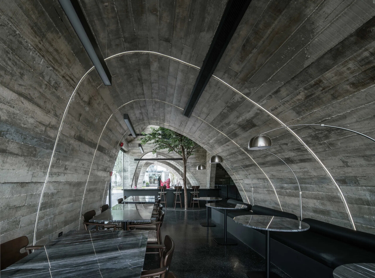
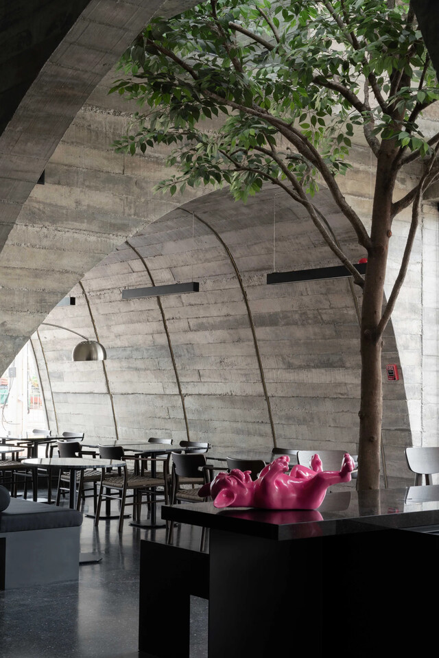
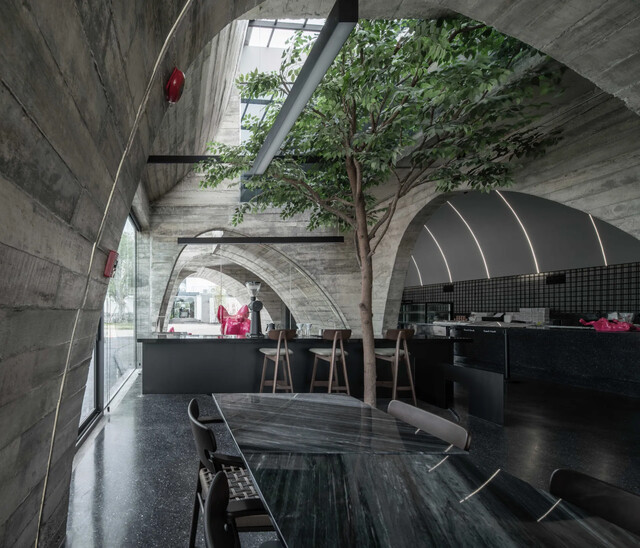
一次脫模粗糙的混凝土紋理,敘述不完美中的完美概念,不平整的牆面,反映了材質的真實,這樣的自然最美。與此同時,在這個以混凝土為主要材質的空間中,家具、飾品以及綠色、粉紅色的LED燈顯得格外醒目,強調了品牌色彩的身份,為咖啡館營造一個記憶深刻的形象。
By using textured concrete, it strengthens the concept of perfection of imperfection where the wall is not completely smooth, but it reflects the authenticity of the material which can be beautiful by itself. Moreover, by using concrete as the main material, the furniture, decorations, and LED lights of green and pink are made outstanding, emphasizing the brand’s color identity, creating a strong memorable image of the cafe.