White Is Good Shop in Weipo, Luoyang
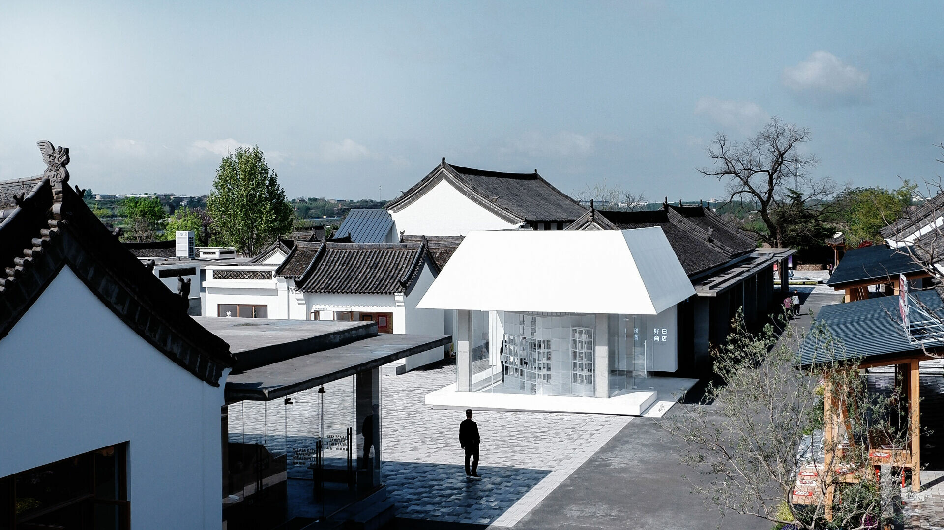
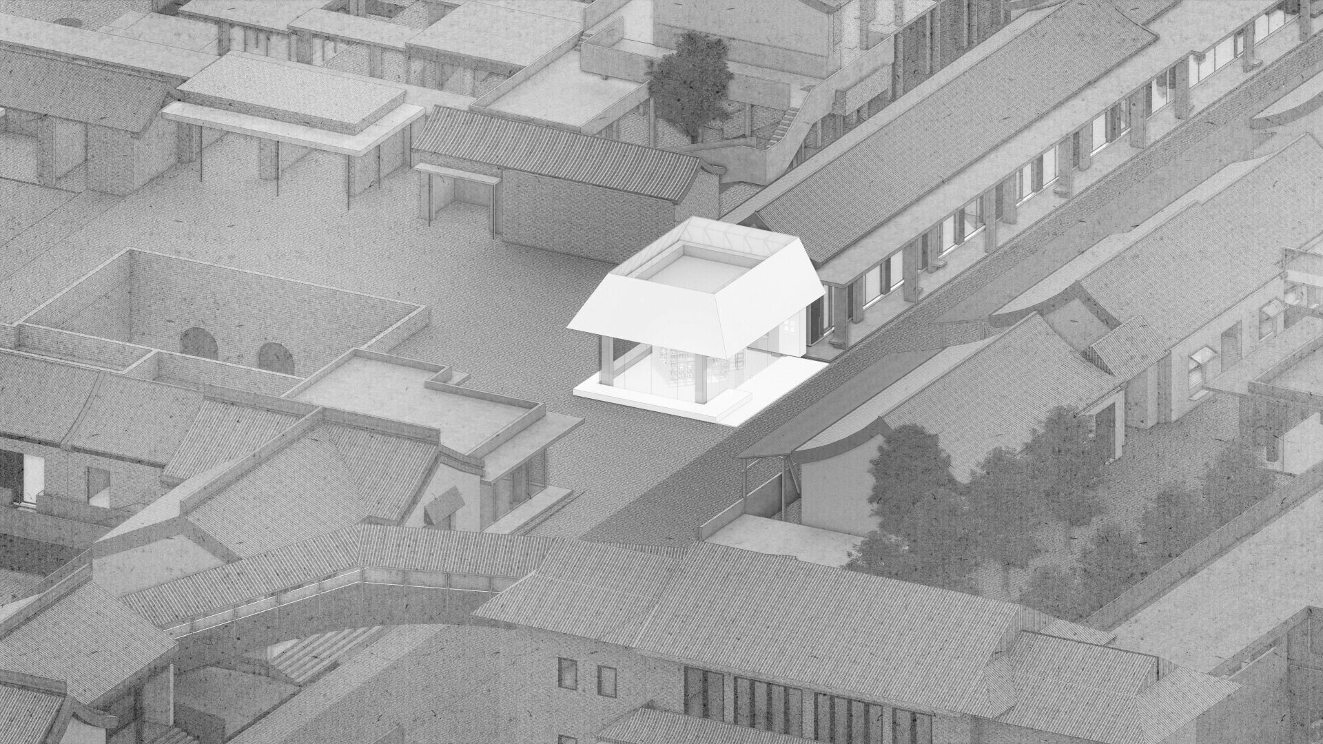
In the reshaping of a historic district, the hardest measure to keep is proportion—how contemporary language enters without upsetting the weight of tradition. Restraint can tip into the dated. Push novelty too hard and it starts to feel untethered. On the outskirts of Luoyang, “Weipo New Chapter” sits in Weipo Village, a place with a 400-year history. The village still offers glimpses of partially preserved yaoyuan vernacular dwellings, alongside a Qing-dynasty street fabric, making it a fitting ground on which renewal can begin.
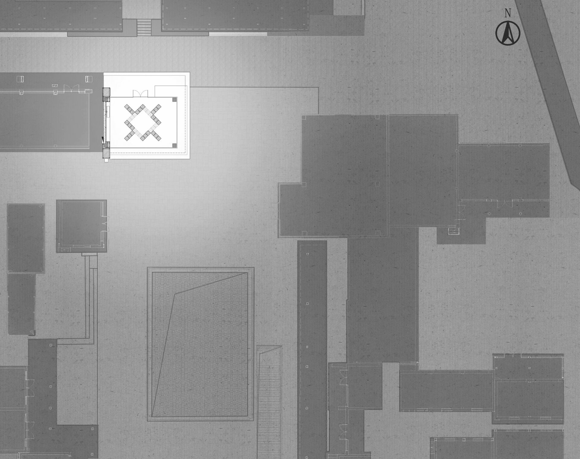
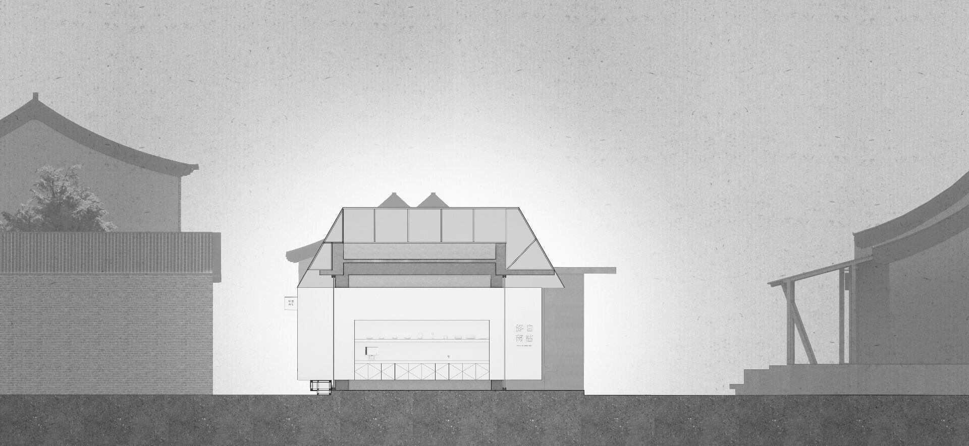
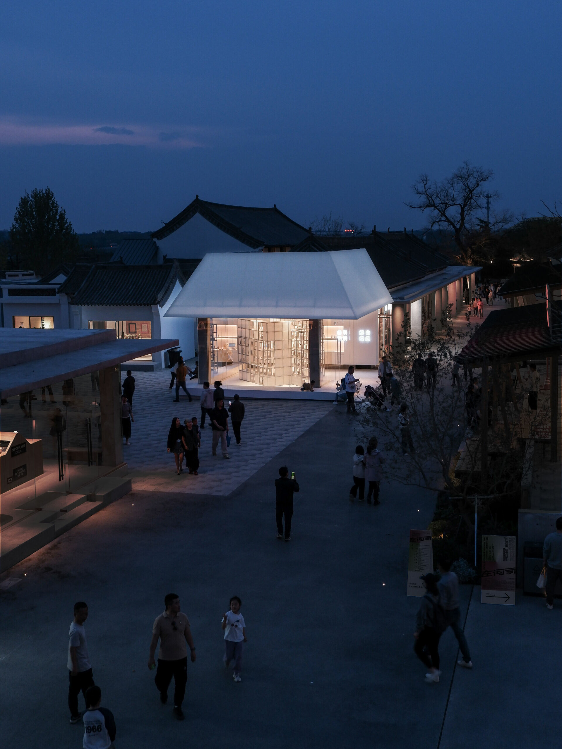
A new zone near the former market is planned to bring in specialty shops, cultural venues, and leisure facilities. The hope is to fold these programs into the district’s older character, while extending local economic momentum and everyday cultural life. Within a familiar field of gray brick and clay roof tiles, a pure-white storefront arrives with a crisp, quietly unforced presence, quickly becoming the visual center of the emerging cluster. This is designRESERVE’s “new home for the brand,” created for White Is Good Shop. Its outline keeps a gable end with an A-frame profile; the roof is resolved as pitched roof planes that echo the neighboring vernacular houses. Inside, four columns define a compact room; they mark out a self-contained square—almost a small world of its own—paired with an approximately 50-square-meter footprint. As described by the design team, the scale is close to the current per-capita living area across China’s urban and rural contexts, reinforcing the archetype of “home.”
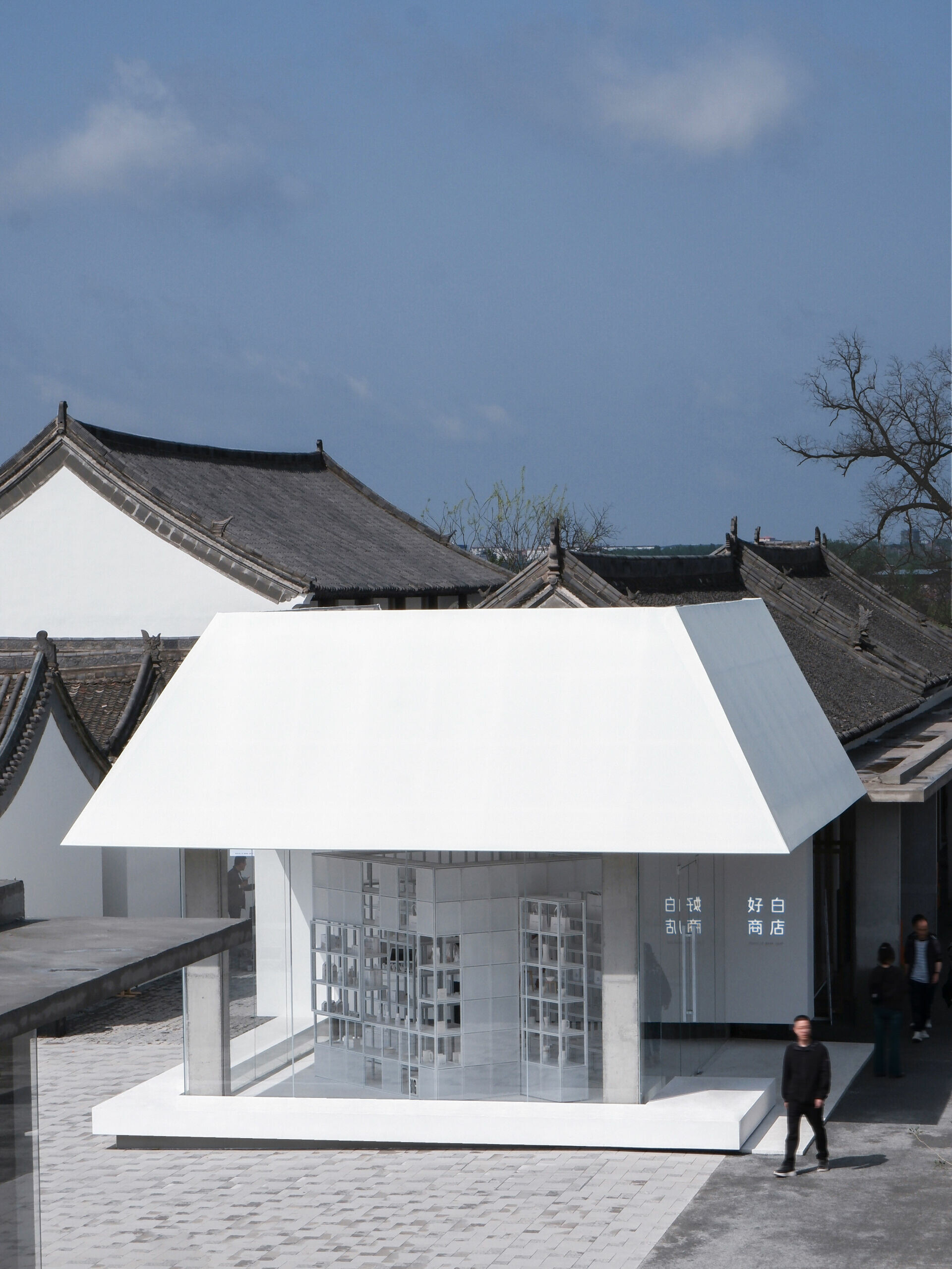
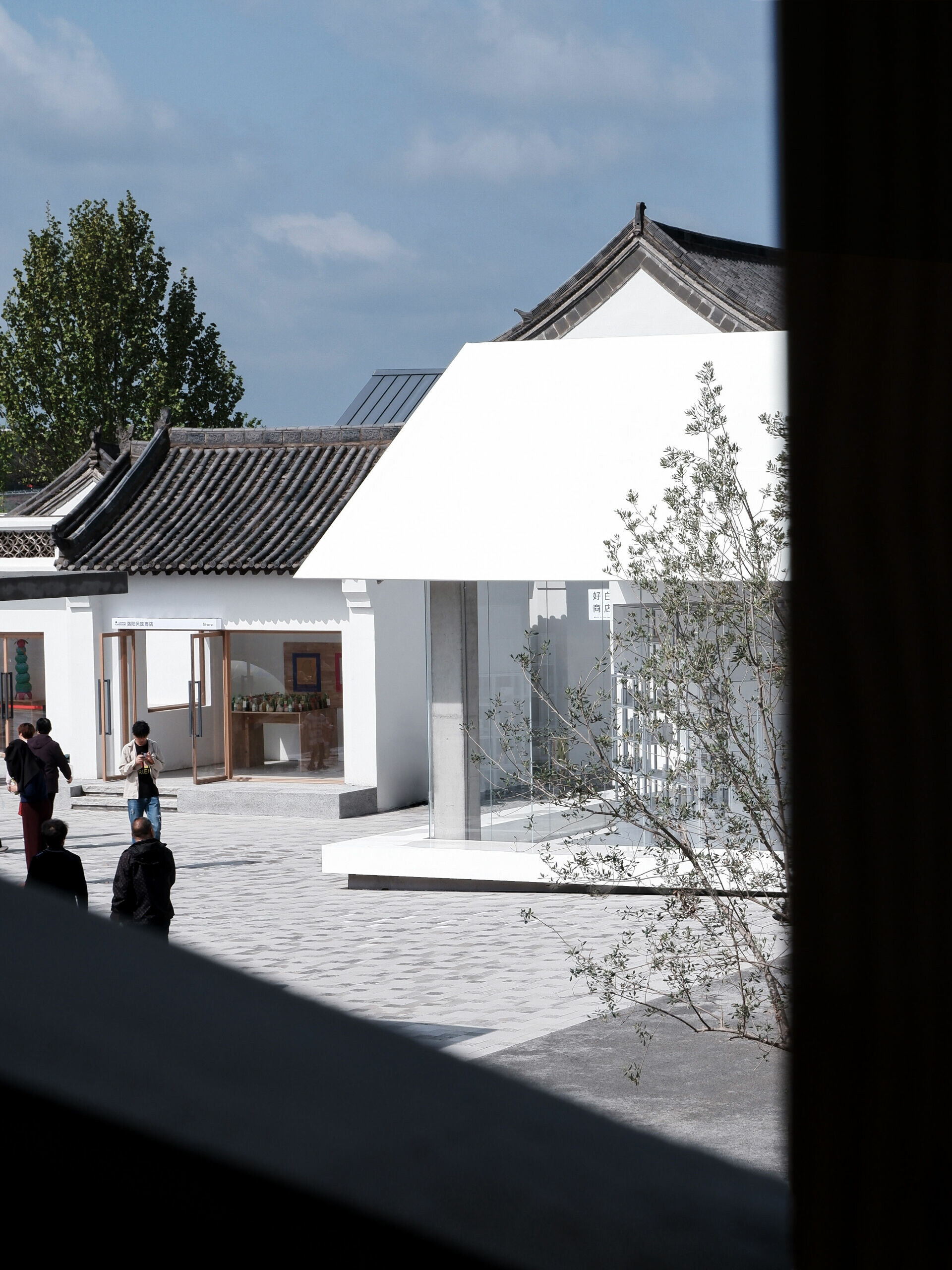
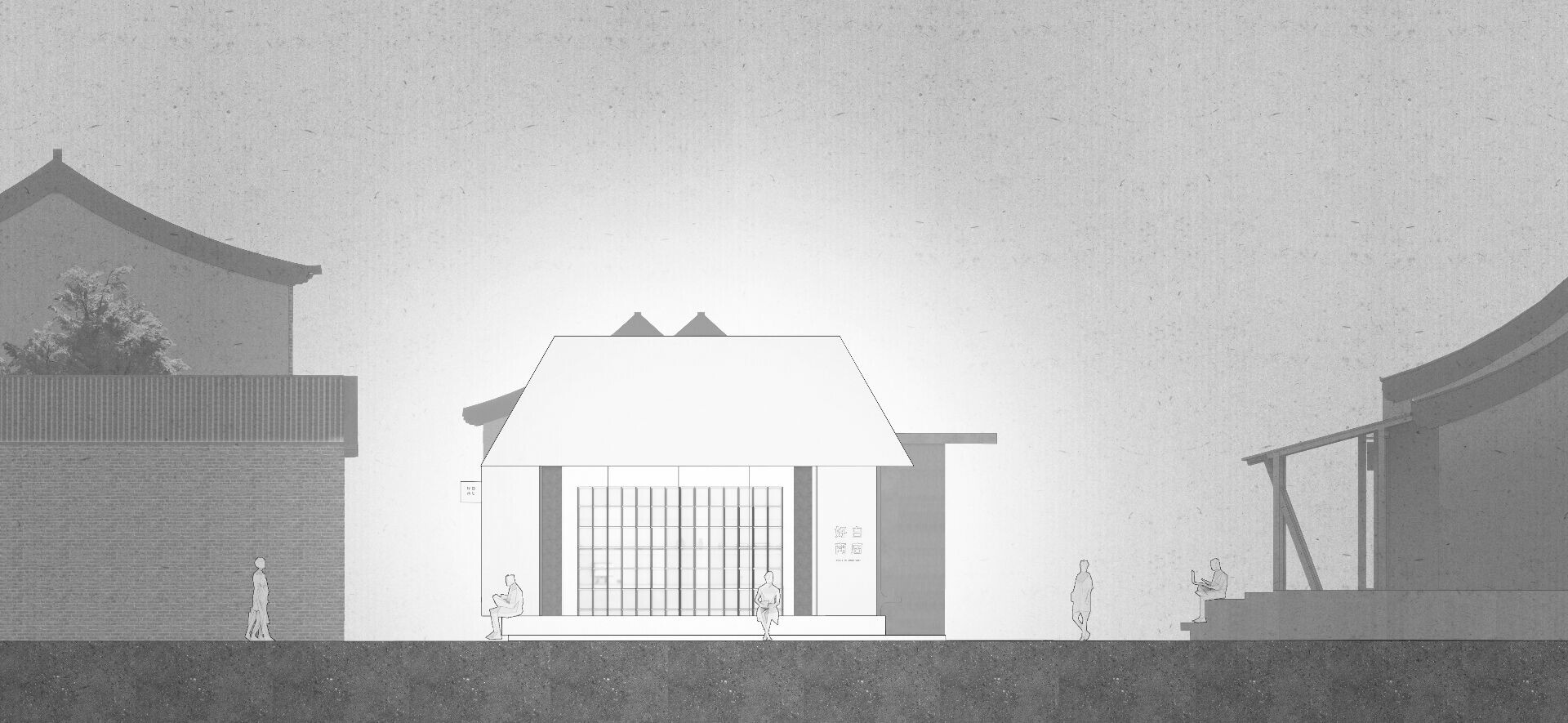
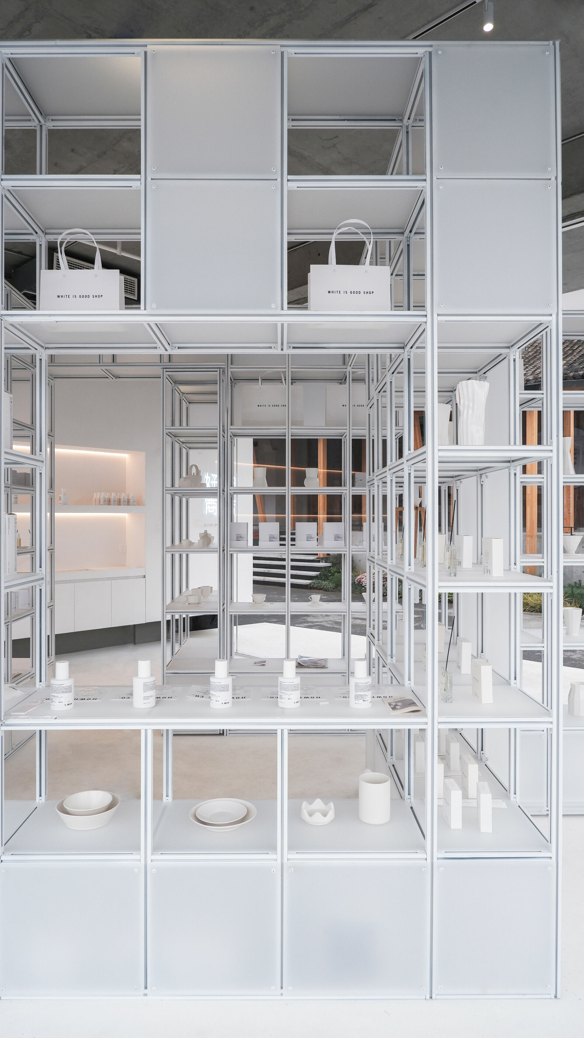
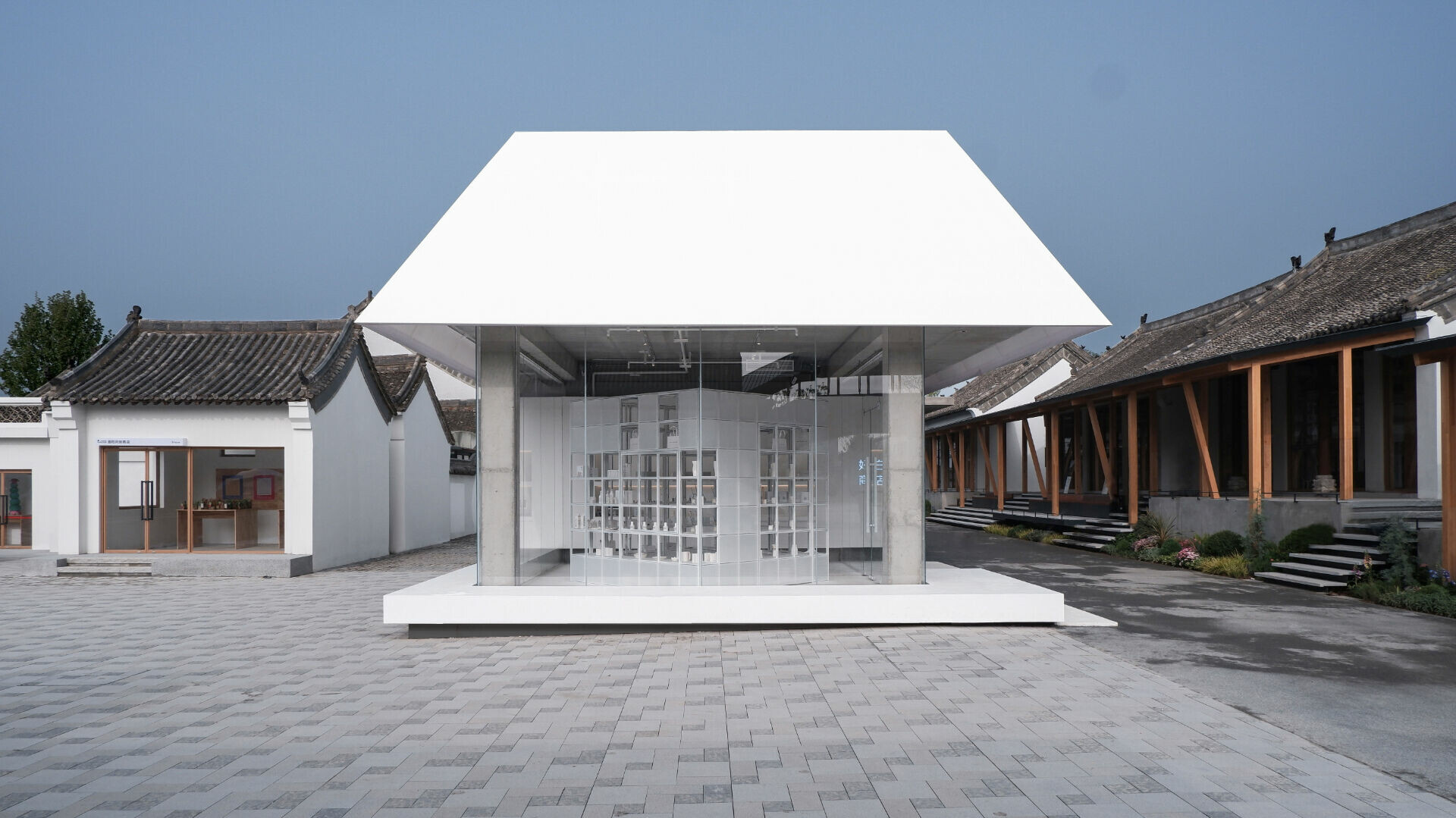
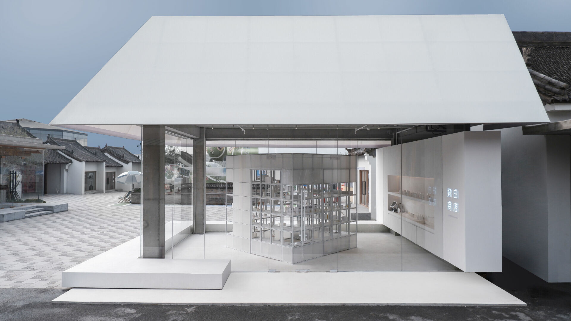
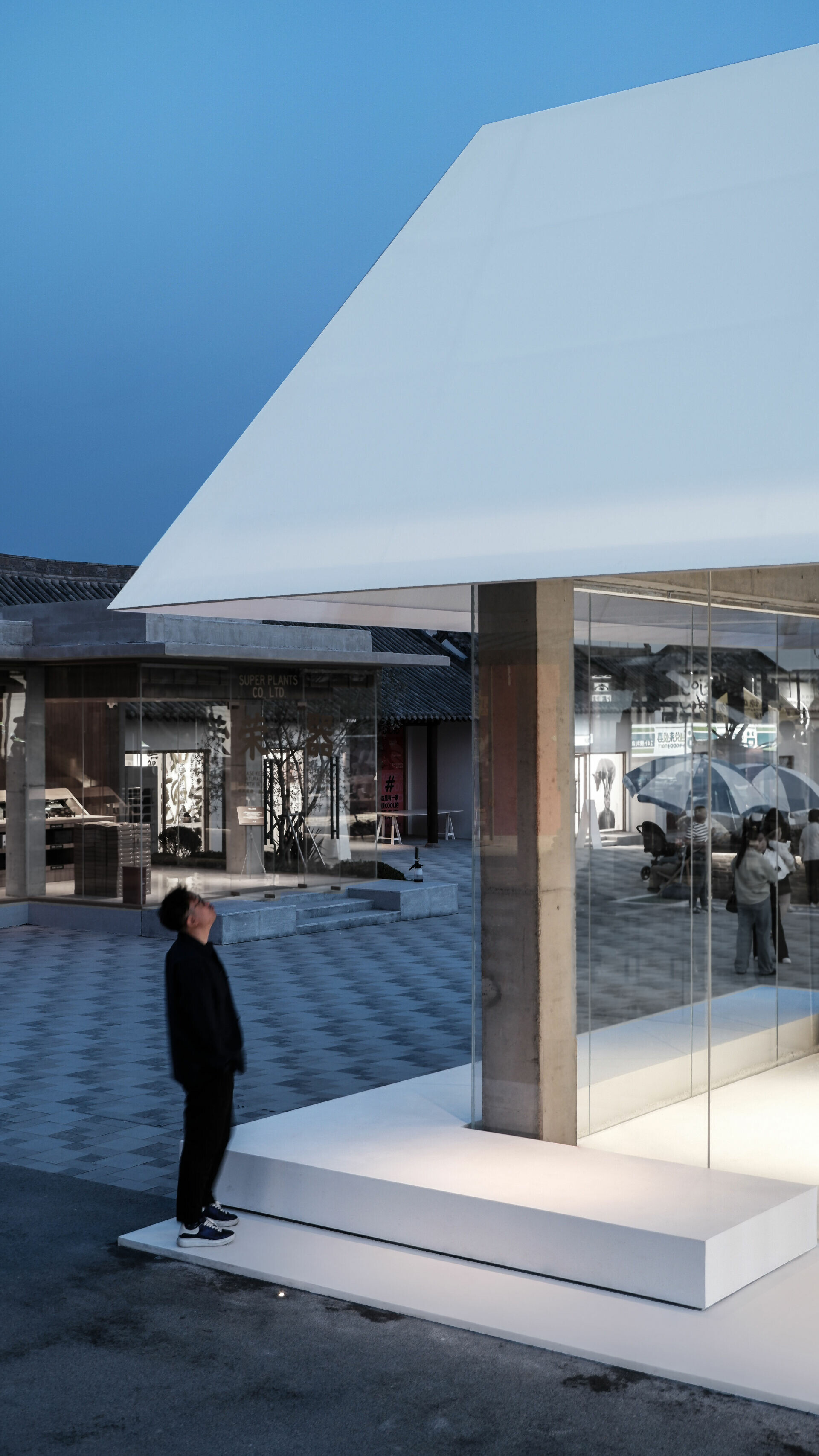
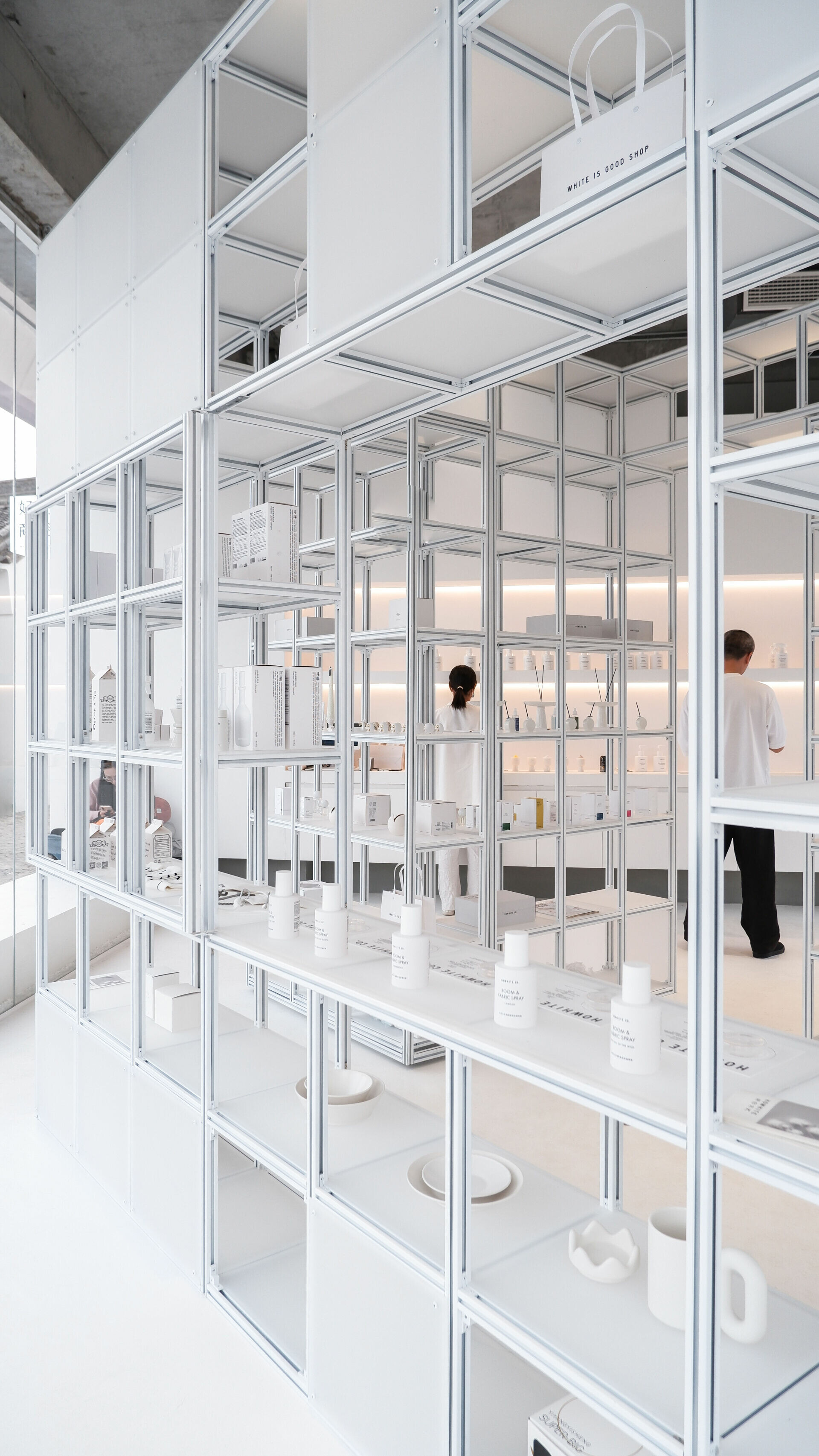
White Is Good Shop began in Beijing’s hutongs. Its products are packaged in plain white, pared-back, eco-friendly materials, and its selection stays close to everyday household needs. A restrained order runs through the brand’s stance—an insistence on removing the extraneous and returning to essentials. That ethic carries into the interior as a disciplined minimalist language, held close to the maxim “less is more.” From the street, three transparent faces of floor-to-ceiling glazing draw the interior into view. The boundary between street and room loosens; openness arrives through sightlines. An eave extends outward to shelter a broad plinth, shaping it into a bench for pause. By allowing the public realm to overlap with the shop interior, the flow of people becomes part of a continuous scene.
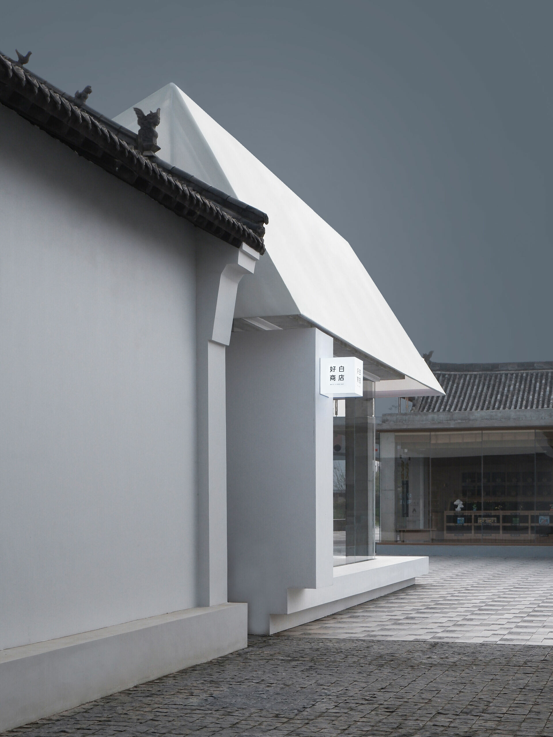
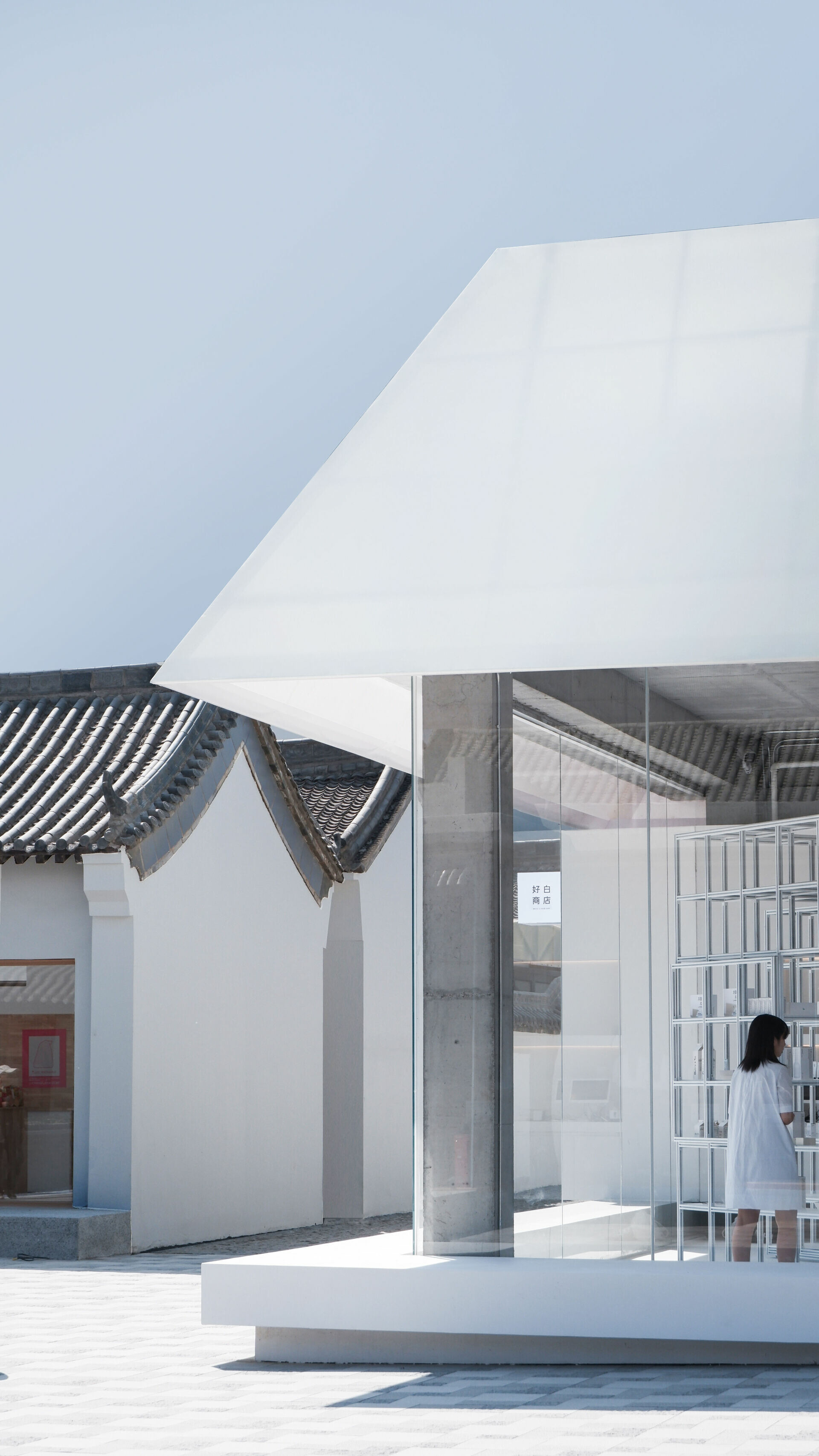
A subtle volumetric cut keeps the shop slightly lower than the surrounding old houses. The eaves are deliberately aligned with nearby new commercial buildings, completing a measured connection across old and new. The roof uses polycarbonate sheets (PC panels) wrapped with translucent fabric, softening light as it enters. In daytime it reads like a thin veil; after dark it glows like a lampshade, releasing a diffused light. White sets the dominant tone without turning flat. As the project notes, “White is not one color.” Different textures answer one another, and shifting light teases out a quiet, almost imperceptible emotional register in the senses.
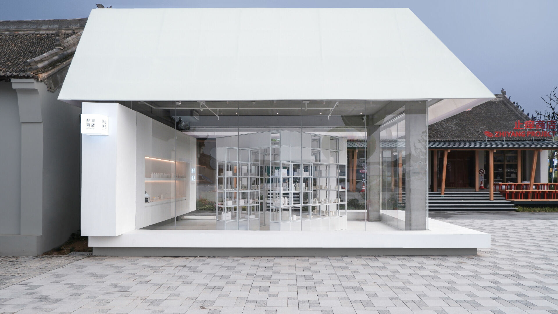
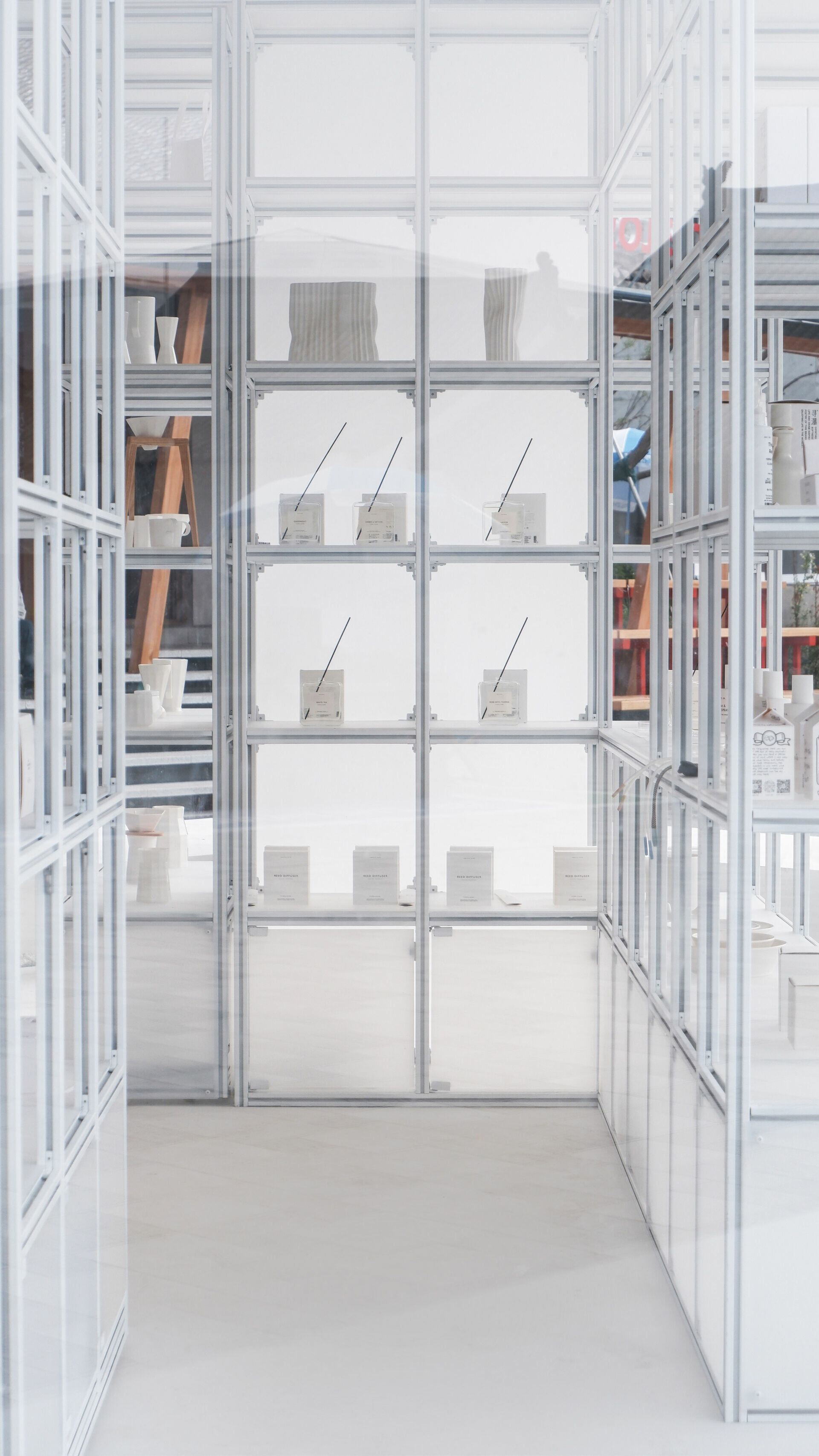
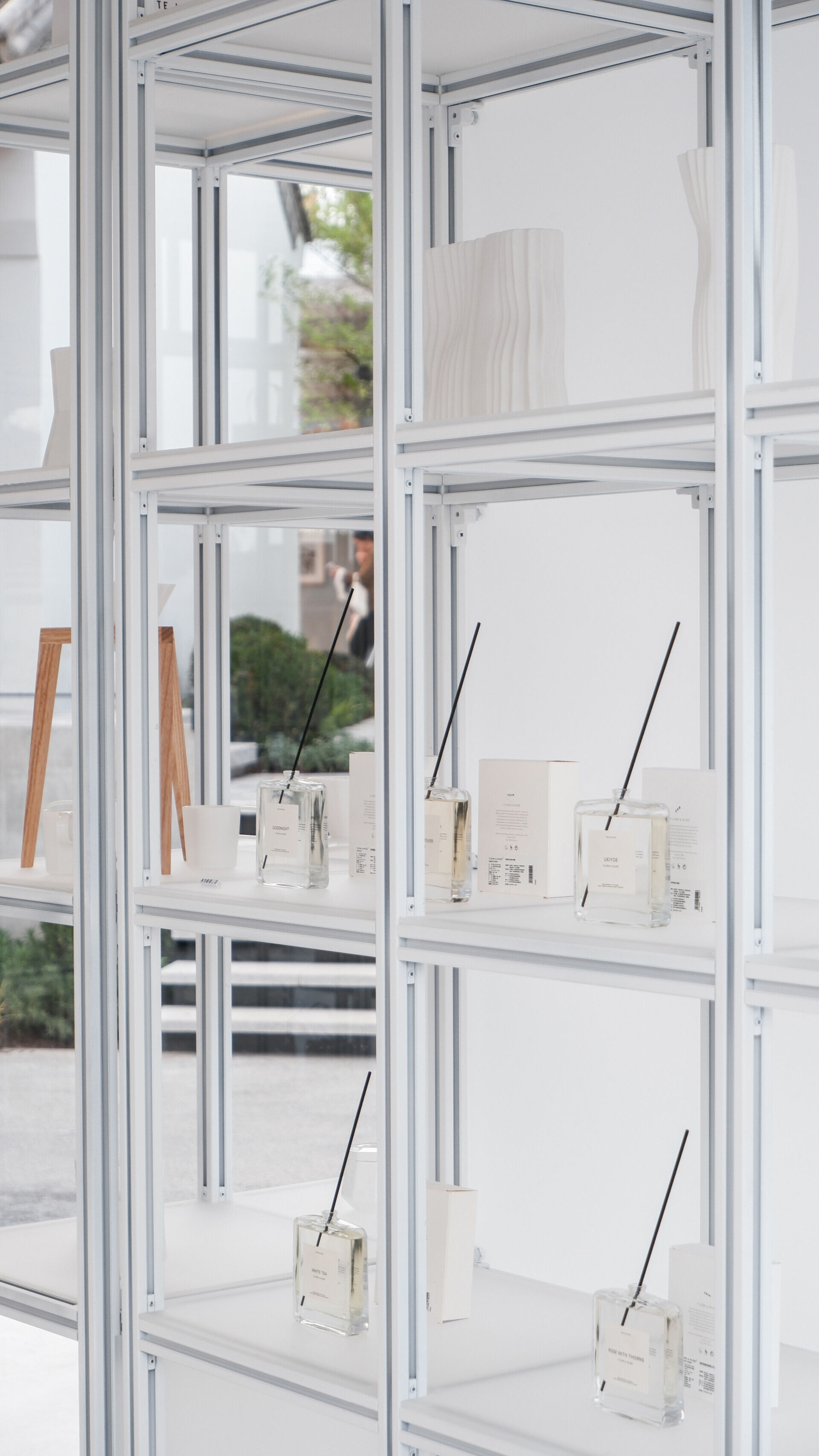
Working with the idea of a “house within a house,” designRESERVE developed a bespoke display system for the shop. A 30×30 mm aluminum frame with frosted acrylic shelves forms a cube measuring 2.85 meters on each side. Rotated 45 degrees and placed at the center, it resonates with roofs and houses near and far. Amid the bustle of voices, a gentler echo seems to surface—history’s long current slipping into the routines of daily life.
Principal Designers | Fangzhou Lydia Song / Feng Yue
Design Team | Shuai Li / Huaer Lin
Character of Space | Commercial retail space
Gross Floor Area | 50 ㎡
Materials | polycarbonate sheets / translucent fabric / microcement /
aluminum profile / frosted acrylics
Location | Luoyang, Henan, China