Members Only

加入會員後,點選Members Only即能閱讀更多完整文章及獨家內容。

Sign up now
WABISABI
  • Projects
    • Worldwide
    • Interiors
    • Features
  • Contemporary
    • Exhibitions
  • Record
  • Lifestyle
  • City Explore
  • News
  • Issue
  • Account
  • Search
  • Language
Mobile nav

Legacy

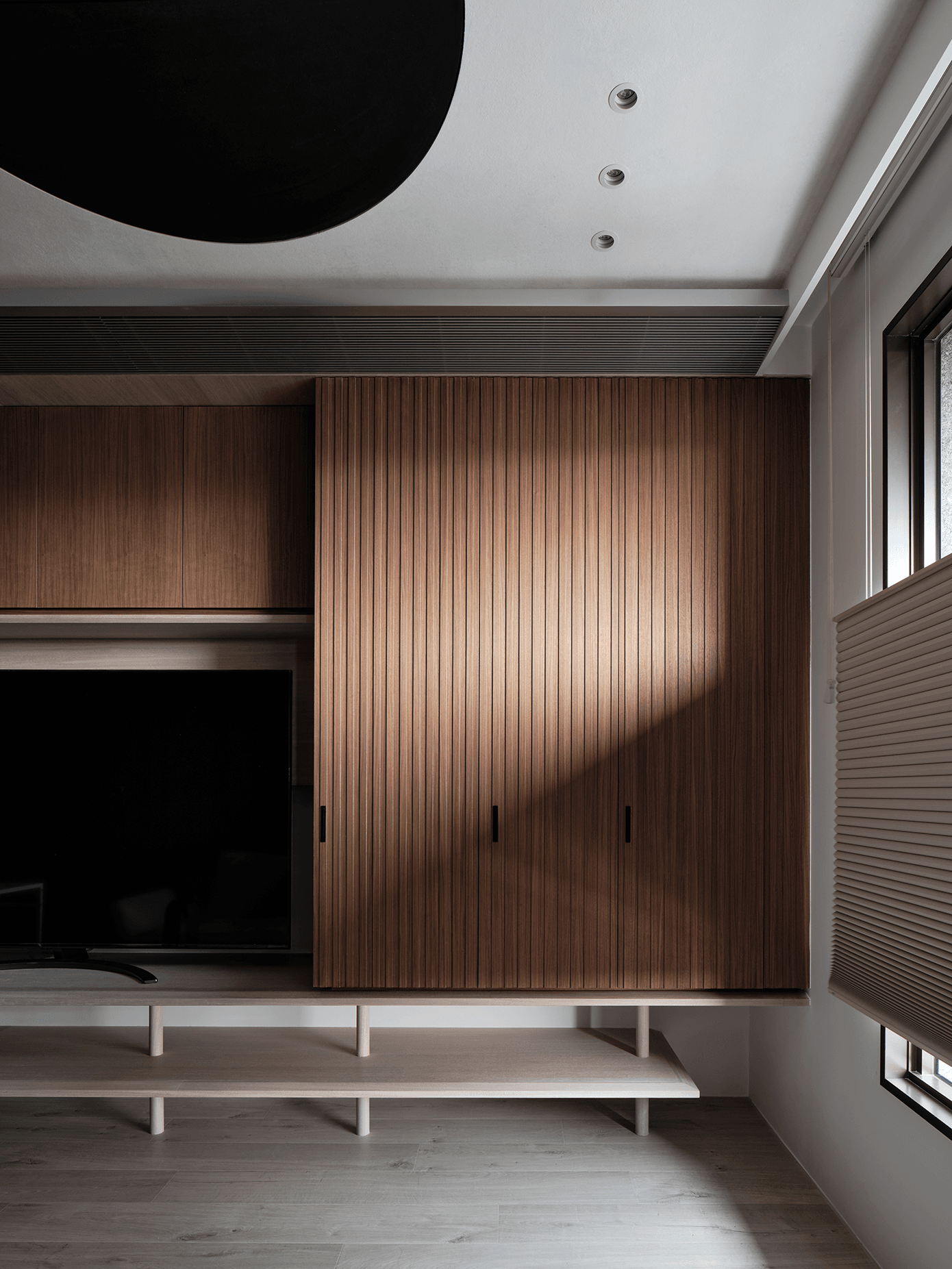
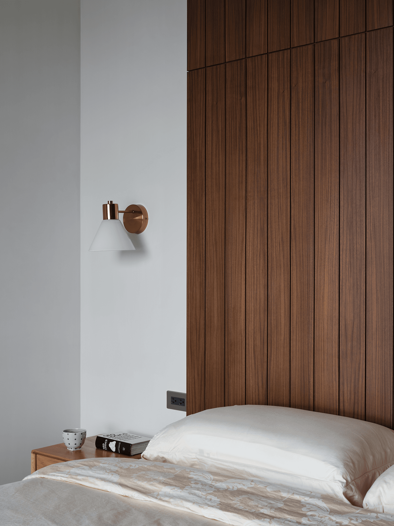
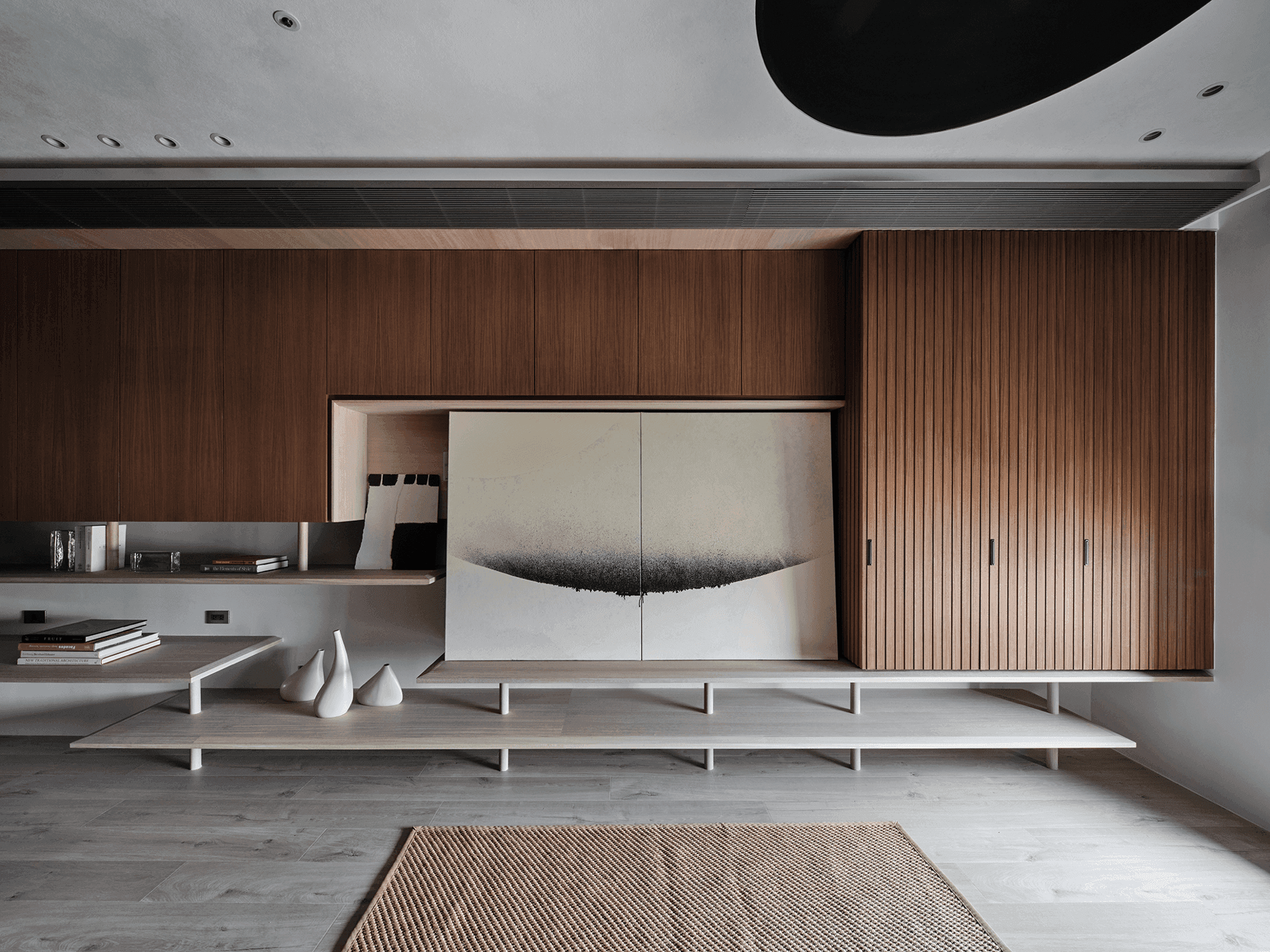
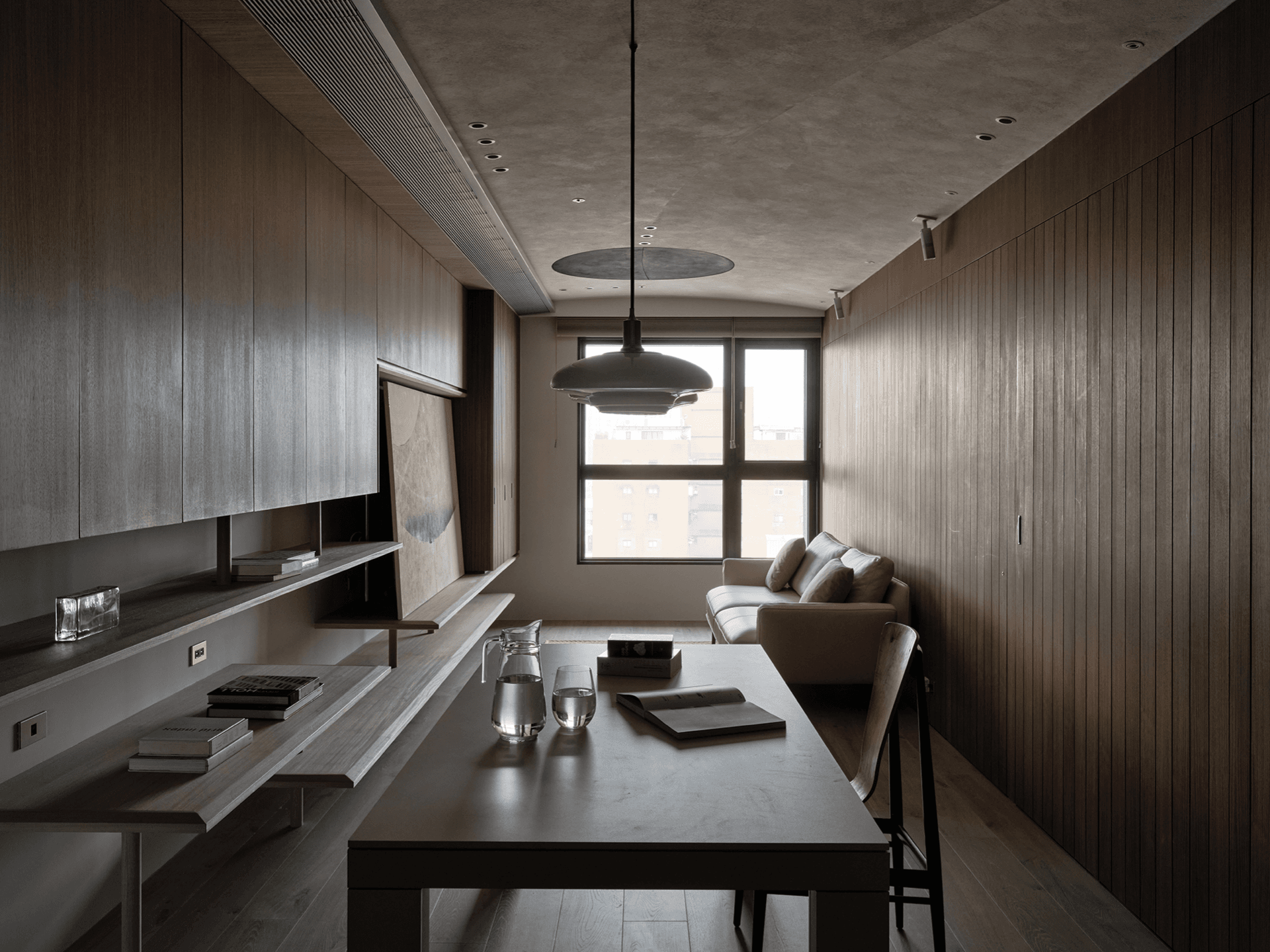
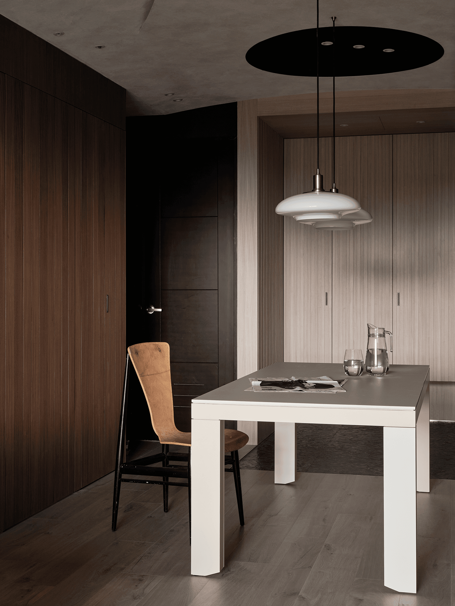
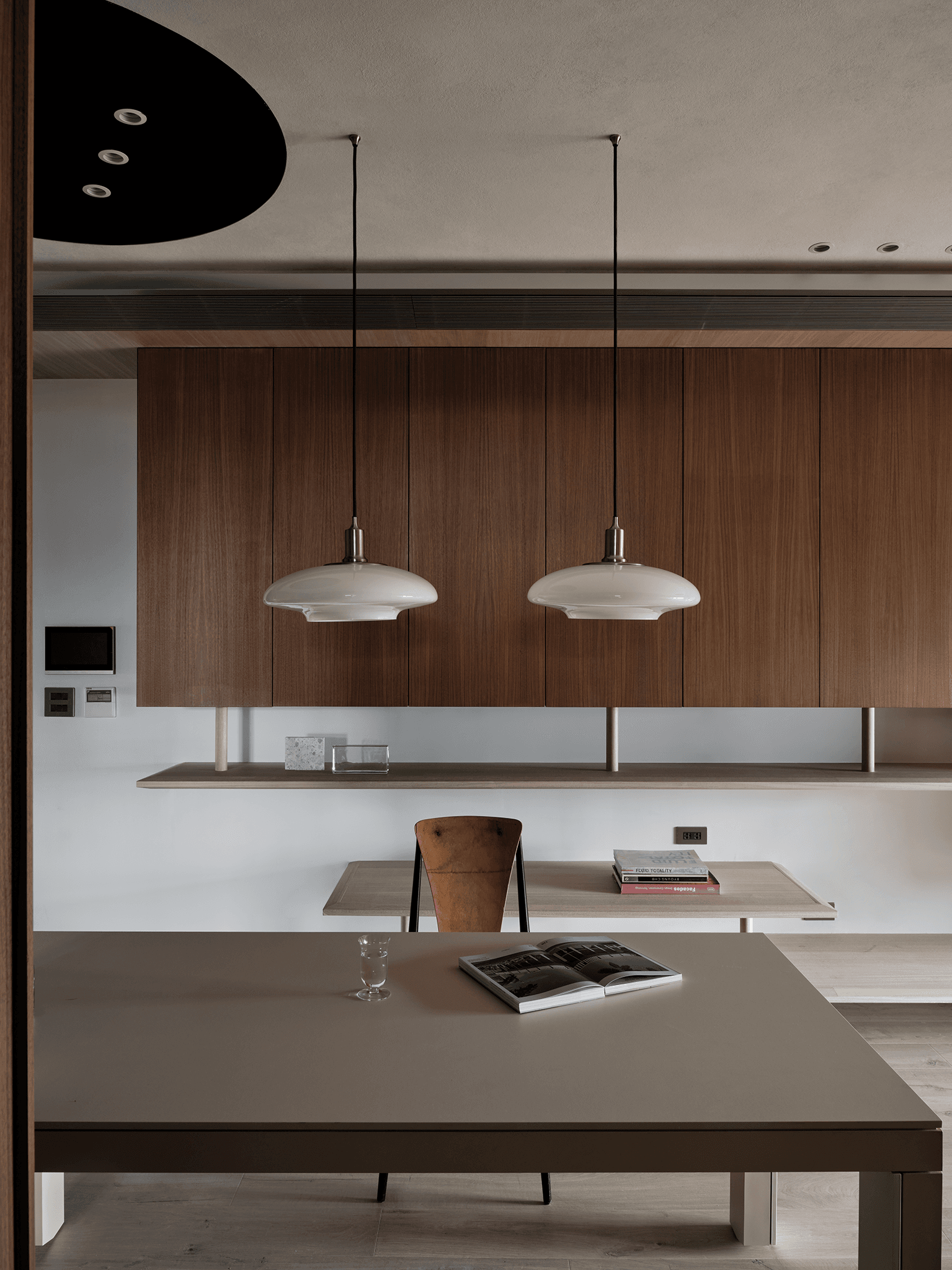
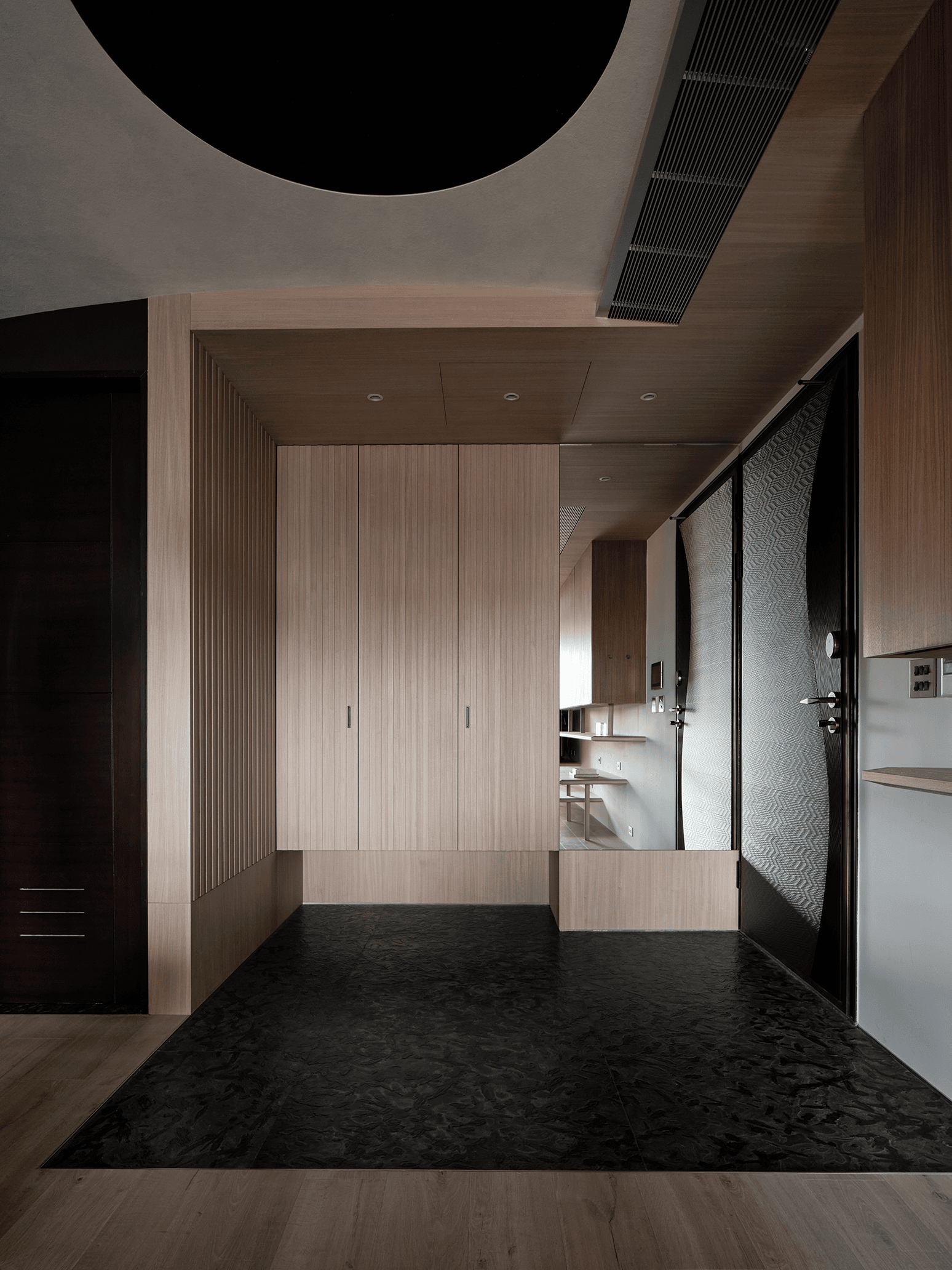
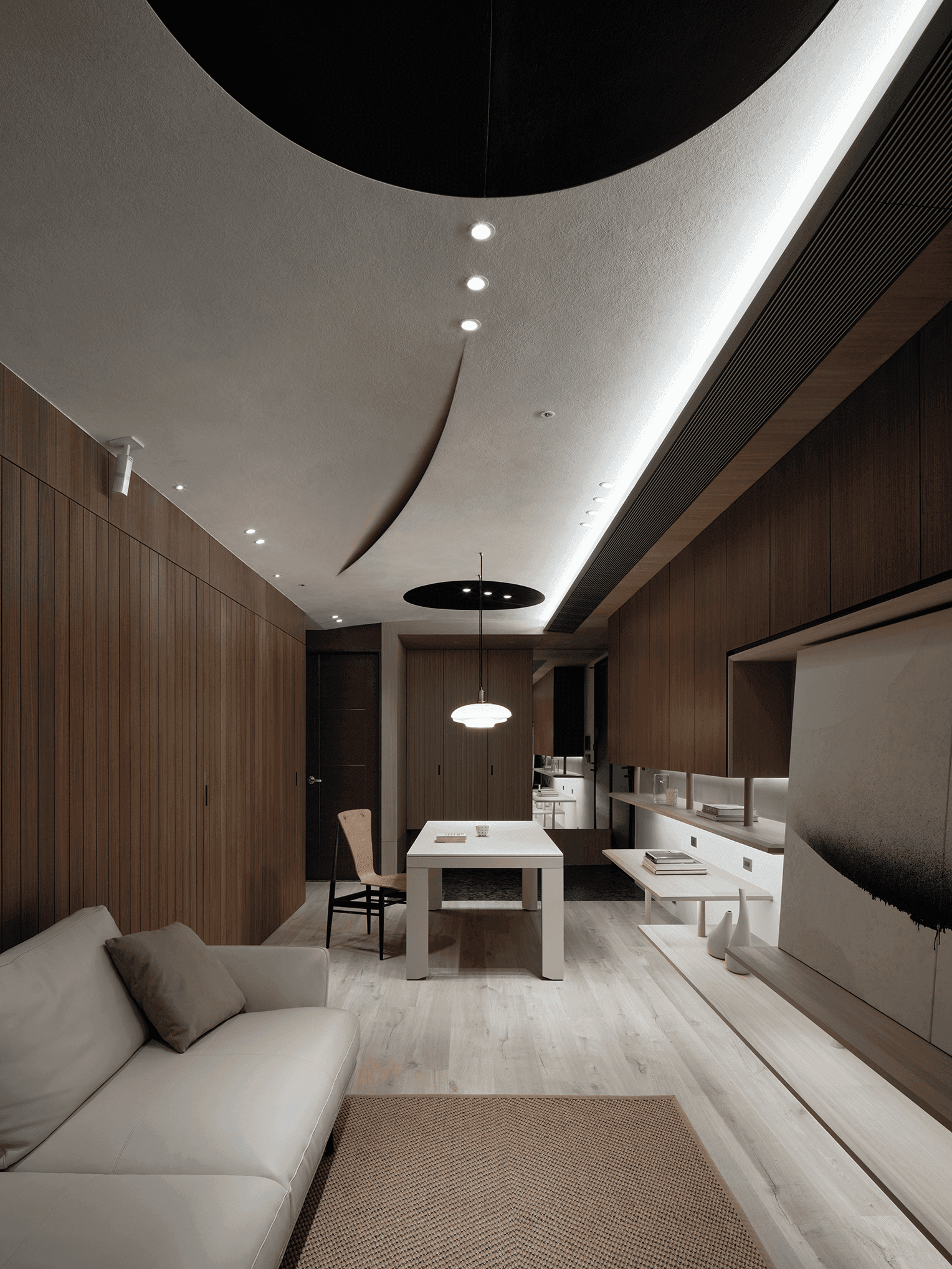
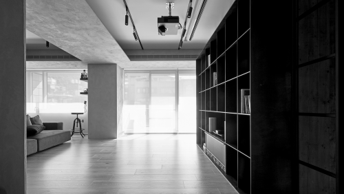
In recent years, the color schemes in terms of spatial design have favored pastel tones, with wooden materials mostly treated in muted colors or painted white, as if dark wood had been popular in the last era. However, in this case, the dark wood tones throughout the room exhibit an elegant ambiance of composure, purity, and tranquility.


With an area of 85 square meters (approximately 25 pings) and four members in the family, there are two living rooms and three bedrooms with open interconnections, which are not quite as spacious but meet the occupants' needs. After entering the foyer, the extended common area connects the living room and the dining room, the family's core area: the dining table. The long white table provides the complex functions of working, eating, and writing homework with children. Behind the dining room seating, a flat wall stained with wood contains the entrance to the kitchen and the children's bedroom. The kitchen and the children's bedroom partially retracted to form three cabinets at the gate, which, together with the overall visual design of the wall, makes the household items invisible and makes the two areas more orderly.
The wall behind the sofa in the living room is a deep stained incense-cedar wood wall with straight wood grain and well-defined regular divisions, integrating the different sized entrances to the master bedroom, two children's rooms, and the kitchen. This wall shows the integration of practical engineering into the design. Since the structure of the space itself is a steel structure, when an earthquake occurs, the flexibility of the steel bones will absorb the earthquake's energy and then release it, which will cause the whole building to shake less and make the room less susceptible to earthquakes.
From the unification of materials and colors to the division of lines and the design of the ceiling shape. The slight curvature conceals many of the house's air conditioning and maintenance equipment. The black circular color block replaces the standard rectangular maintenance holes. At the same time, an arc cuts straight through the ceiling to create layers for the flat ceiling, responding to the shaking of earthquakes and highlighting the presence of shapes and objects through the color tonality and choice of materials, blending the Bauhaus era design style with abstract artistry.
 
At the end of the interview, designer James Fong mentioned that the design of this project was based on the ambiance of Wabi-Sabi and was, in essence, a further pure presentation. Without deliberately defining the design as a wabi-sabi style, he utilized the imagery presented in this style at the early stage of the design to provide a reference for the owners and enhance the sensitivity of the five senses. Once he had a picture in mind to facilitate communication at a later stage, he found a mutual consensus on what the house would look like with basic materials and no more than a variety of colors so that the home would be valid for the life of the occupants.

傳

家

近幾年,空間設計範疇的色彩計畫流行著淺色調,木質材料也多是淡色抑或刷白處理,彷彿深色木頭已然是上一個時代的流行。然於本案中,整室深木色澤卻呈現出一份浸潤於沉穩的氣息,純粹,寧靜。


空間面積為85平方公尺(約25坪),家庭成員四人,共有開放連結的兩廳和三房臥室,不盡闊綽卻相符著居住者需求。從玄關入門後,銜接客廳、餐廳的長條型公領域,在家庭核心移向餐桌上的現代,白色大長桌因應了工作、用餐,陪小孩寫作業等複合機能,桌子後方的電視牆是開放錯落的層板,可以擺放書籍、文件、事務機。餐廳座位後方,肖木染深的平整牆面含藏通往廚房與小孩臥房的入口。為爭取更多收納機能,廚房與小孩臥室退縮了局部空間,於入口處形成三道櫃體,搭配牆面的整體視覺設計,使家庭物品收整於無形,也使兩處場域更加方正。

客廳沙發背後的牆面,是一道染深的肖木牆,木紋直順,搭配條理分明的規律分割,整合了通往主臥房、兩間小孩房與廚房,大小不一的入口。此道牆展現了實務工程整合到設計的考量。由於空間本身的結構是鋼構建築,當地震的時候,鋼骨的柔韌性會吸收震動能量再釋放,整幢建築搖晃程度較大,居於室內也會較有地震感受度,倘若在牆面使用大片建材便較容易產生龜裂,因此,細長的天然木皮,像是數個單細胞整齊排列,統整空間視覺的同時,藉由分割而成的溝縫,降低左右晃動時牆面產生裂縫的機會。


從材料用色的統一到線條分割,來到天花板的造型設計。微幅弧度隱藏著許多房屋的空調與維修設備,黑色的圓型色塊取代常見的矩形維修孔,一道弧線率直劃開天際,為平面天花板切出高低層次,因應地震的搖動之外,亦透過色調和選材,彰顯造型亦或物件的存在感,以抽象的藝術性融合包浩斯年代的設計風貌。


當訪談進入尾聲,方俊傑設計師提到本案設計,其實是基於侘寂氛圍上,更為純粹的呈現。沒有刻意定義成侘寂風格的設計,原因是在設計初期,他運用此種風格所呈現的意象,為業主提供參考,並提升五感的敏感度,當心中一旦有了畫面便利於後期溝通,素雅的材料,不超過多種色調的住宅將會是什麼樣子,找出彼此的共識,便能讓住宅忠於居住者的生活。


—


Morpho-Design   |   形構設計


morpho-design.net

the Reflection and Flow of Light
上一頁

the Reflection and Flow of Light

treehouse
下一頁

treehouse

  • About
  • Privacy policy
  • Track Order
  • Customer
  • Contact
  • Join us
FACEBOOK
instagram
Language

Copyright © WABISABI ISSUE. 侘寂傳媒有限公司 統一編號:90451315

  • Projects
    • Worldwide
    • Interiors
    • Features
  • Contemporary
    • Exhibitions
  • Record
  • Lifestyle
  • City Explore
  • News
  • Issue
Language