


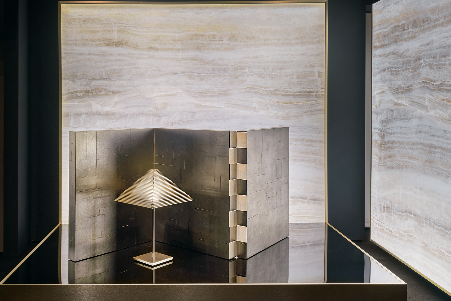
➤ 品項 Item|2026 年 LOGO 燈飾 · WINCHESTER 屏風
居所品味的內在尺度
The Inner Measure of Home
Giorgio Armani 曾說:「優雅不在於耀眼,而是令人難忘。」在 Armani 的設計語彙裡,優雅無需聲張,它始終關乎身體的自在,以及刪減的紀律,而這份對美感的信條,由時裝延伸至居住空間,反覆驗證何謂多餘、何謂必要;這些經過時間淘洗仍可辨識的經典形體,形成品牌基因裡對材質與工藝運用的獨特座標。自 1982 年第一盞 LOGO 燈飾問世,到 Armani/Casa 正式成立,將逾四十年的設計思想凝結成品牌珍貴的遺產,這套邏輯在空間中便有了完整載體。2026 年,米蘭旗艦店以「Origins」為題重返原點,將橫跨 1982 至 2010 年具識別度的「Icons」,以初始版與再版並置於展示櫥窗中,面對跨越近半世紀的經典作品,除了溯源,亦是一場品牌對起源的驗證:設計在快速更迭、新品不斷追逐話題的當下,能不依賴潮流、仍長存在生活裡的經典,究竟會是什麼樣貌?
Giorgio Armani is often quoted as saying, “Elegance is not about being noticed, but about being remembered.” In Armani’s design language, elegance never calls attention to itself. It begins with ease in the body and a disciplined sense of what to leave out. That conviction moved from fashion into the home, continually asking what was superfluous and what needed to remain. Forms that remain recognisable after years of refinement have become touchstones for the brand’s approach to materials and craft. The LOGO lamp, introduced in 1982, brought this thinking into the interior; Armani/Casa later gave it fuller expression throughout the home. More than four decades on, it remains one of the brand’s defining legacies. In 2026, the Milan flagship returned to that source with Origins. In the windows, Icons dating from 1982 to 2010 appeared, each in its original finish alongside a re-edited version. Looking back across nearly half a century, the exhibition asked what in those early designs still endures. At a time when design cycles are accelerating and new releases continually vie for attention, what allows a classic to remain part of everyday life without depending on passing trends?
➤ 圖片提供 Images|雙橡園家居.Twin Oaks Casa
Icons:經典何以被辨認
Icons: How a Classic Remains Recognisable
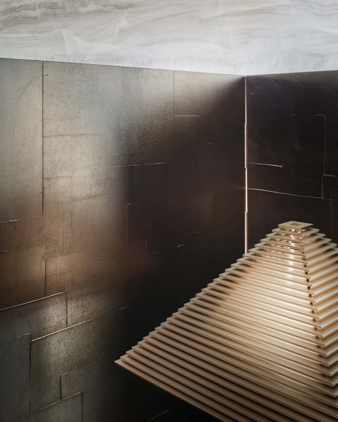
回看這些作品,即使在材質與飾面更替之後,其核心靈魂與使用角色仍存有可辨識的共同特質,它們分別汲取不同年代、文化的設計語言,在 Armani/Casa 以俐落線條、精準比例與機能秩序的精微工藝,使物件不止於形體。LOGO 燈飾是 Giorgio Armani 進入居家領域的起點,設計之初,機能性便是這盞燈的核心,初始版高於一般桌燈的尺度,光源從中央渲染周圍;再版以灰米色層片木三角燈罩,重新切分光影層次,光源便由層與層之間滲出,陰影成為燈飾造型的一部分。於是,居家空間便有了溫度;這盞時刻守候的 LOGO,即使數十年後也仍做著同一件事。
Materials and finishes may change, but the underlying logic remains. The pieces draw on different periods and cultures, yet their character and role within the home remain clear. Armani/Casa gives those references coherence through clean lines, precise proportions and a clear sense of function. Those decisions take physical form through craft: in the finish, the fall of light and the feel of the surface. Placed at the centre of a table, LOGO makes its purpose clear. Designed in 1982 as Giorgio Armani’s first object for interiors, the original stood taller than a conventional table lamp, allowing soft, even light to reach across a wider area. In the re-edited version, the triangular shade is rendered in greige-painted lamellar wood. Light filters between the horizontal layers, breaking the glow into finer bands and making shadow part of the lamp’s form. The room feels warmer for it. Decades on, LOGO still does the same quiet work.
隱而未蔽的界線為空間微添層次,WINCHESTER 源自對東方傳統屏風的詮釋,刻意降低的尺度,建立款待與私密之間自由的距離,允許視線越過上方、身體止步於前;再版的銀色鏝抹灰泥表層,回應自文藝復興教堂到巴洛克宮殿 Stucco 於歐洲建築中數百年的工藝脈絡,工匠層層抹覆深淺不一的手工肌理;三扇式面板間的鉸鏈以對比色帶排列出棋盤格紋,使表層成為光影展演的載體。當親友來訪時,它便在主與客之間劃出一道不言明的邊界;獨處時,則於閱讀區或工作區前保留適度距離。
A boundary need not close a room to give it depth. WINCHESTER reinterprets the traditional East Asian folding screen at a deliberately lower height. The eye can travel above it, while the body pauses at its edge. In the re-edited version, the Silver Drafted Stucco finish recalls stucco’s centuries-long presence in European architecture, from Renaissance churches to Baroque palaces. Built up in layers, the hand-worked surface carries subtle variations in depth. Contrasting hinge bands between the three panels form a checkerboard pattern, allowing light and shadow to move across the surface. When friends visit, it marks an unspoken boundary between host and guest. In quieter moments, it sets a reading corner or workspace slightly apart.
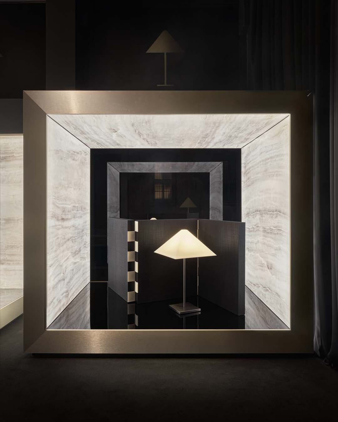
➤ 品項 Item|1982 年 LOGO 燈飾 · 2000 年 WINCHESTER 屏風
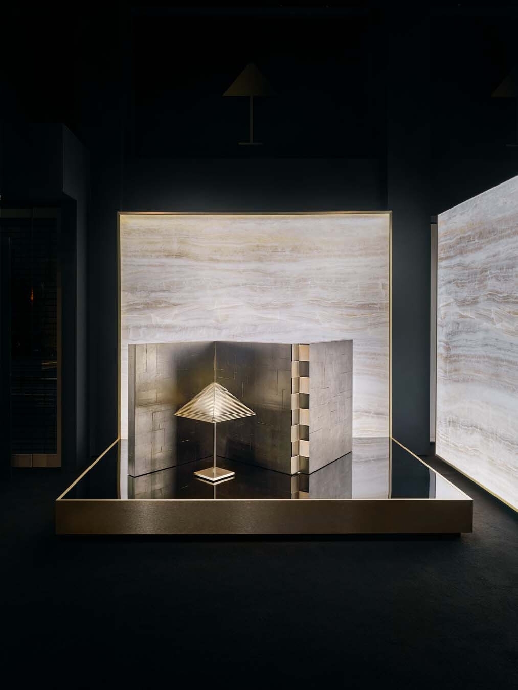
➤ 品項 Item|2026 年 LOGO 燈飾 · 2026 年 WINCHESTER 屏風
踏入玄關,SEINE 玄關桌一高一低的檯面,承接一盞燈與一件珍藏,將返家後的視線定格為一幀靜謐端景;入口因而不再只有生活收納,也成為人從城市返家後短暫沉澱的緩衝。初始版以黑色格紋雕刻織物交織的紋理;再版則以泥褐色鏝抹灰泥工藝轉化為家具質感語彙,純粹的橋式線性在不同光線下顯得深邃,量體的簡約輪廓為玄關處刪去多餘雜訊。
At the entrance, the staggered heights of the SEINE consoles hold a lamp and a treasured object. Together, they turn the first view on returning home into a quiet vignette. The threshold becomes more than a place for storage; it offers a brief pause between the city and private life. In the original finish, black grid engraving translates the interwoven texture of fabric into a hard surface. In the re-edited version, Mud Drafted Stucco gives the pure bridge form a hand-worked surface. As the light shifts, the form gains depth, while its pared-back volume keeps the entrance visually quiet.
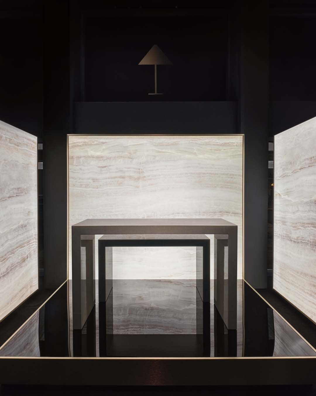
➤ 品項 Item|2000 · 2026 年 SEINE 玄關桌
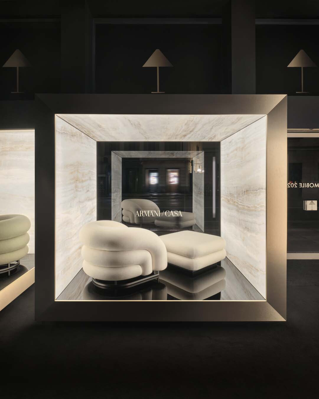
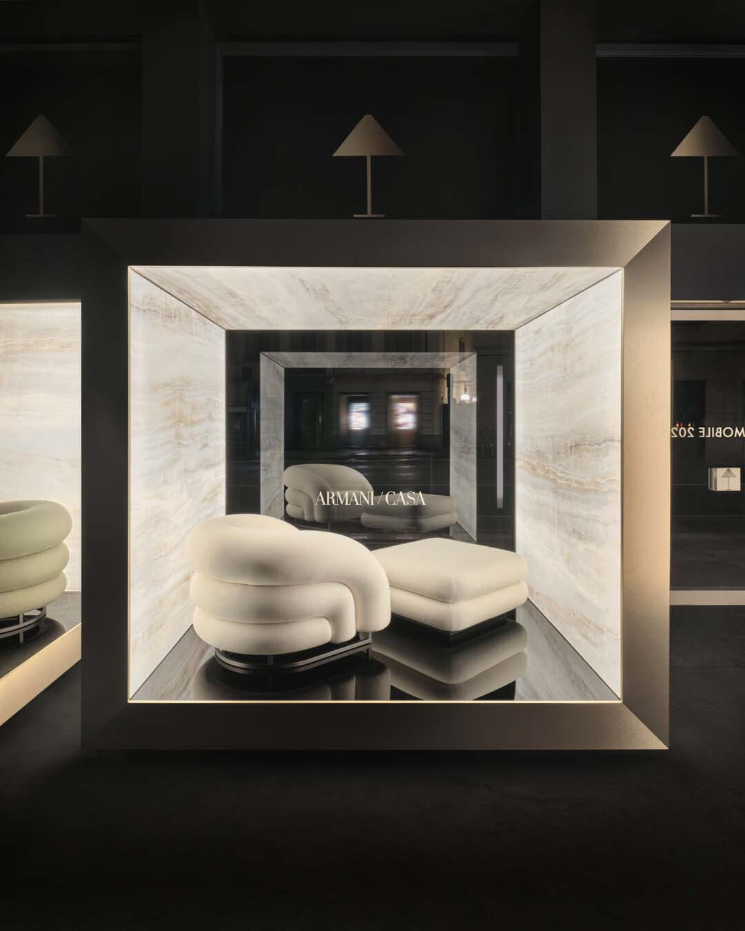
➤ 品項 Item|2008 年 BALOON 扶手椅、椅凳
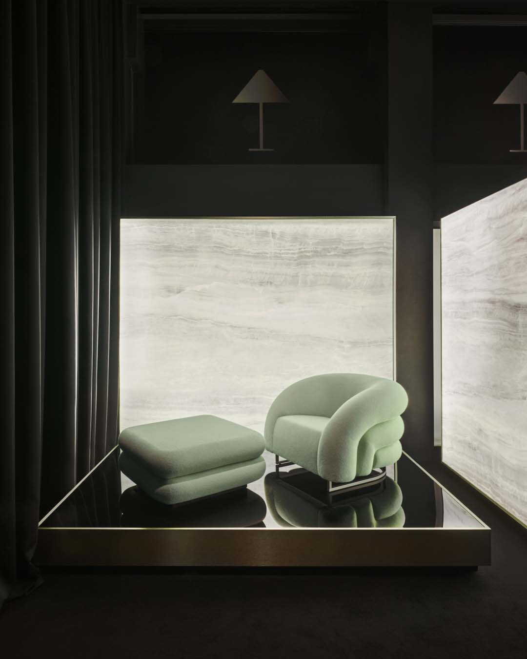
➤ 品項 Item|2026 年 BALOON 扶手椅、椅凳
靜奢材質如何剪裁光影
How Material Restraint Shapes Light and Shadow
進入客廳,BALOON 扶手椅與腳凳、TOKYO 扶手椅分別提出兩種相反而互補的身體承接。在一個不需要回覆任何訊息的午後,沖一杯茶、翻閱書本,悠閒地倚於 BALOON 扶手椅上,雙腳在柔軟的腳凳上找到支撐,Bergen 織物沿著飽滿圓弧的椅身延展,細密表層使光線停留在柔軟起伏之間,柔化空間裡過多的直線,背靠弧度讓肩膀自然放鬆,椅面深度則容許膝蓋微微彎曲、收攏雙腿,BALOON 陪伴的,是允許自己放鬆的那些時刻。窗外日光漫射於 Basel 天鵝絨包覆 TOKYO 方正幾何的輪廓上,灑落的光束使絨面隨視角產生深淺變化,轉譯傳統 Art Déco 克制的幾何與歐洲裝飾工藝中對光影張力的表現,減輕幾何秩序帶來的疏離感,坐入其中,其方正的邊界讓背脊自然端正,使待客談話時,看上去從容不迫;前者允許身體釋放,後者則以清楚的邊界予以承接。
In the living room, BALOON and TOKYO support the body in contrasting yet complementary ways. On an afternoon when no message needs answering, tea and an open book are enough. One settles into BALOON, feet resting on the soft footrest. Bergen fabric follows the chair’s generous curves; its fine texture holds the light and softens a room crowded with straight lines. The rounded back lets the shoulders relax, while the generous seat leaves room to bend the knees and draw the legs in. BALOON belongs to the slower moments of the day. TOKYO brings a different kind of composure. Daylight falls across the Basel velvet wrapped around its rectilinear form, and the pile shifts from light to dark as the viewing angle changes. The Art Déco geometry remains rigorous, while the velvet’s changing sheen softens its formality and recalls the European decorative arts’ sensitivity to light and shadow. Its defined frame gives the sitter a more upright bearing, lending poise to face-to-face conversation. BALOON lets the body loosen; TOKYO gives it a clearer frame.
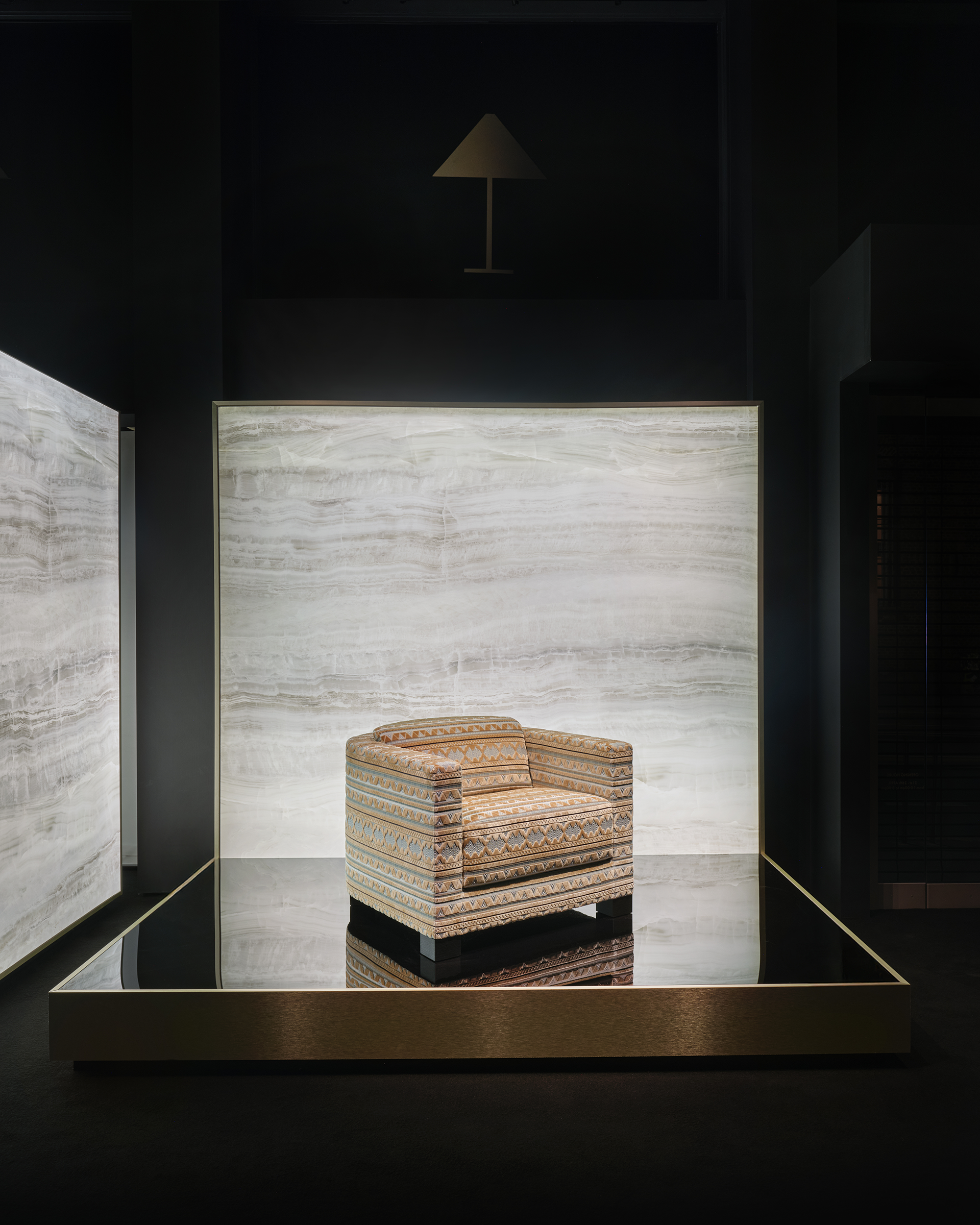
➤ 品項 Item|2026 年 TOKYO 扶手椅
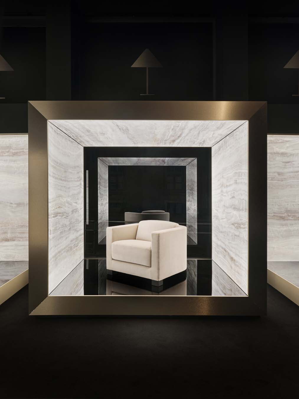
➤ 品項 Item|2000 年 TOKYO 扶手椅
當物件長存於居所被反覆感知,它便悄悄進入身體記憶,成為人辨認空間特徵的一部分,進而與日常秩序串連:那是雙眼記住的光源色溫,以及背脊熟悉倚靠的輪廓。材質能夠改變,觸感可以被重新理解,經典被留存的前提,即是物件與身體之間已建立默契;「優雅」不再是被觀看的表象,也不靠物件彼此競逐,它存在於每一道線條、每種光澤與每個使用的瞬間,日復一日逐漸形塑出居所品味的內在尺度。
When an object remains in a home and is encountered day after day, it gradually becomes part of bodily memory. A room becomes familiar through the colour temperature of its light and the curve the back has come to know. Materials may change, and the feel of a surface may be reinterpreted. A classic endures when repeated use makes it familiar to the body. Elegance is no longer merely a matter of appearance, nor does it depend on objects competing for attention. It lives in every line, every sheen and every moment of use. Over time, those moments shape the inner measure of home.
➤ 圖片提供 Images|雙橡園家居.Twin Oaks Casa