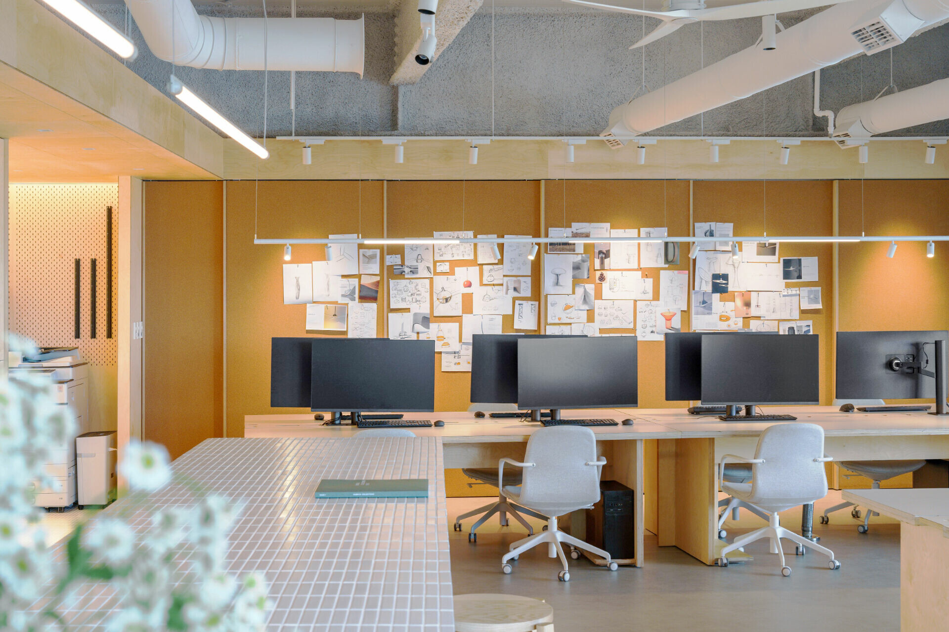
Members Only

加入會員後,點選Members Only即能閱讀更多完整文章及獨家內容。

Sign up now
WABISABI
  • Projects
    • Worldwide
    • Interiors
    • Features
  • Contemporary
    • Exhibitions
  • Record
  • Lifestyle
  • City Explore
  • News
  • Issue
  • Account
  • Search
  • Language
Mobile nav


酷必客辦公室

KUBRICK’s Office


在有序生活製作所的設計中,秩序並非是刻意建構的框架,而是內核邏輯的展現。對設計師陳敬儒而言「如何表現機能,在滿足機能後抹去多餘表情,使其整合於造型,形成空間有秩序的符號」是他最重視的設計基礎,這個概念如實體現於他為知名風扇企業 KUBRICK 設計的辦公空間,於當中細節便能尋見精準整合機能,進而演化的各式符號,使其與秩序合而為一的具象呈現。


At InOrder Studio, design is not about imposing an artificial framework of order; rather, it reveals the inherent logic within. For designer Ching-Ju Chen, the foundational principle is “to articulate function—in that once a function is fulfilled, any superfluous expression is stripped away and seamlessly integrated into the form, creating a spatial symbol of order.” This concept is vividly embodied in his design for the office of renowned fan manufacturer KUBRICK, where every detail reflects a precise integration of functionality that evolves into distinct design motifs, yielding a tangible union of function and order.


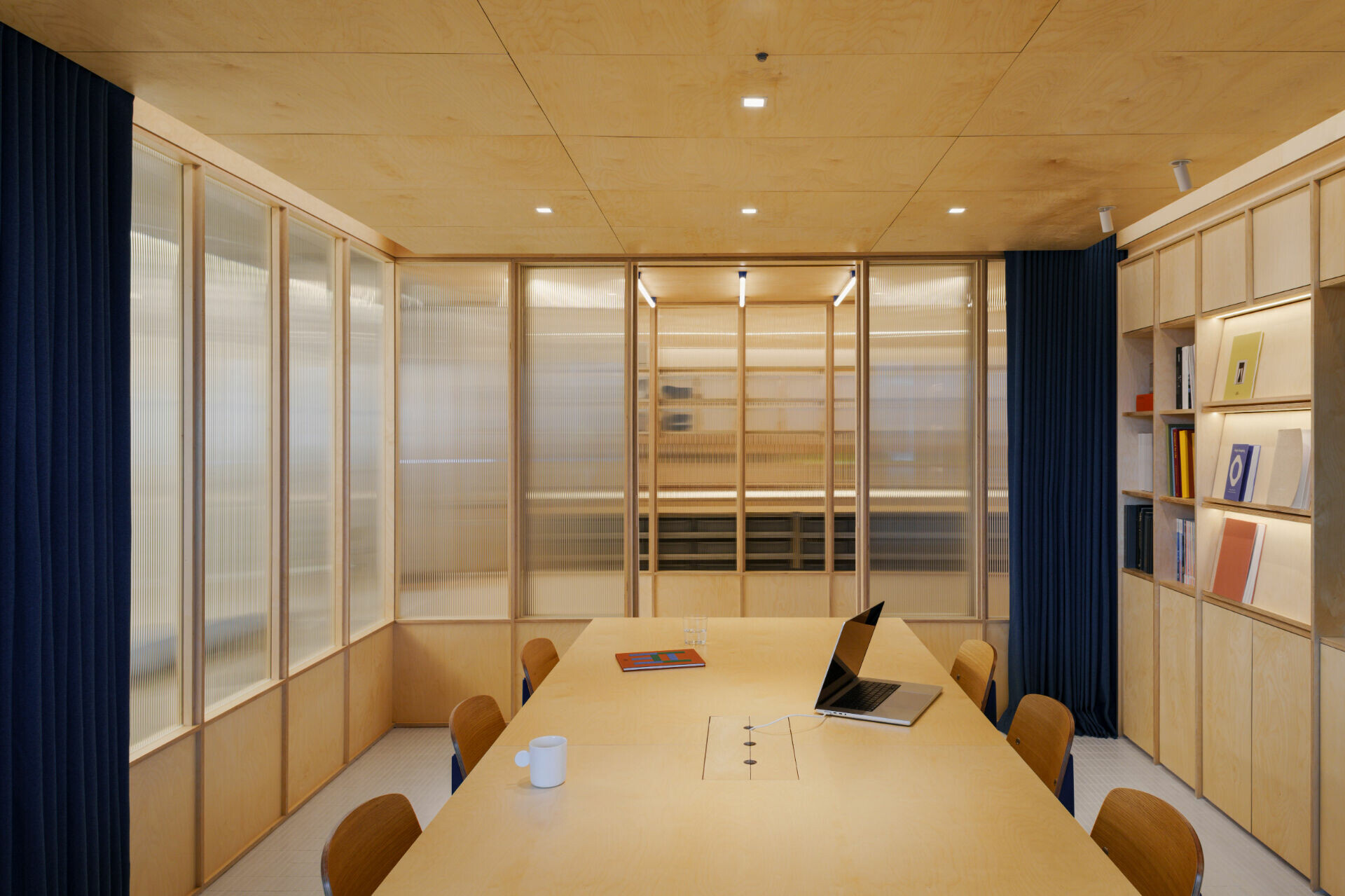
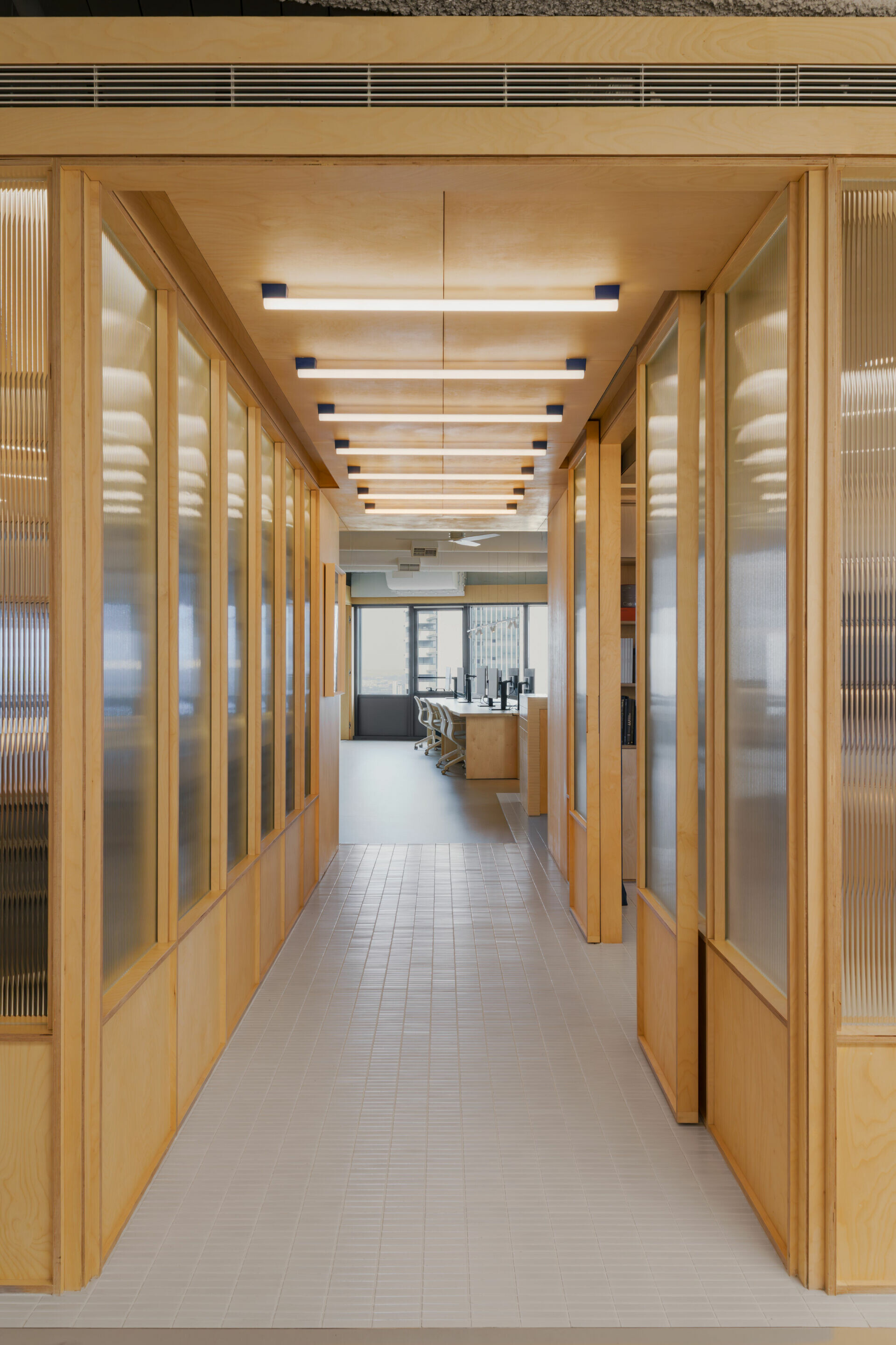
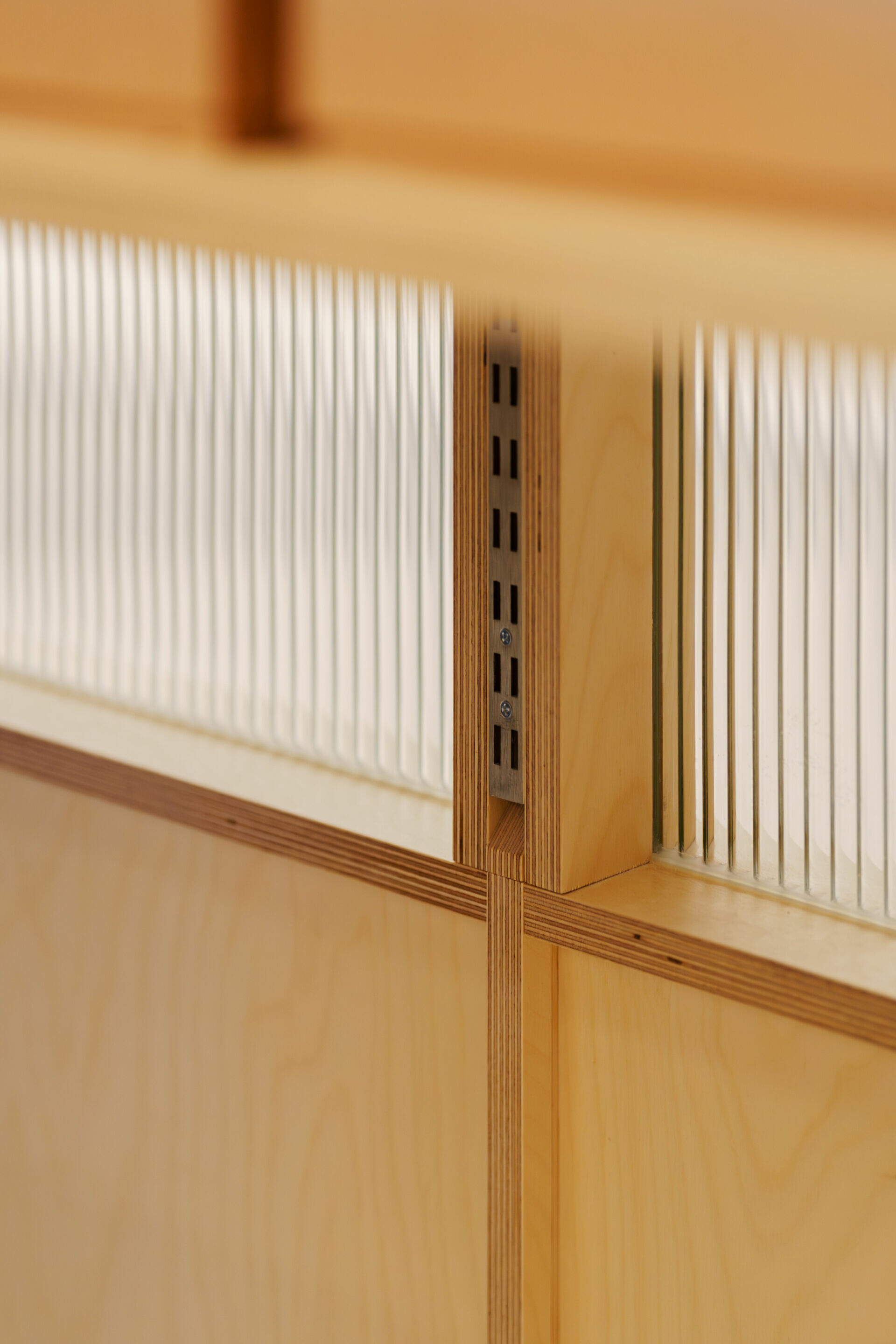
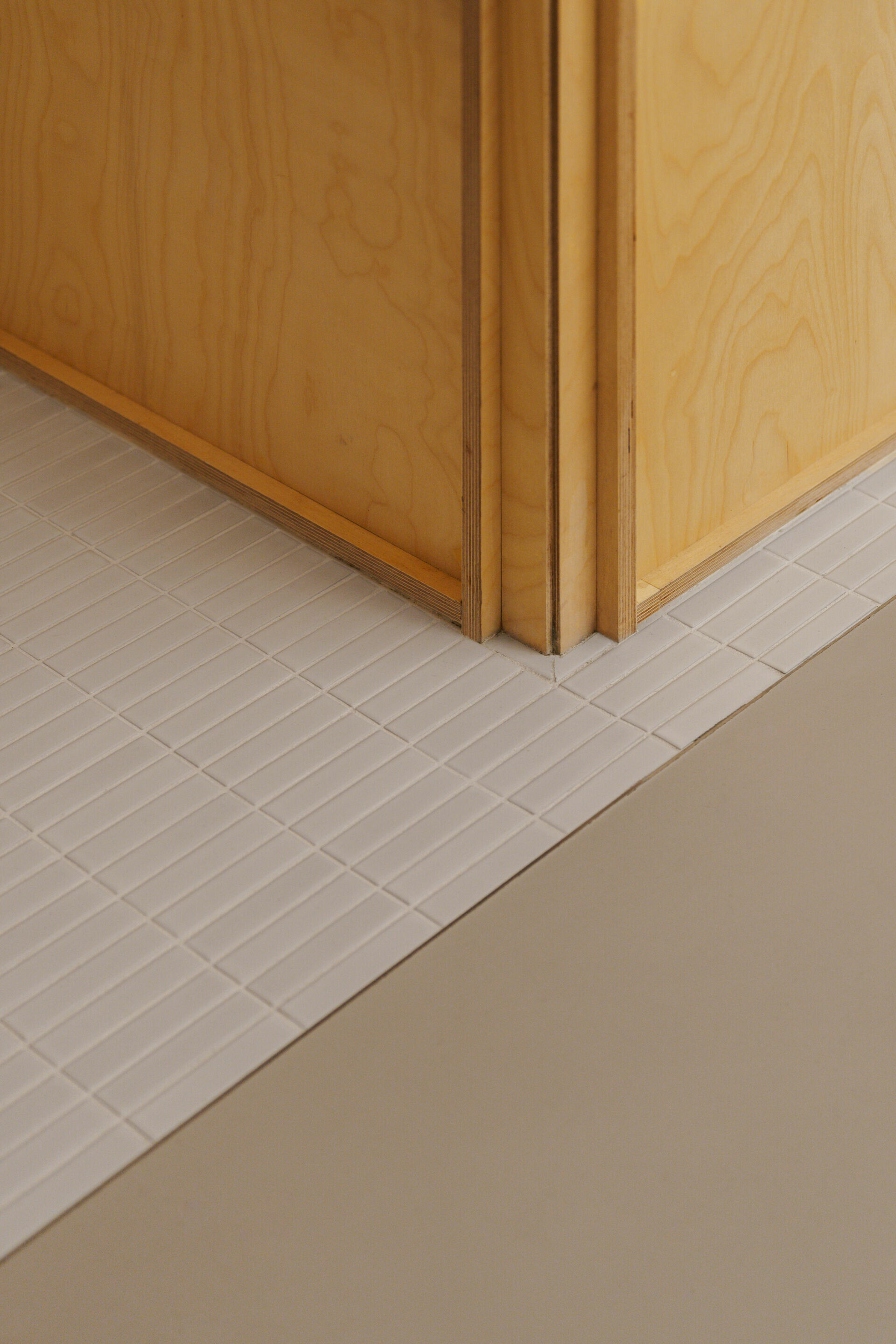
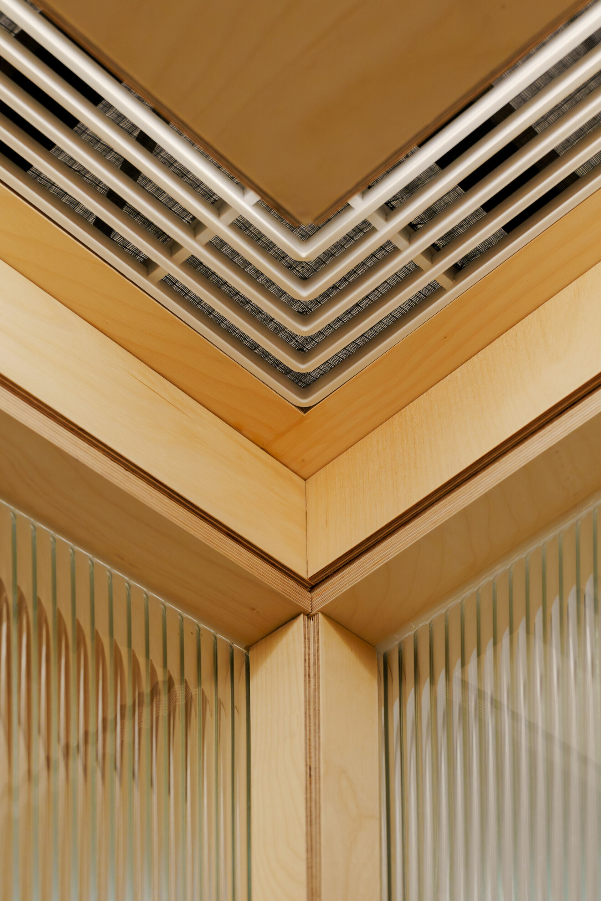
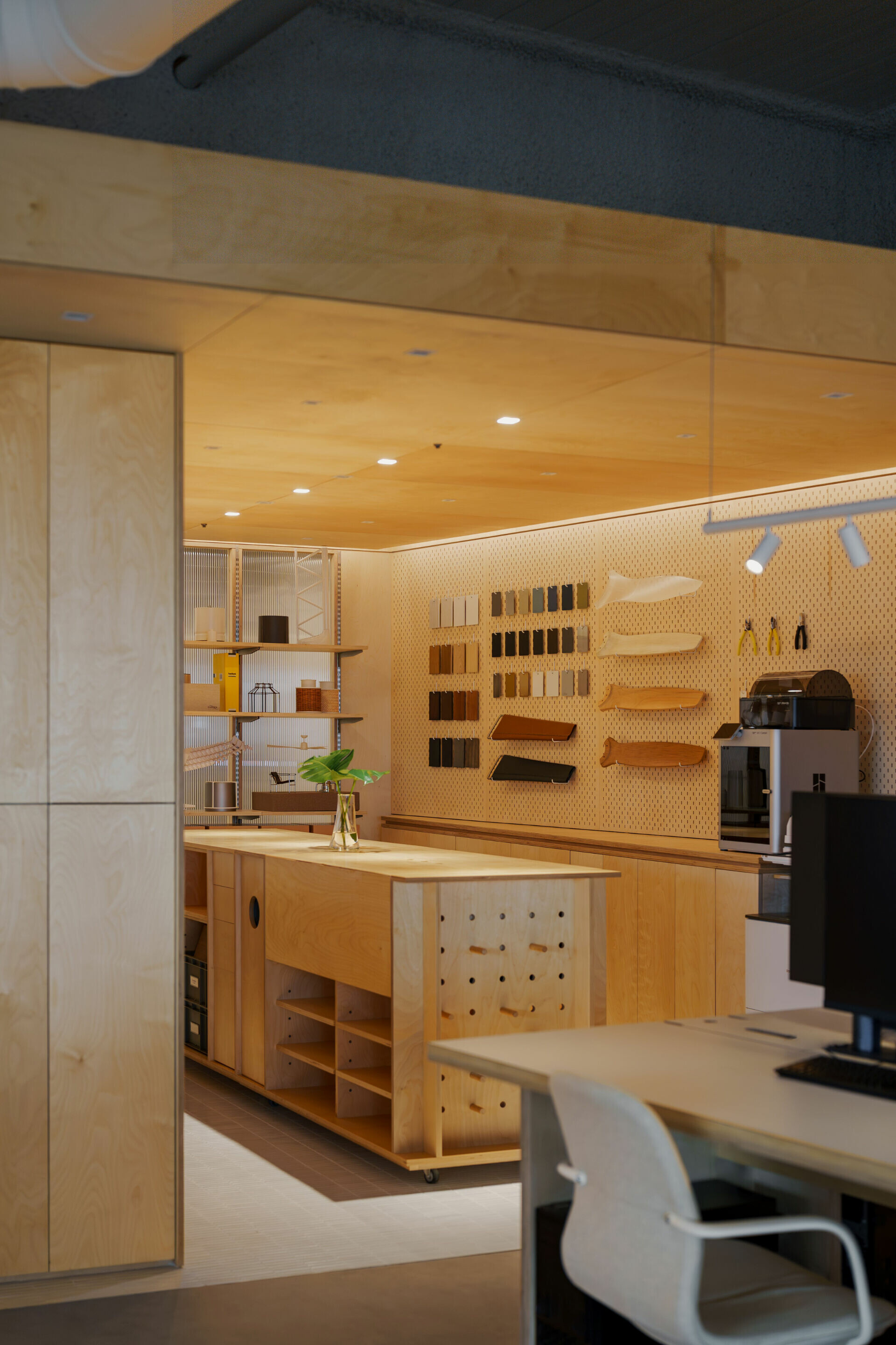
正因對細節秩序的極致追求,有序生活得以回應同為設計背景業主的明確需求和理念,作為品牌接待和研發的辦公場所,藉由空間語言傳遞企業對機能之於產品開發嚴謹看待的標準,雙方有效率地建立共識後,協同施作單位合作完成。於是,樺木便成為主導辦公室的核心素材,其夾板側剖層壓的明暗線條蘊藏豐富層次,自然特性完美契合品牌產品設計的語彙,那深淺分明的表情突顯著紋理輪廓,形成空間裡獨特存在的識別。


Driven by an uncompromising pursuit of meticulous detail, InOrder Studio adeptly addressed the client’s clear vision and requirements—reflecting a shared design background—to create a space that serves both as a reception area and a research and development hub. Through a carefully crafted spatial language, the design communicates the company’s rigorous standards in product development. Following a swift consensus between all parties, the project was collaboratively executed with the construction team. Birch wood was chosen as the dominant material for the office; its layered plywood—with light and shadow interplay—reveals rich textures, while its natural character harmonizes perfectly with the design language of the brand’s products. The striking contrast in its tones accentuates the wood grain, establishing a unique spatial signature.


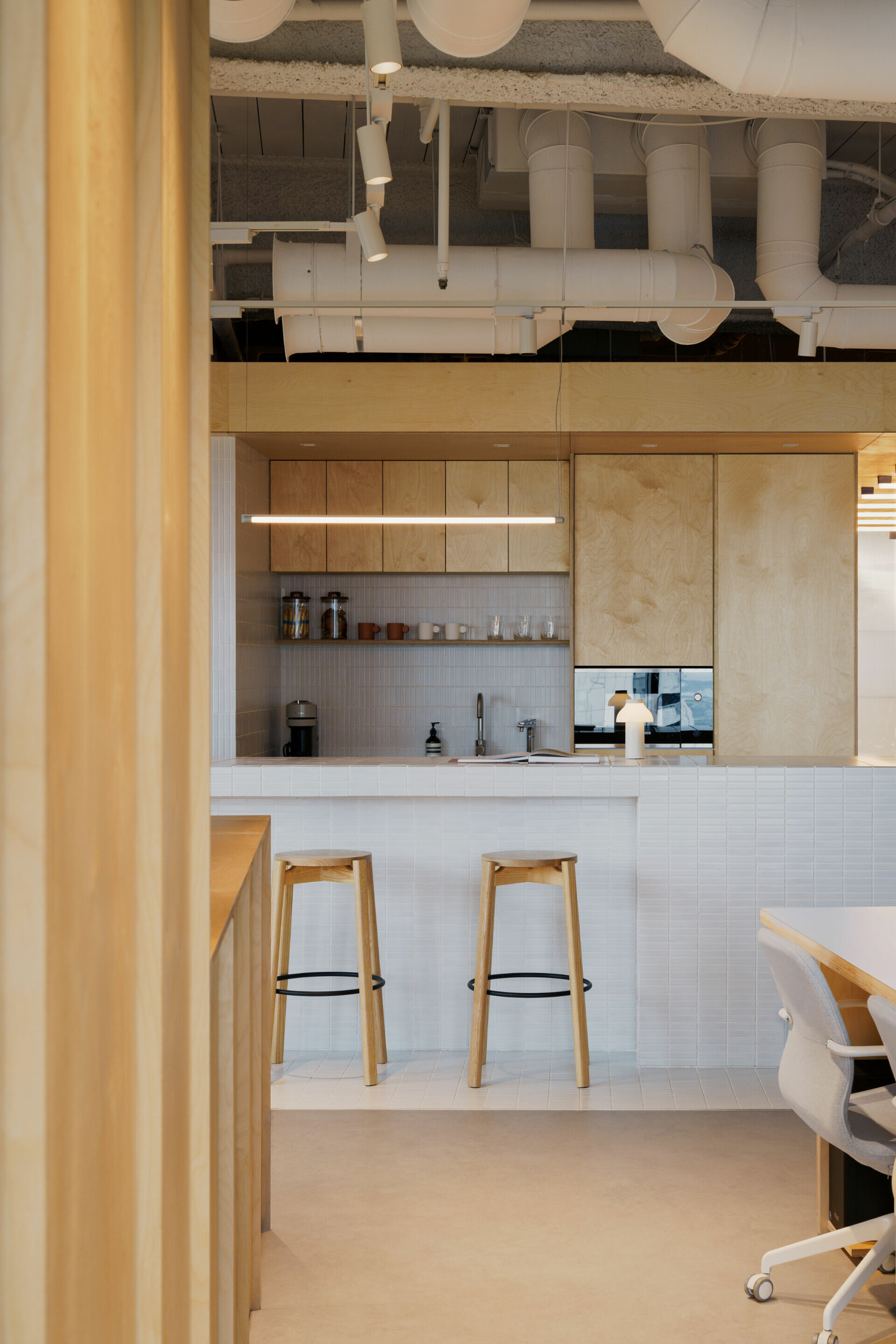
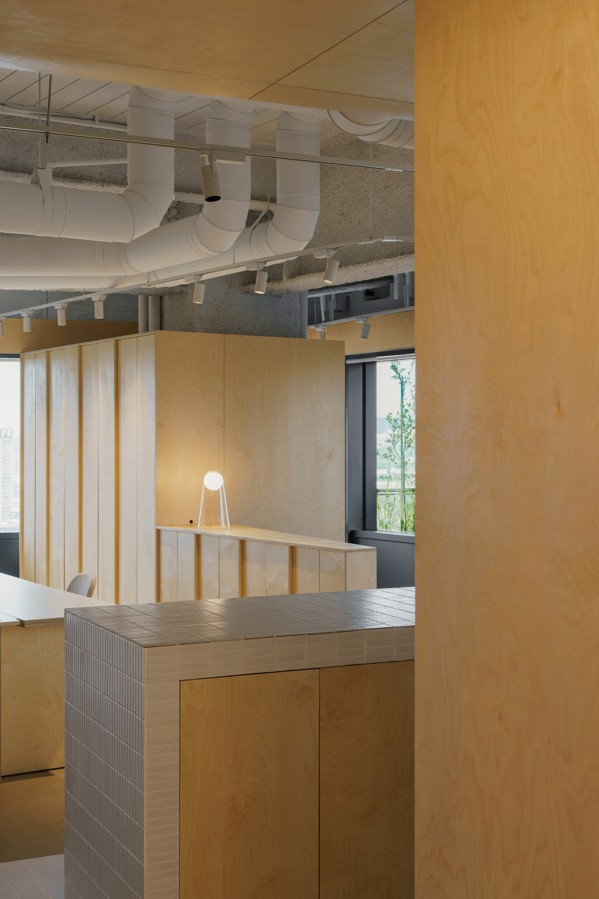
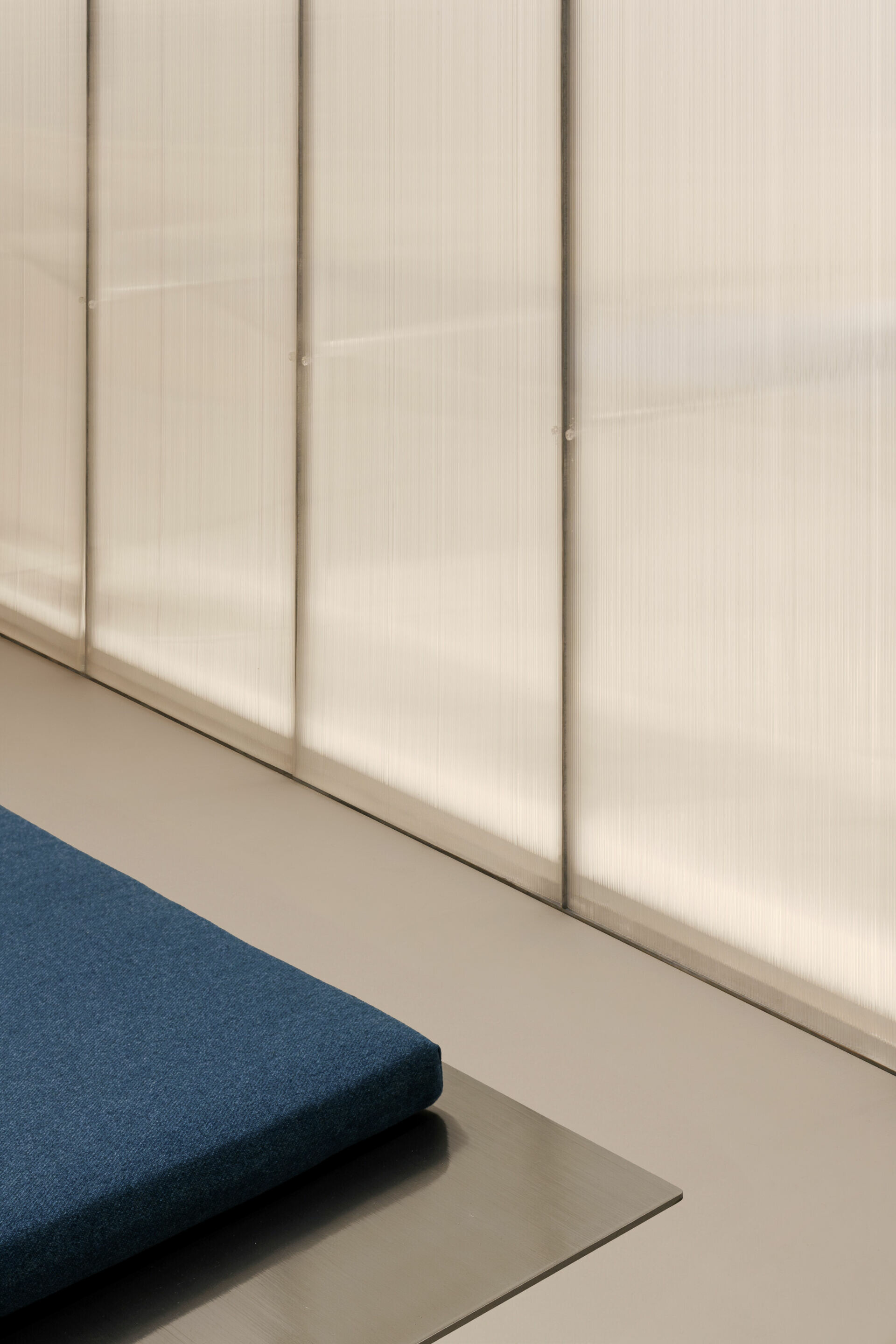
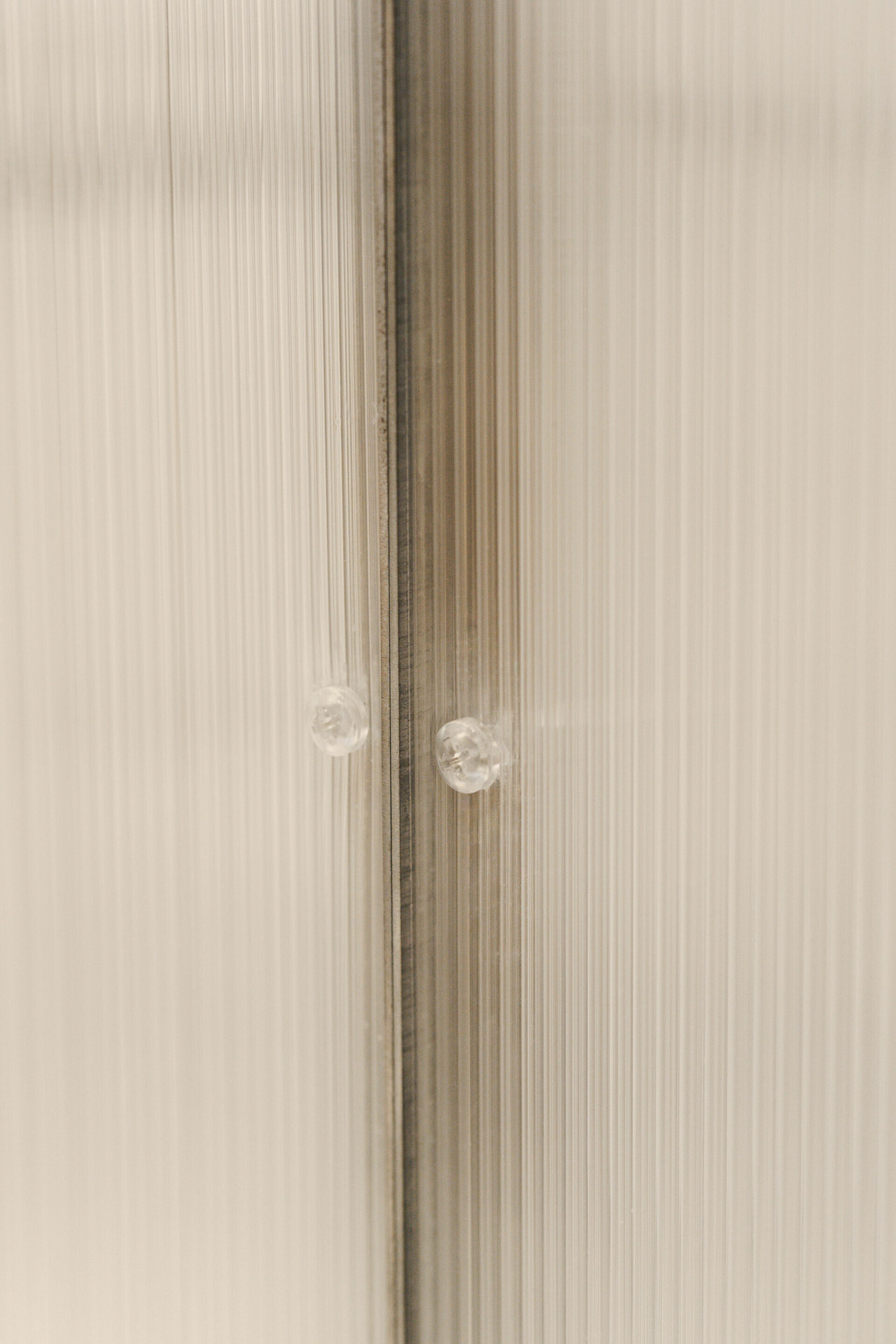
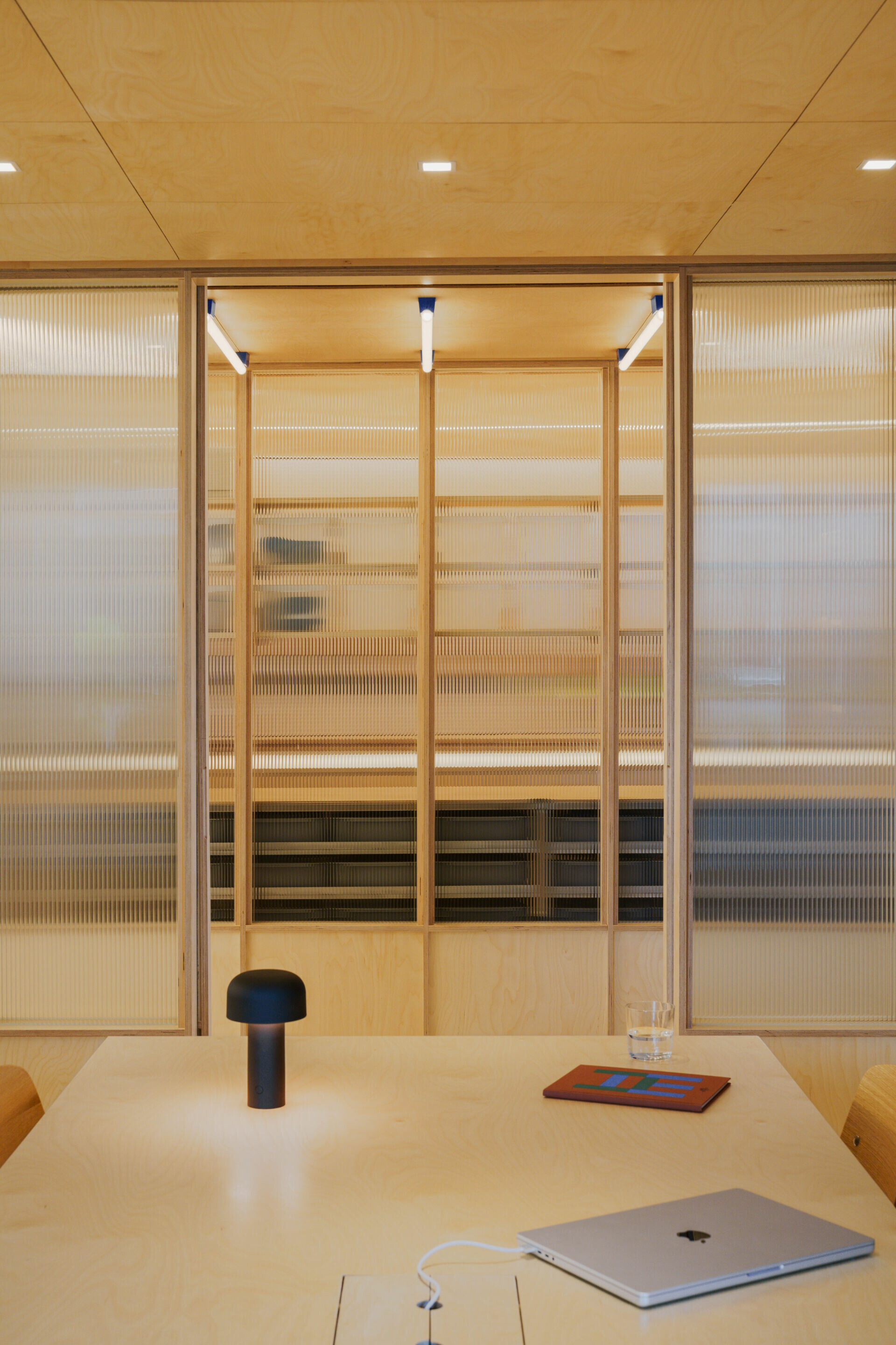
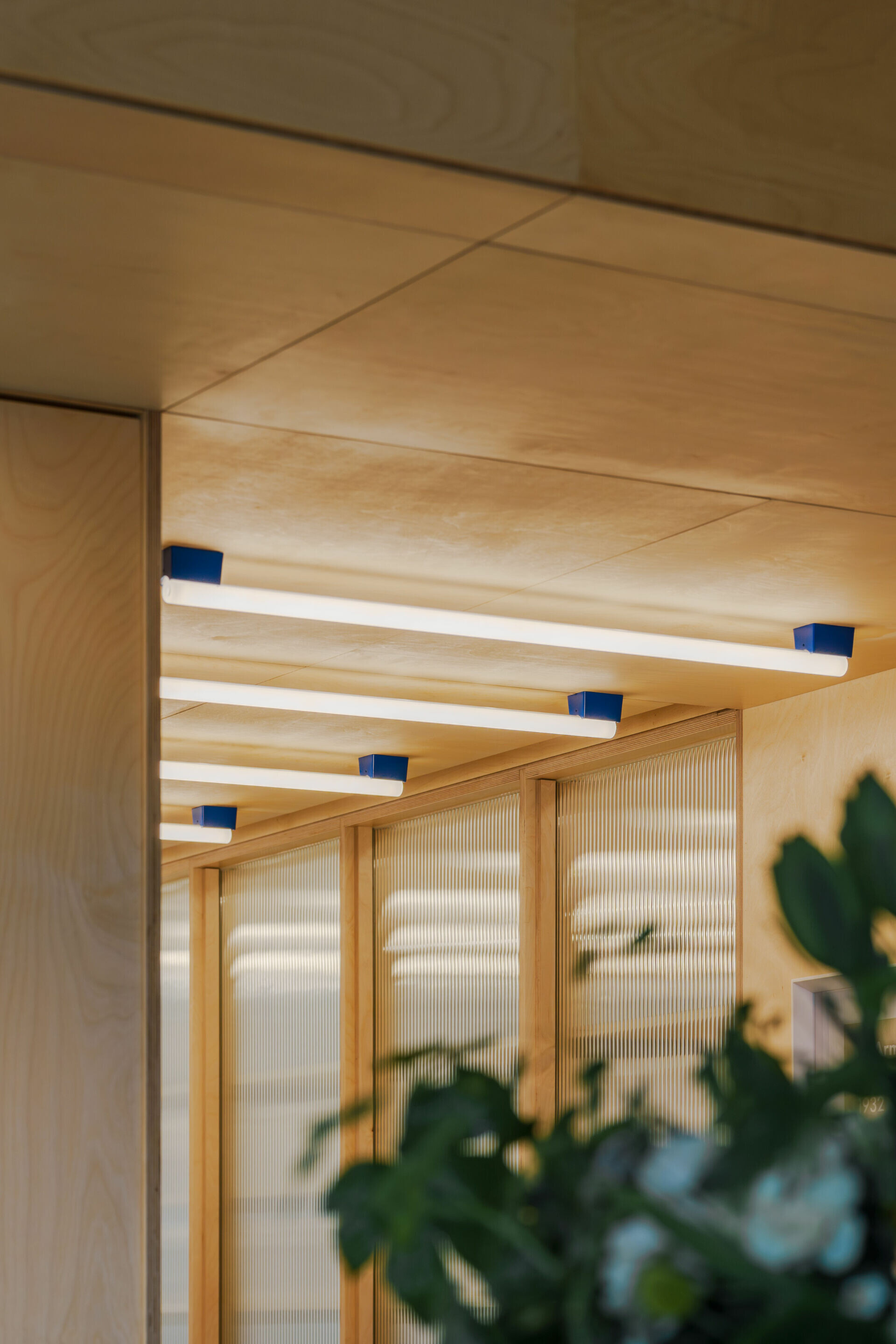
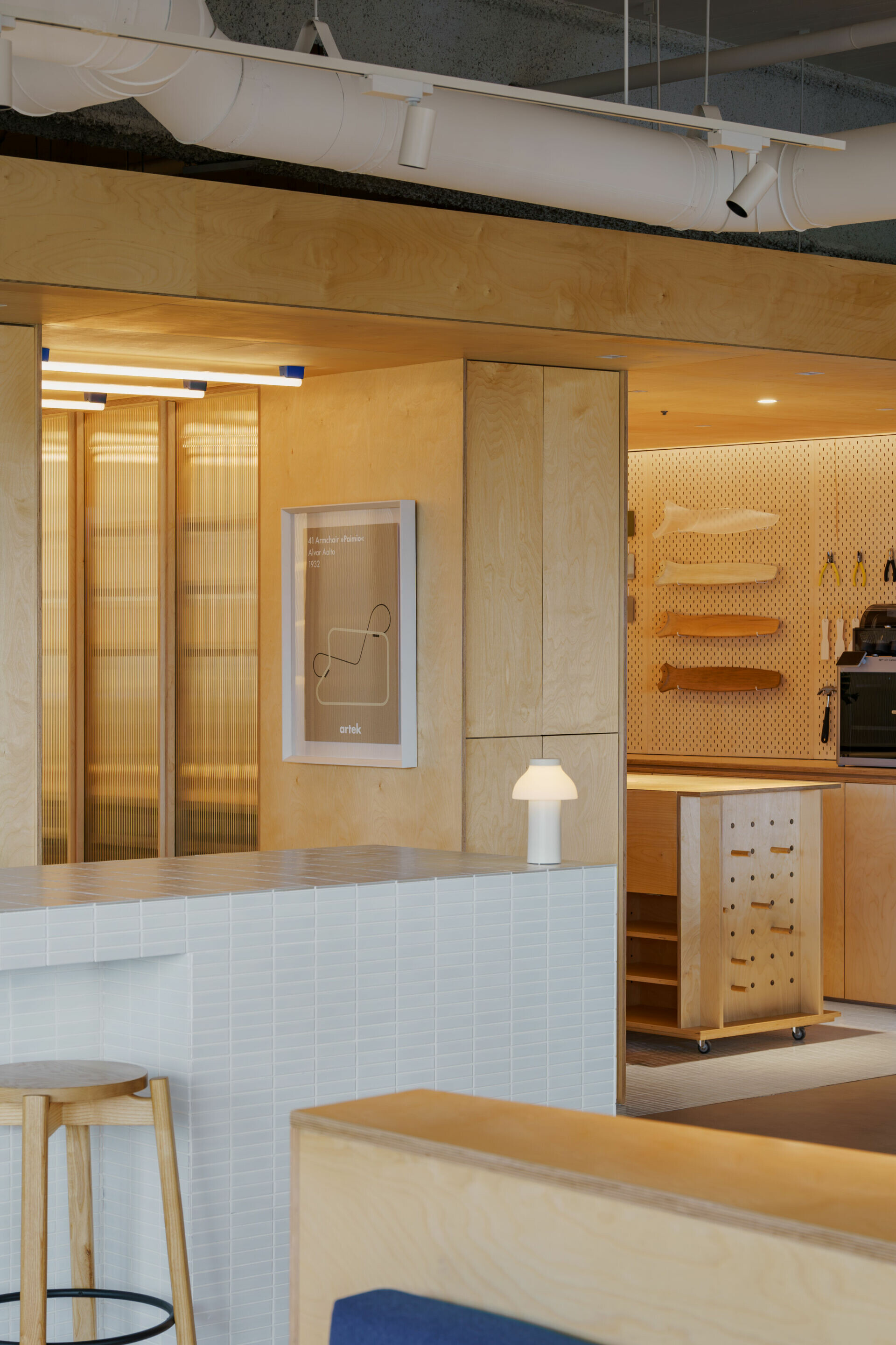
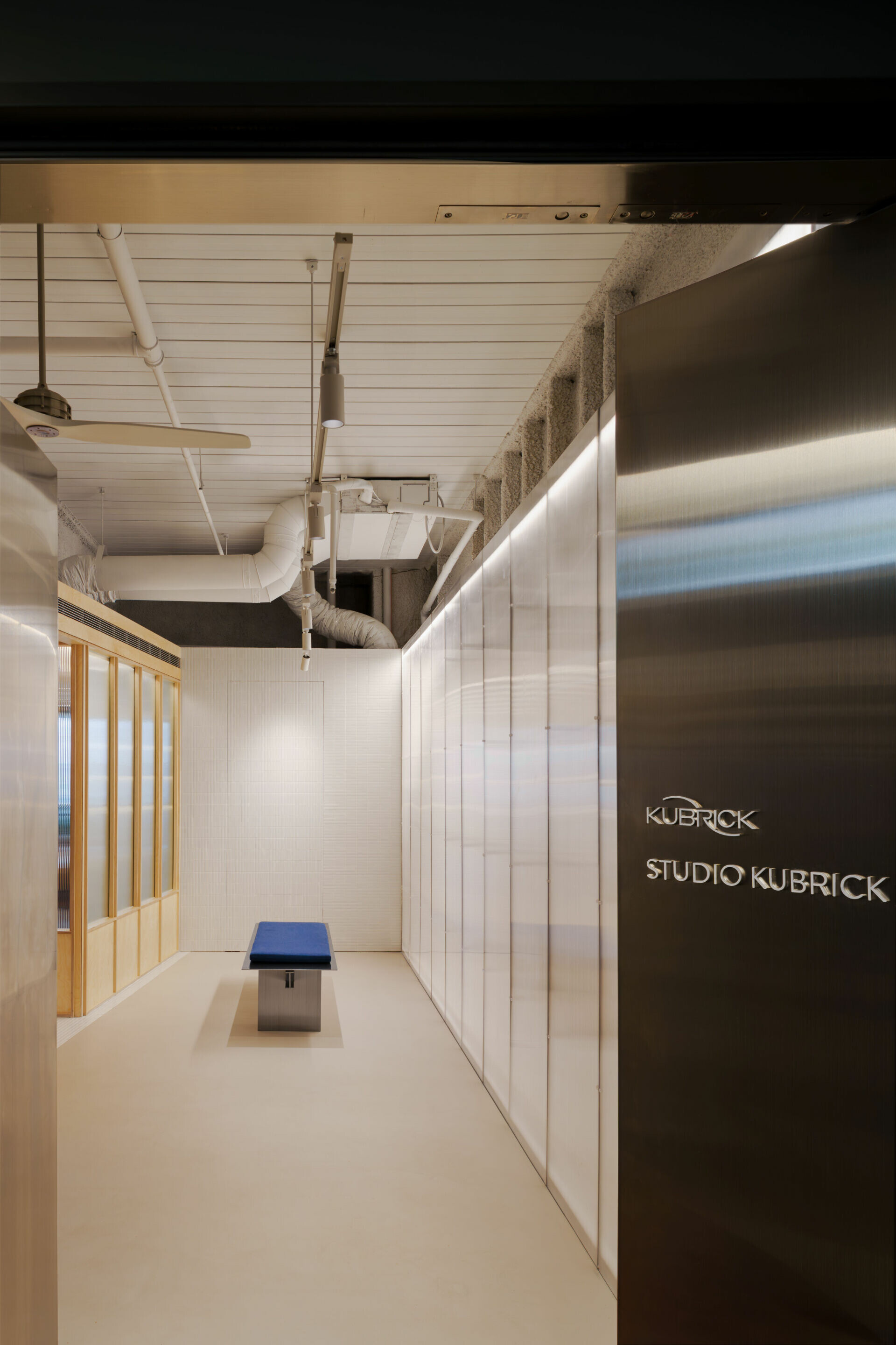
為了回應其側面結構紋理,陳敬儒選用半透材質使光線能自由地滲透四處,強化空間遞進的層次感。因此,於入口處導入多數用於建築立面的中空板鋪排,整合柔和色溫及壓克力螺絲輔以 L 型折板框架組裝,使光膜牆體整齊劃一地點亮空間,作為一處明亮等候或展示或交流的門廳。進一步以長虹玻璃的線性語言延續樺木側面表情,其透光曖昧特質提供會議室穿而不透的獨立性,透過地面相異介質的銜接引導動線,長條馬賽克磚悄然劃分產品元件、中島吧台與辦公區等範圍。


To echo the textured rhythm of the birch’s cross-section, designer Ching-Ju Chen employed semi-translucent materials that allow light to diffuse freely, enhancing the sense of depth and progression throughout the space. At the entrance, translucent façade panels—typically used in building exteriors—are arranged with careful precision. Integrated with soft color temperatures, acrylic fasteners, and L-shaped folded frames, these panels form a uniform light membrane that brightly illuminates the area, creating an inviting foyer for waiting, displaying, or interacting. Further into the space, a transition in flooring materials subtly guides circulation. The linear language of reeded glass continues the expression of the birch, while its diffuse, enigmatic quality provides the conference room with a sense of privacy without complete isolation. Meanwhile, rectangular mosaic tiles quietly delineate zones for product components, the central island bar, and the main office area.

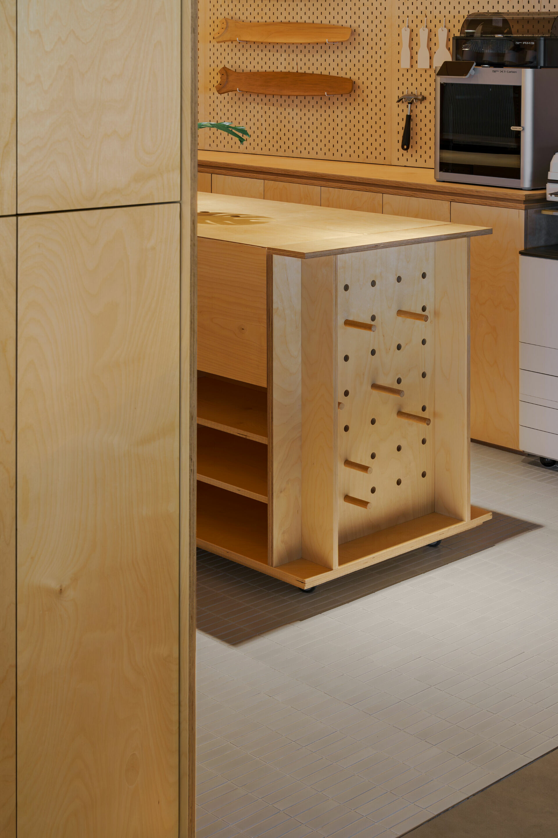
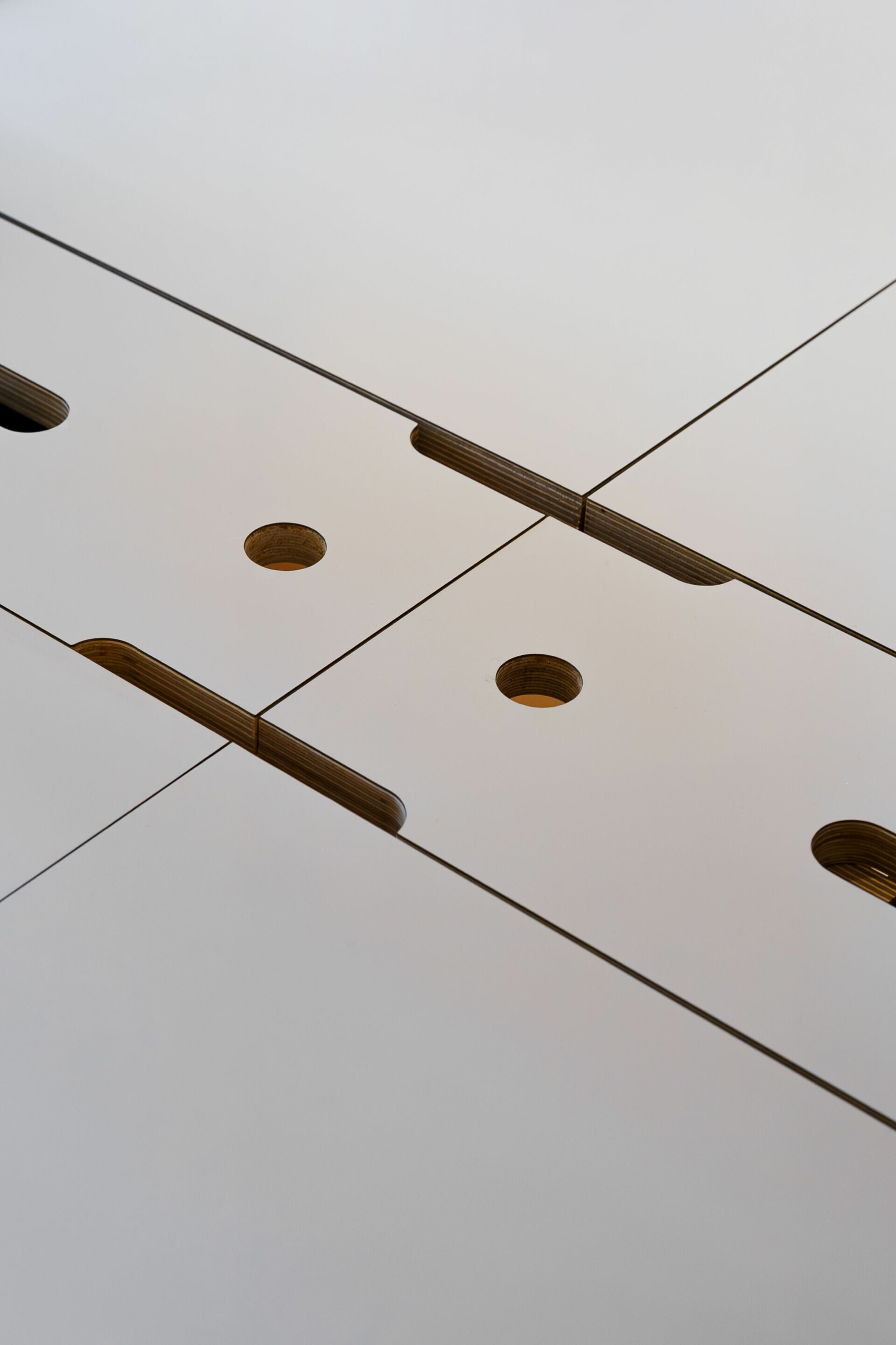
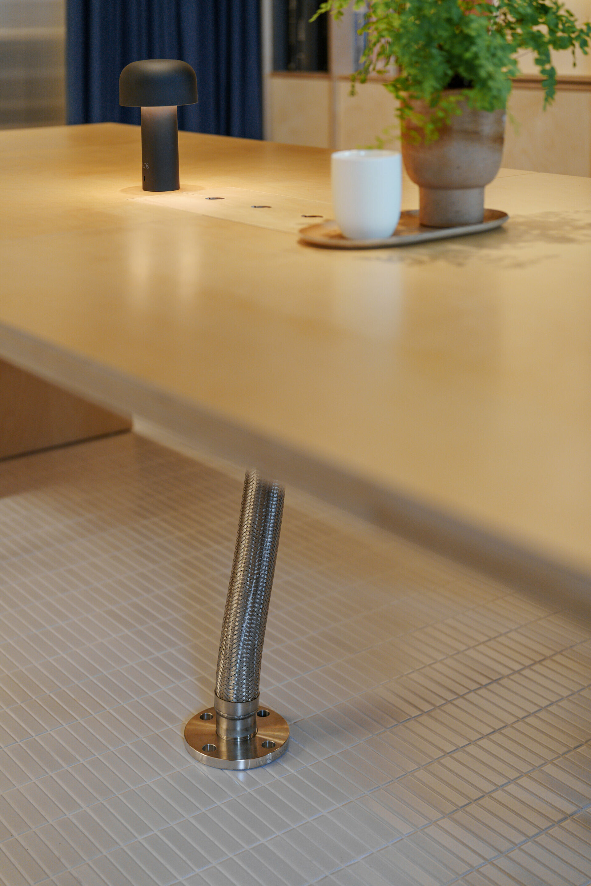
陳敬儒對於精準度的追求,從最初放樣、丈量比例到現場一比一輸出測試,每處細節皆嚴謹計算,並非盲目地決定燈飾布排和開關面板的相對位置,還深入地考量燈條間距和模組尺度,確保光線均勻分布消除空間暗處 ; 留設於辦公桌面的圓形與矩形孔洞便是整合收線、便利開闔,像是有趣的驚嘆符號,即使是桌面下方的線材,也相同地移除視覺阻擾,選擇一般用於高壓水電管的法藍口式金屬管道收整,這種精神與工業設計追求的精確度十分吻合。


Ching-Ju Chen’s unwavering commitment to precision is evident from the initial layout and proportional measurements to the one-to-one on-site testing. Every element is meticulously calculated: the placement of light fixtures and switch panels is determined not arbitrarily but through careful consideration of light strip spacing and module dimensions to ensure uniform illumination and eliminate shadows. Circular and rectangular openings on work surfaces serve both as integrated cable management solutions and as intriguing visual accents. Even the wiring beneath the desks is thoughtfully concealed using flanged metal conduits—commonly employed for high-pressure installations—thereby removing any visual distractions and echoing the precision prized in industrial design.


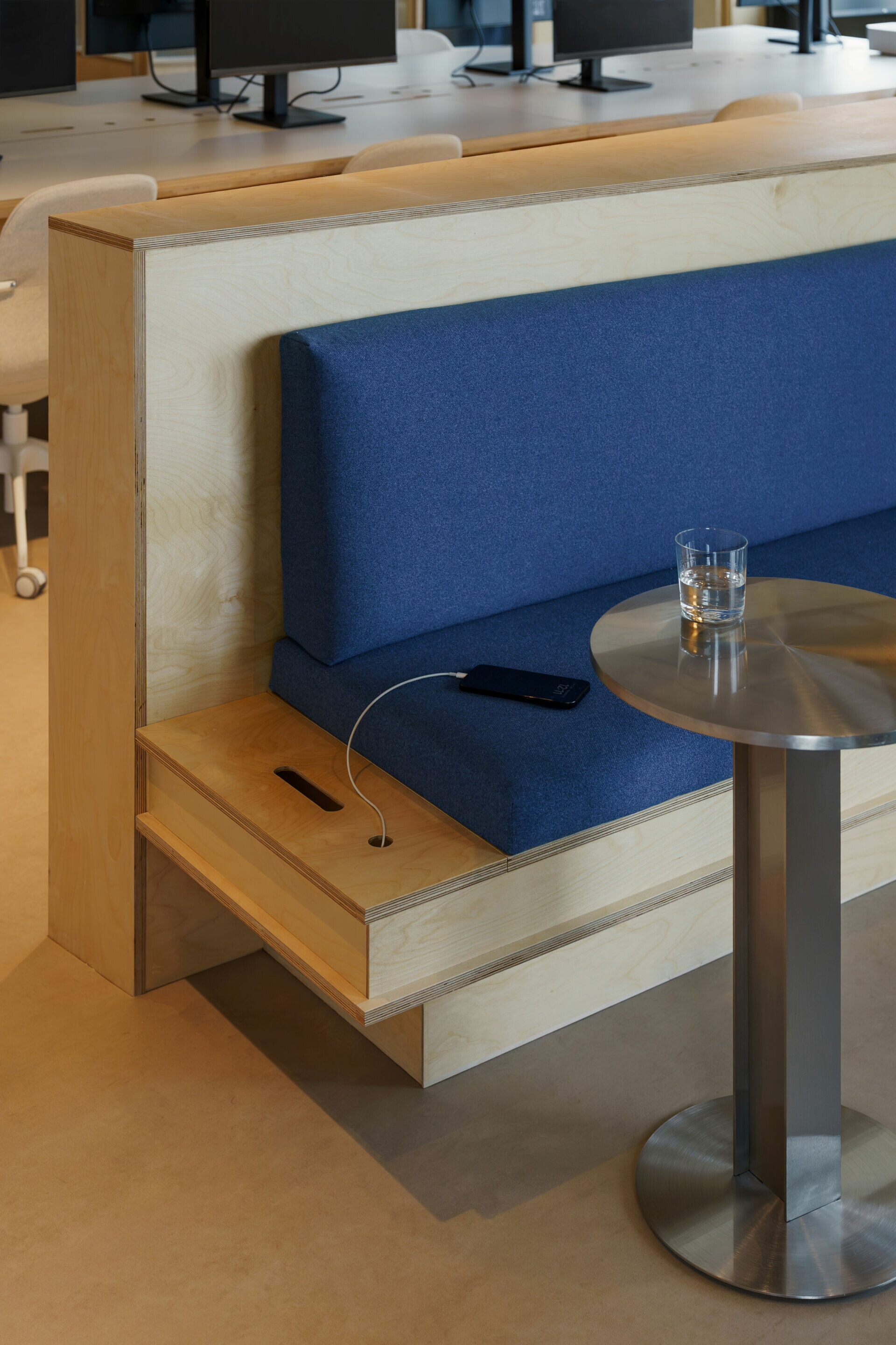
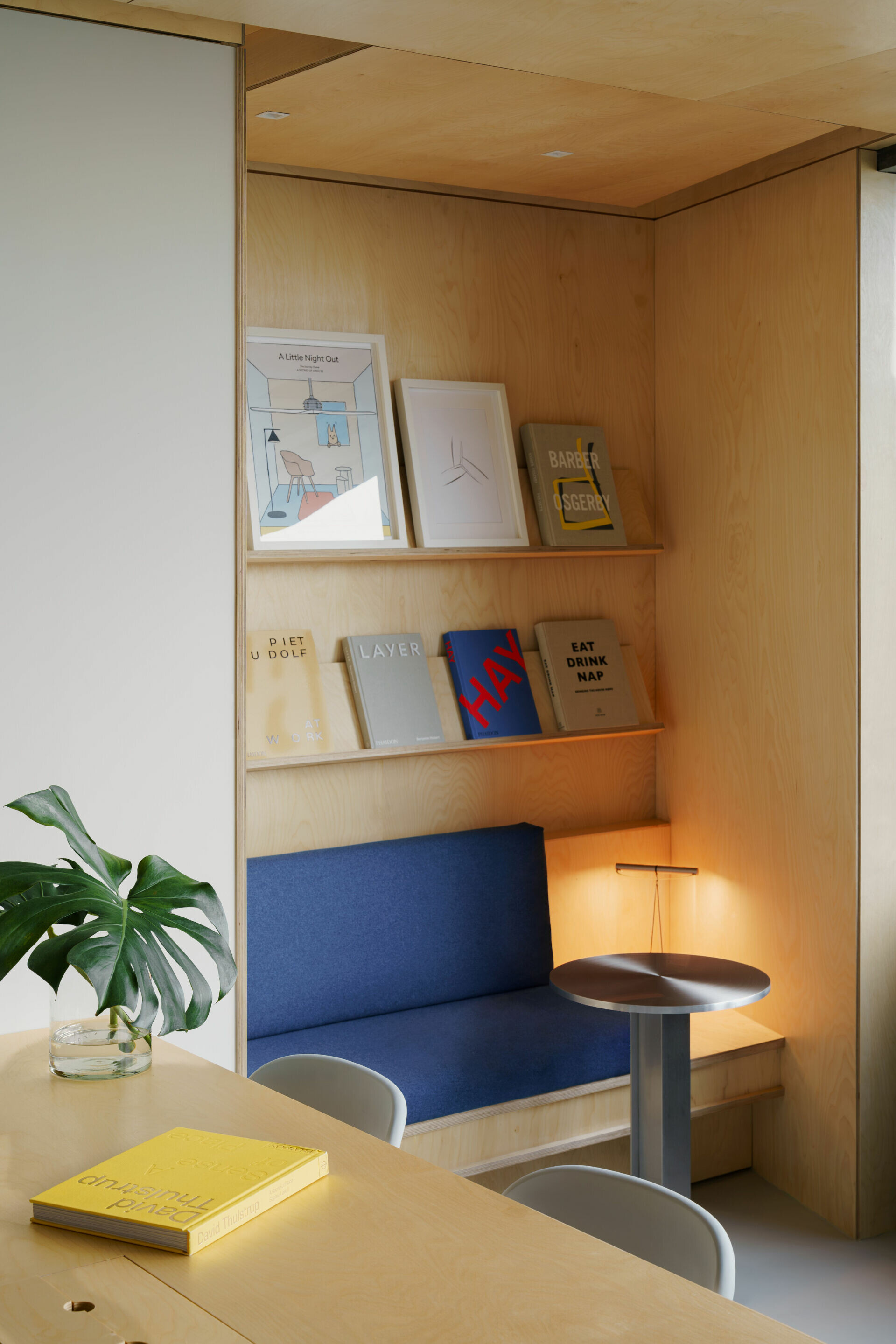
寶藍色適度地點綴於 KUBRICK 辦公空間中的燈座、椅墊和窗簾,回應企業的色彩意涵,陳敬儒在設計不止於對視覺的表象呈現,這些材質被設計後的模樣之於該功能與形式相容所表達的態度,使空間達到簡約仍保有細膩溫度的直覺式體驗,精準細節相映品牌的產品哲學,正如「少即是多」極簡設計的本質,每個減法背後,皆蘊含著更深層思考、有條不紊詮釋這些形式的純粹,創造不僅能被使用也被「讀懂」的空間語言。


A measured touch of cobalt blue is tastefully introduced in lamp bases, seat cushions, and curtains throughout the KUBRICK office, subtly reflecting the company’s color identity. For Ching-Ju Chen, design transcends mere visual presentation; it harmonizes function and form to create an intuitive experience that is both minimalist and warmly engaging. Every precisely executed detail mirrors the brand’s product philosophy and embodies the minimalist adage “less is more.” Behind every subtraction lies deep contemplation and a systematic interpretation of pure form, ultimately forging a spatial language that is not only functional but also inherently “readable.”
Design Studio | InOrder Studio @inorder.studio
 
Photography | Studio VWP @studio_vwp
Wulingshan Eye Stone Spring
上一頁

Wulingshan Eye Stone Spring

LH House
下一頁

LH House

  • About
  • Privacy policy
  • Track Order
  • Customer
  • Contact
  • Join us
FACEBOOK
instagram
Language

Copyright © WABISABI ISSUE. 侘寂傳媒有限公司 統一編號:90451315

  • Projects
    • Worldwide
    • Interiors
    • Features
  • Contemporary
    • Exhibitions
  • Record
  • Lifestyle
  • City Explore
  • News
  • Issue
Language