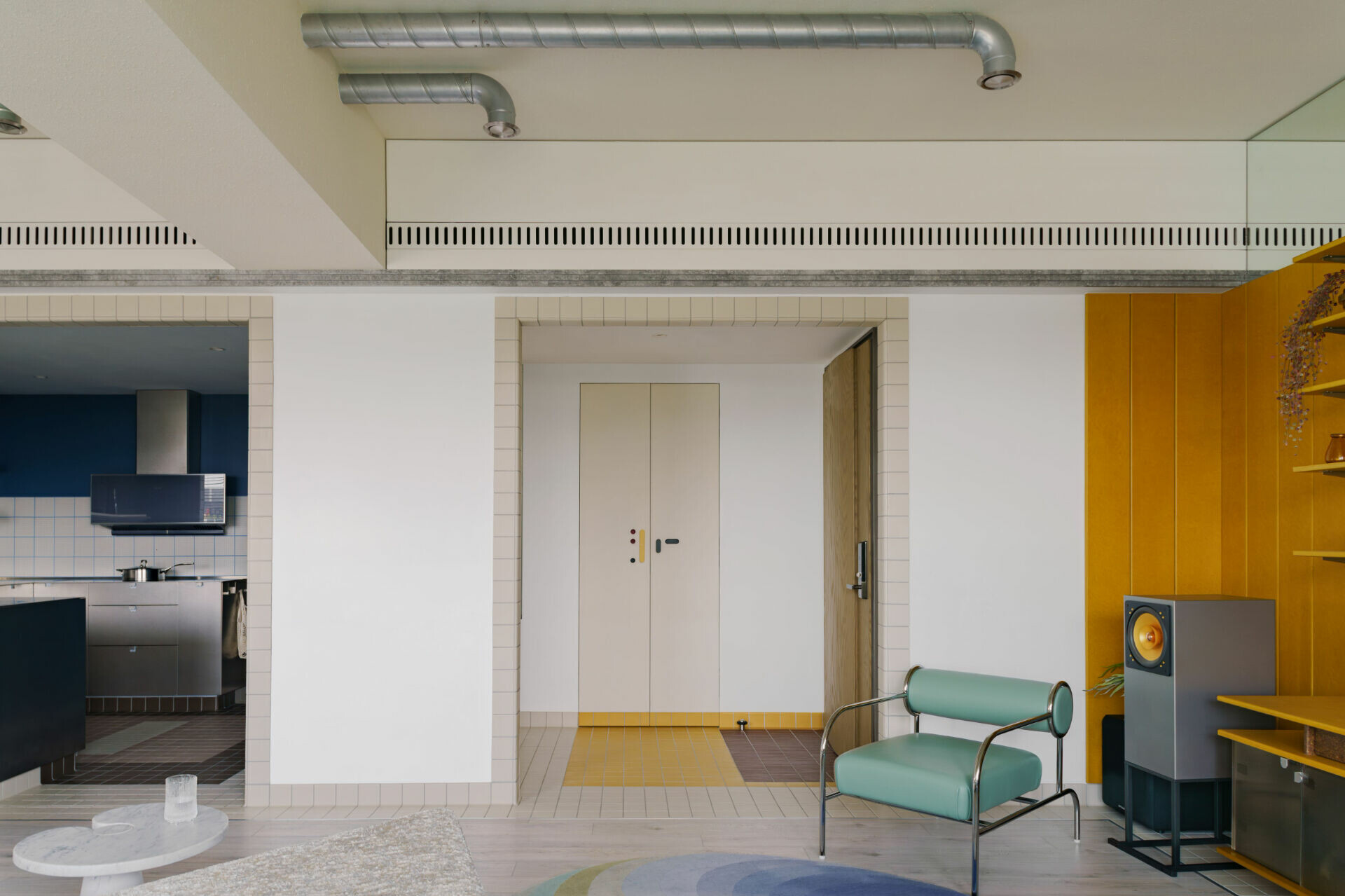
HOUSE L
I still remember the first time I stepped into this residence. Vivid, richly layered colour animated the interior, while furniture of organic form and contrasting materiality was arranged throughout. Set against a pure white backdrop defined by clean, economical lines, each element carried its own character with ease while remaining in quiet harmony with the whole. Together, they created an atmosphere rich in human warmth and artistic sensibility, drawing the eye almost instinctively from one detail to the next in search of the thinking behind each arrangement. What first reads as a light-footed composition, bold in colour and charged with visual tension, is in fact grounded in inOrder Studio’s deep understanding of design and exacting control. Every scene that appears effortless has been carefully orchestrated, with vivid colour and geometric form brought into order through rigorous spatial logic to create a narrative that is both emotional and precise.
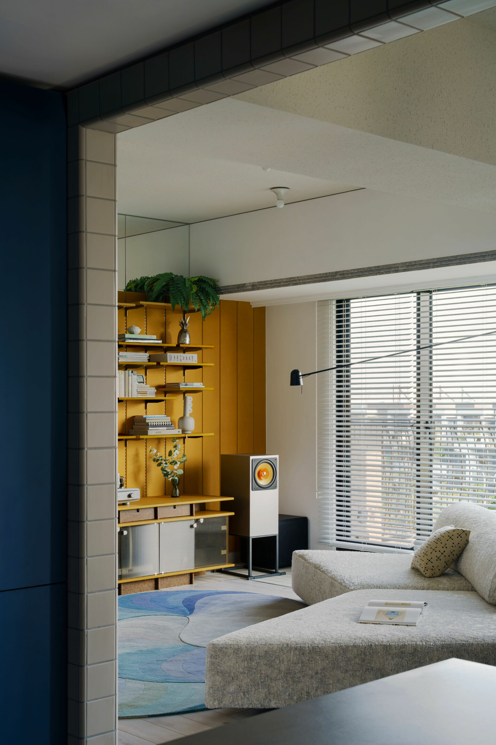
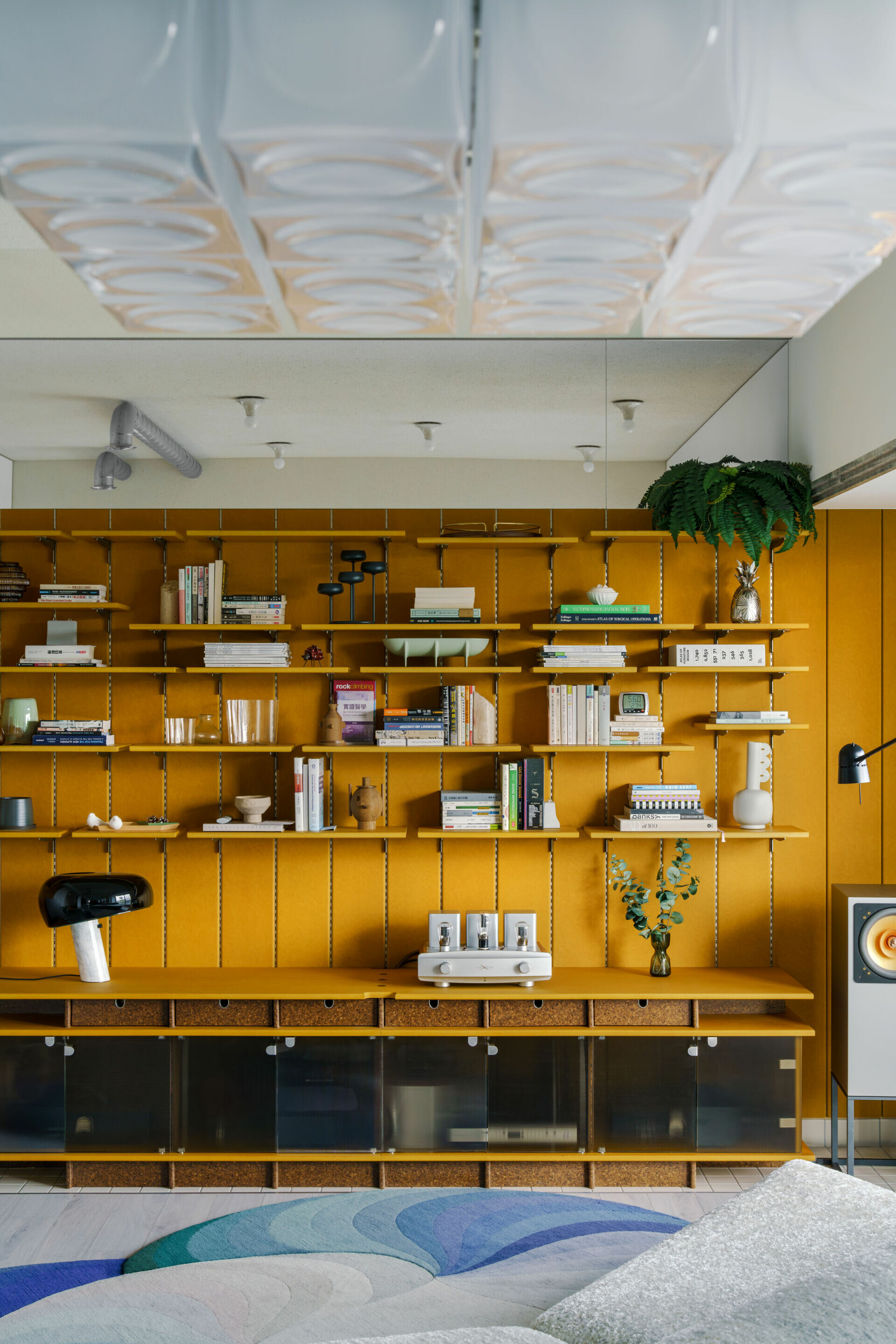
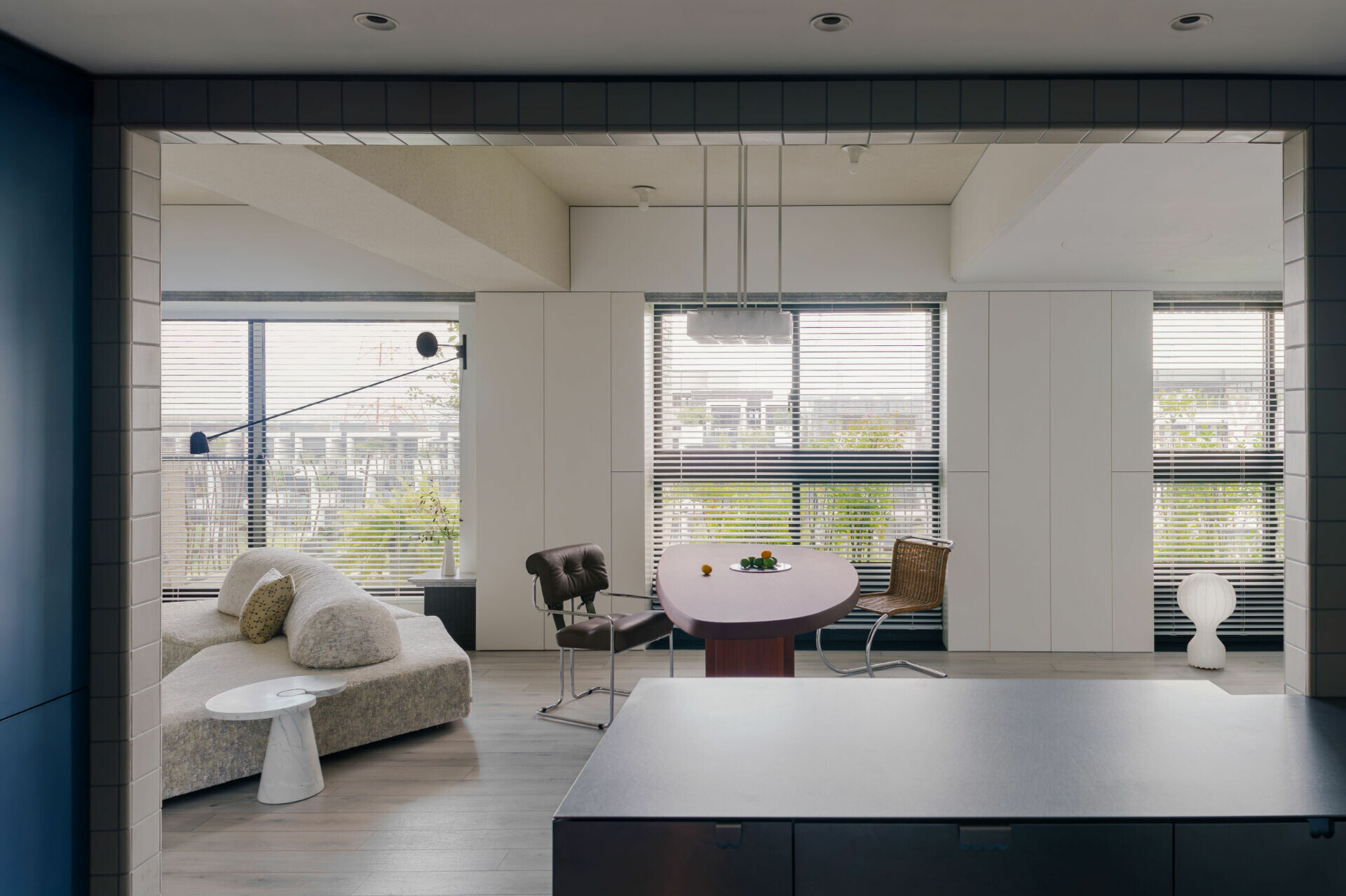
“I think a professional designer is a bit like a rapper,” says designer Ching-Ju Chen with a laugh. “You need a broad enough vocabulary to catch the rhymes your clients throw at you, to connect everything naturally, and, in the end, to shape a new song through space, one that carries the rhythm of someone else’s daily life.” Hearing Chen describe his approach in these terms, it becomes easy to understand how, within a home of nearly 150 square metres, he is able to handle the homeowners’ love of Mid-Century Modern with such fluency and restraint. From the outset, he knew that the couple collected furniture from the 1950s and had sourced a wide range of pieces from different countries specifically for this home. Taking these clues as his starting point, Chen began to consider the placement of each piece and the balance of colour it would require, without fixing the design too early. The spatial framework was instead left open and resilient, capable of accommodating the layers that would come later.
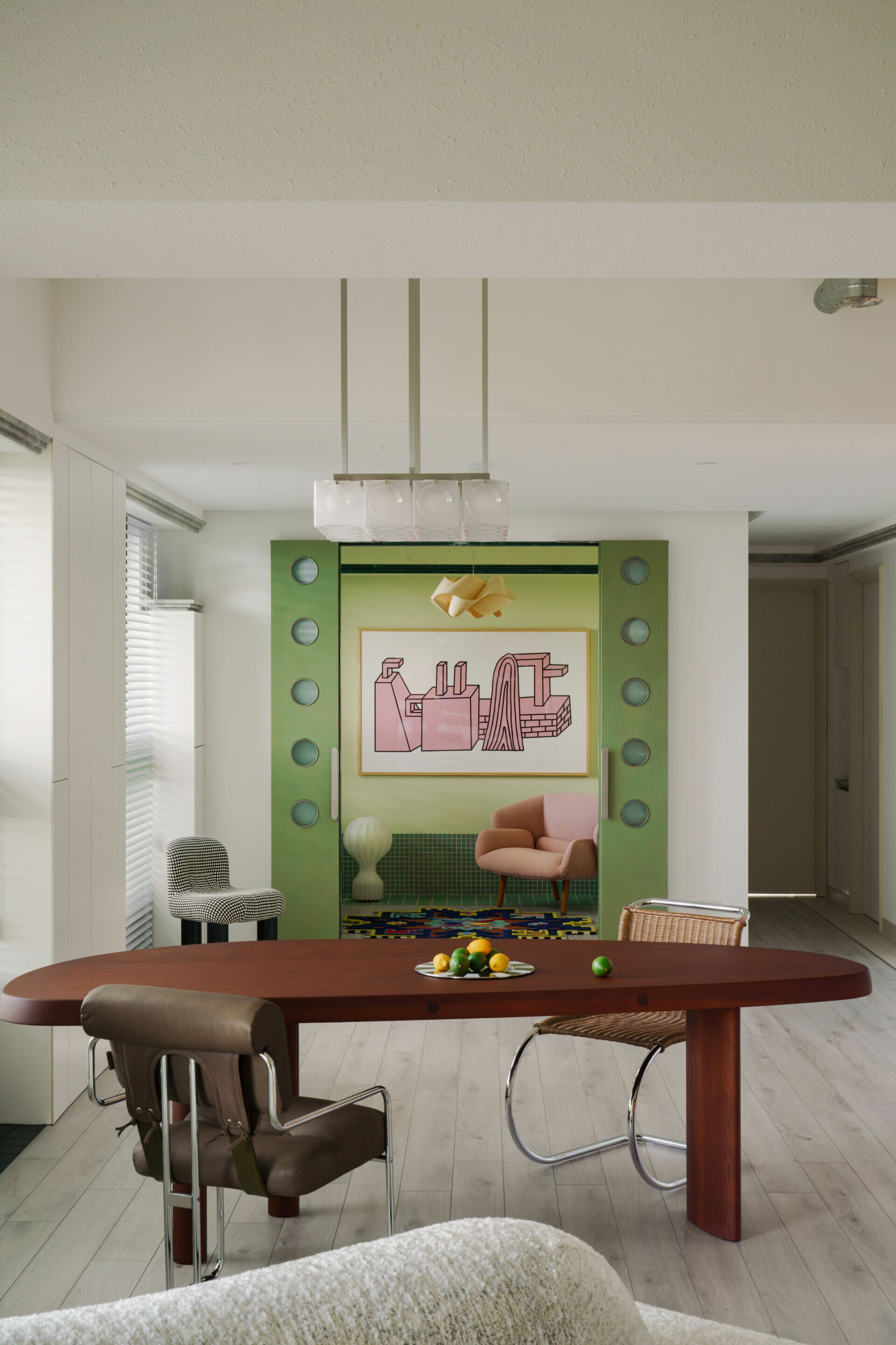
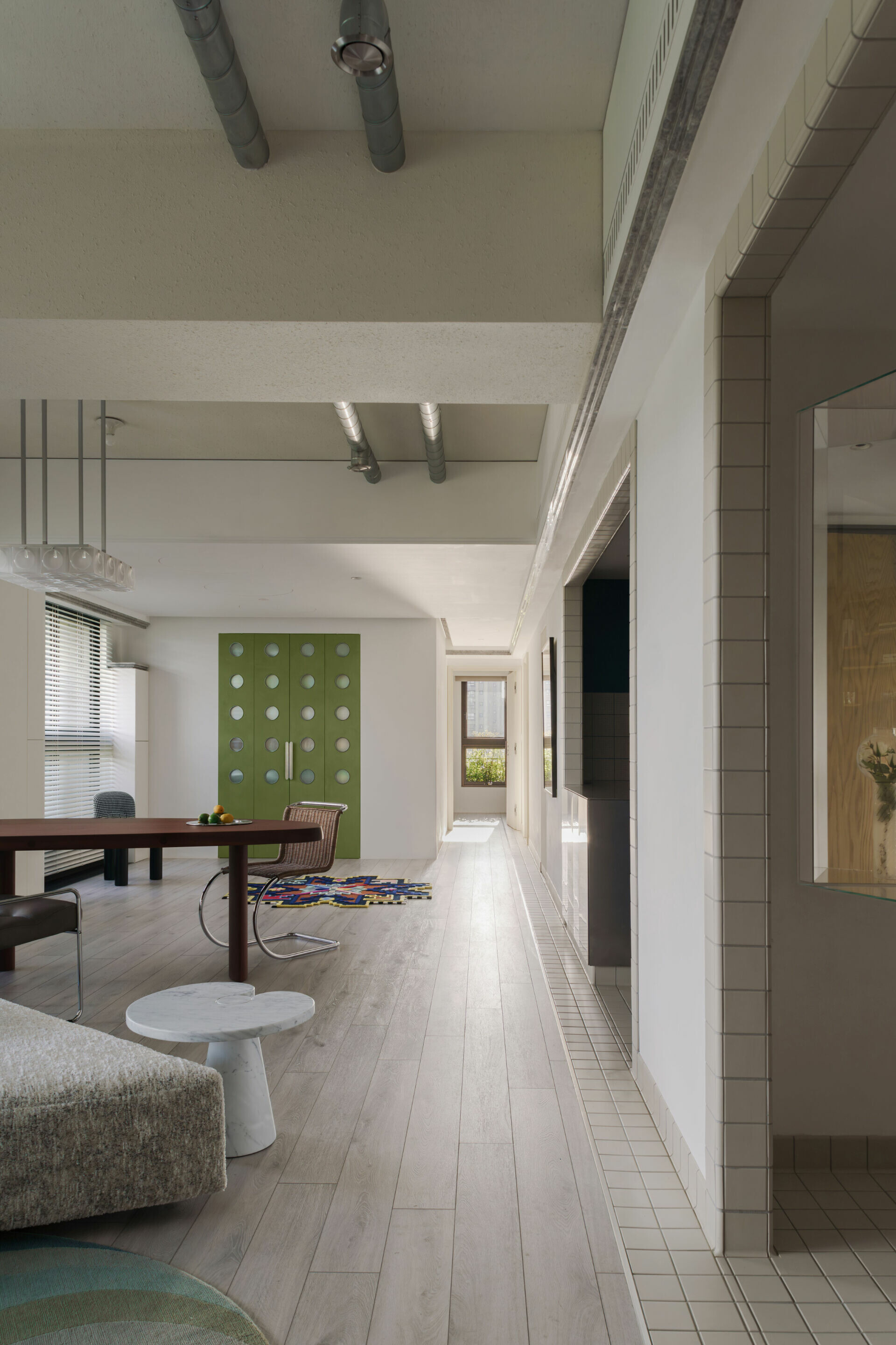
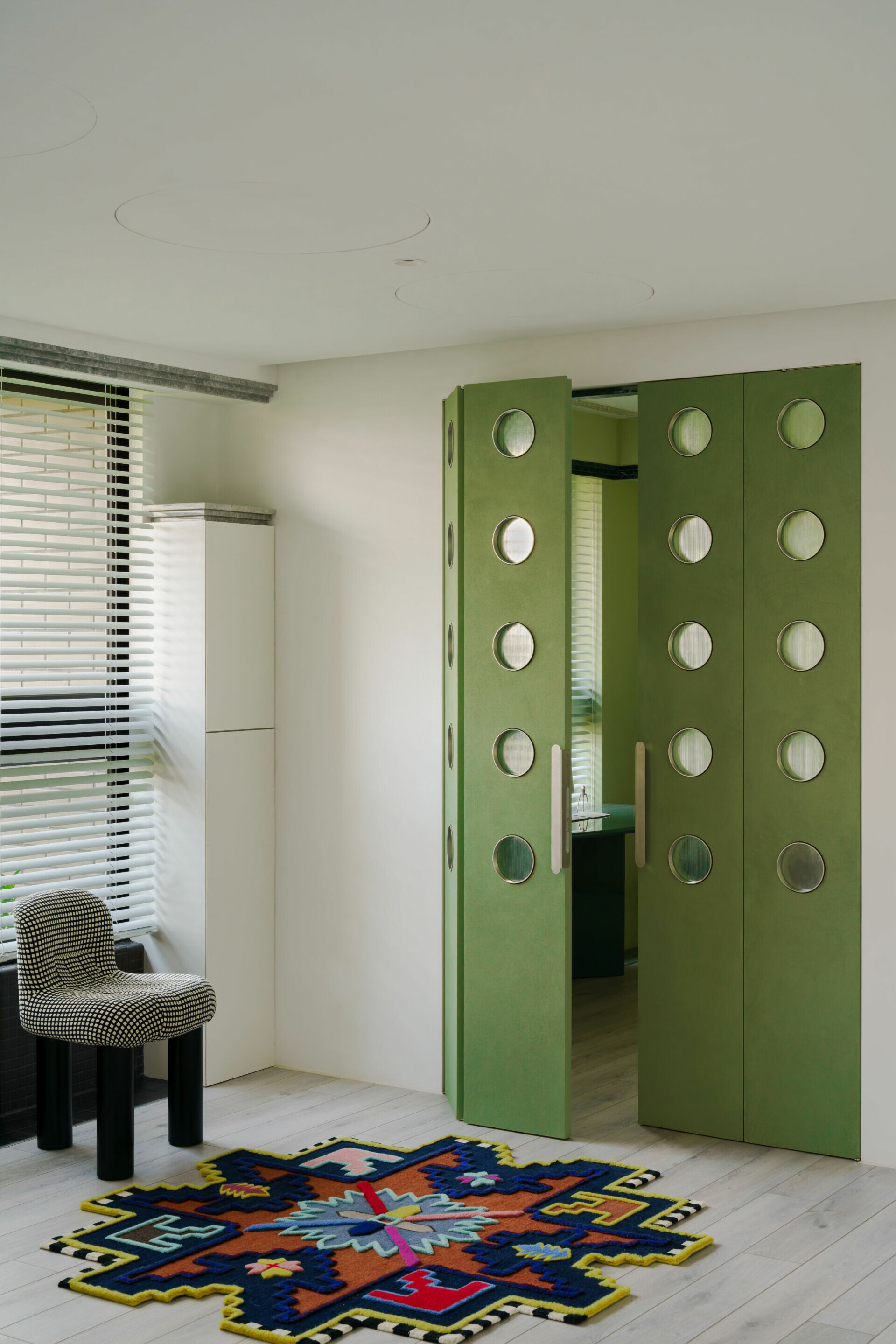
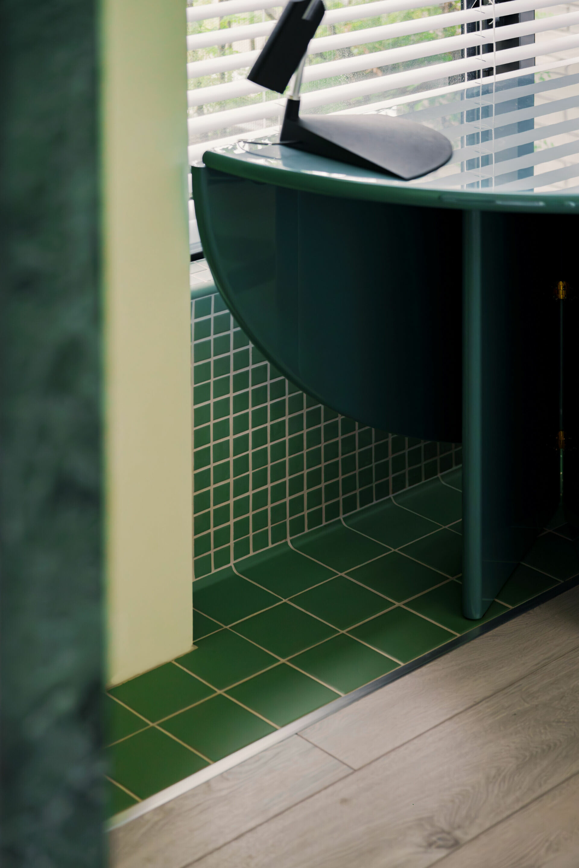
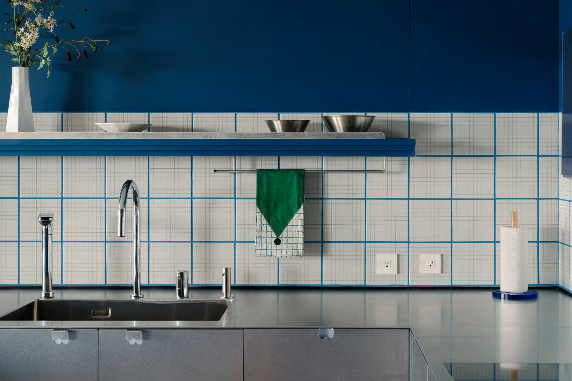
Because Mid-Century Modern emerged in mid-twentieth-century Europe and the United States, the design also needed to resonate with the local character of its Taiwanese setting. During the early stages of the project, as the studio looked for elements from the same period within Taiwan, tile emerged as the defining material of the scheme. It first appears underfoot in the entrance hall and then recurs throughout the home. Through precise calculation and candid communication, the team addressed the homeowners’ initial concerns about water absorption. The imported Portuguese tiles were then mesh-mounted by a Taiwanese tile fabricator, allowing them to be installed with exacting consistency. Here, tile serves as a quiet, unobtrusive base, while its colour and the precise alignment of the grout joints lend everyday domestic life a distinct expression. From a distance of ten metres or at close range, the composition reveals different layers of visual pleasure.
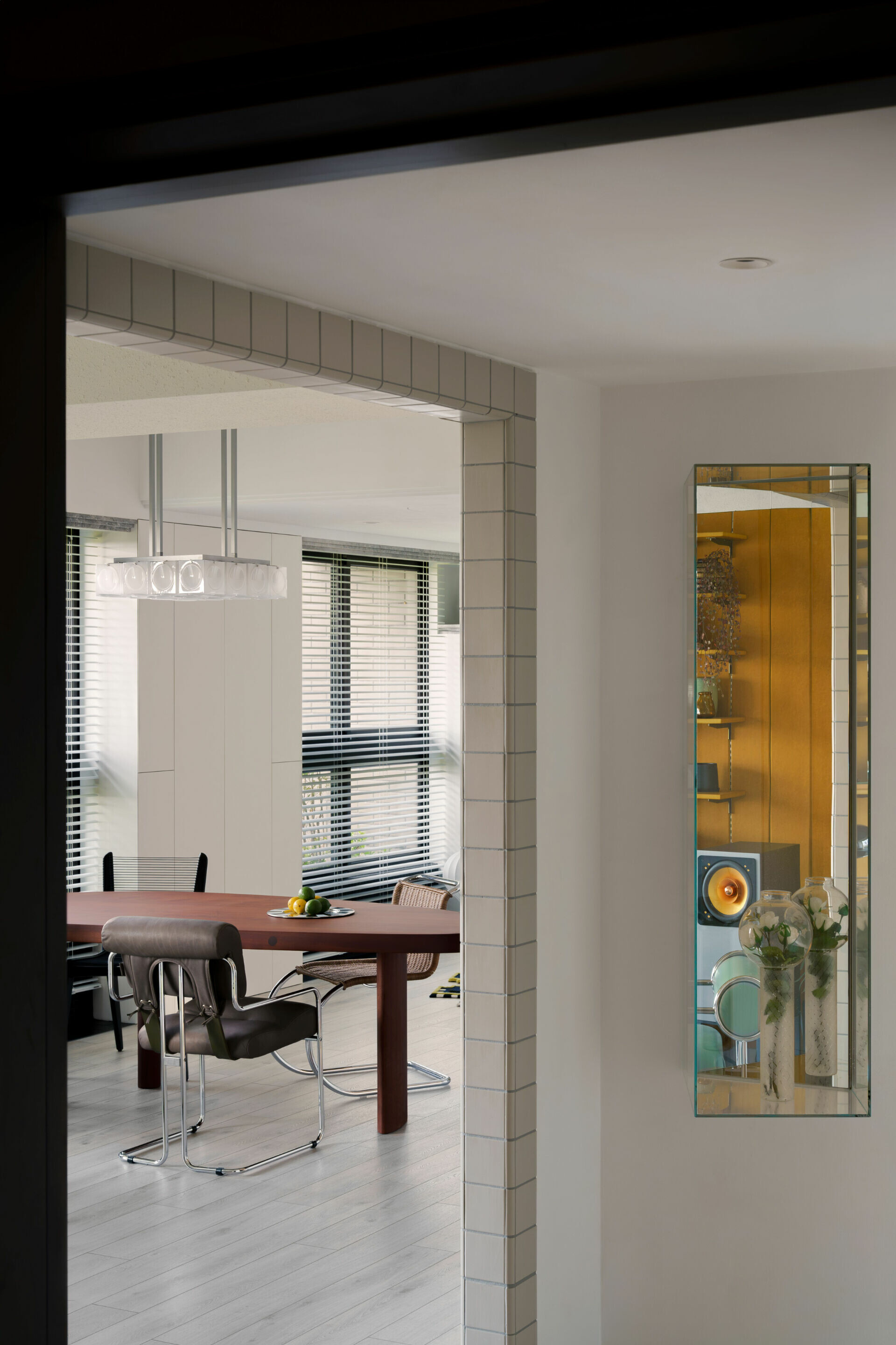
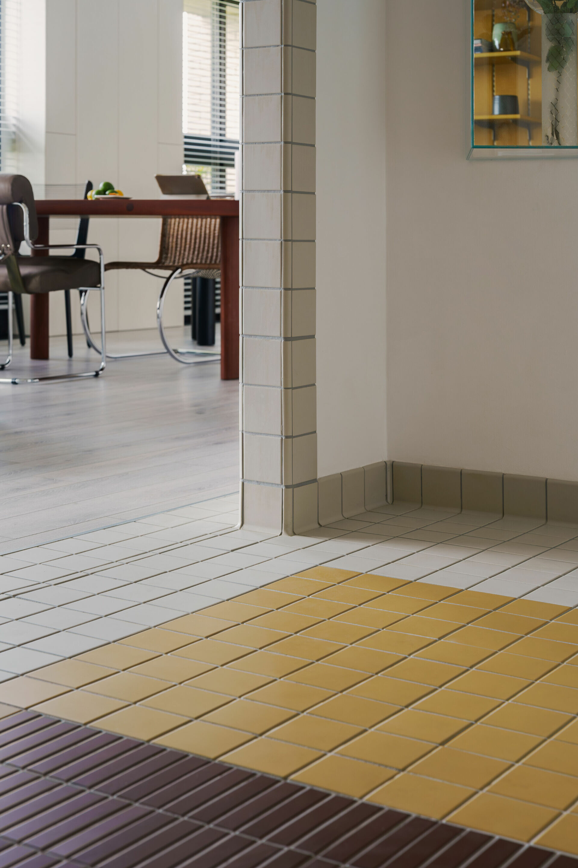
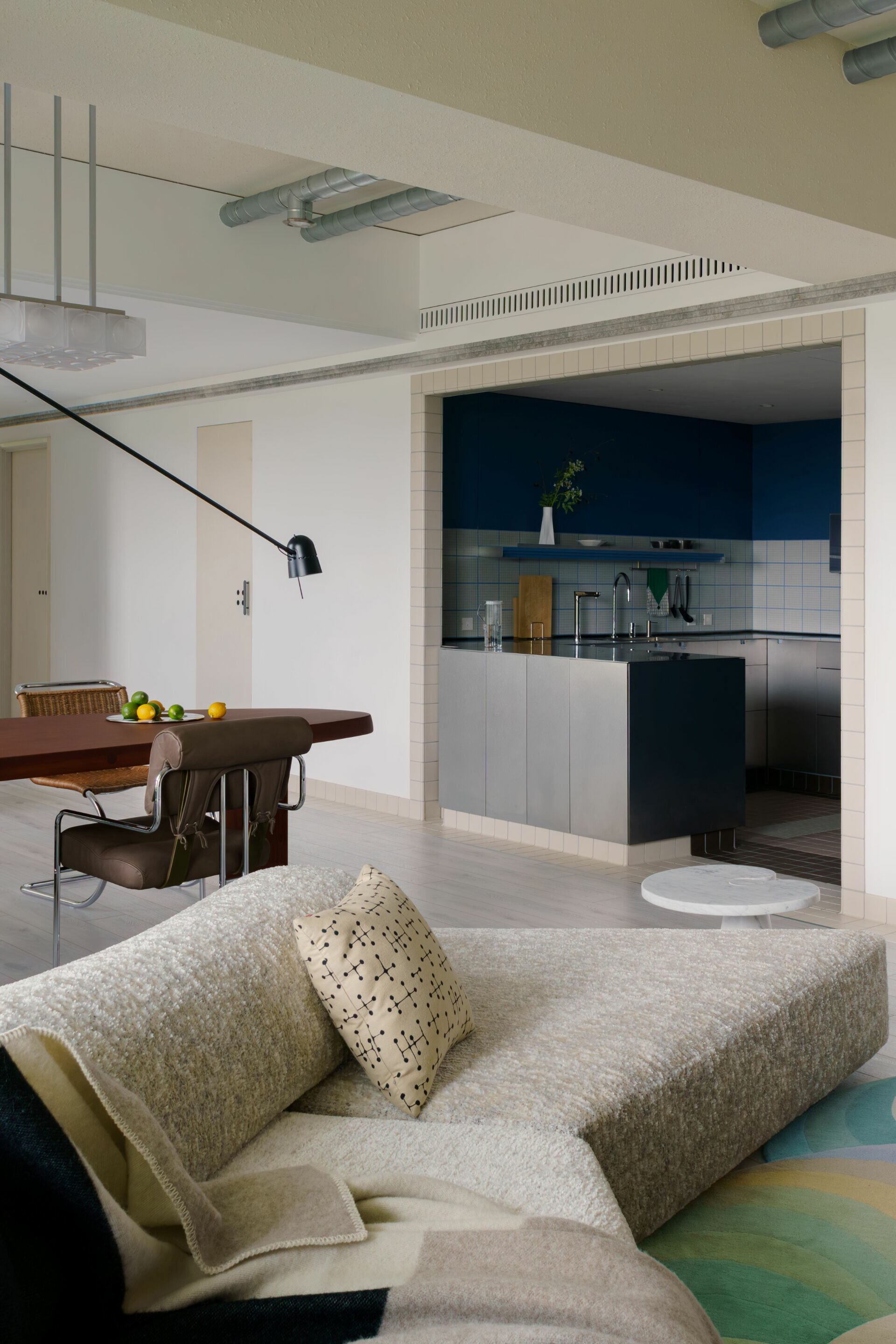
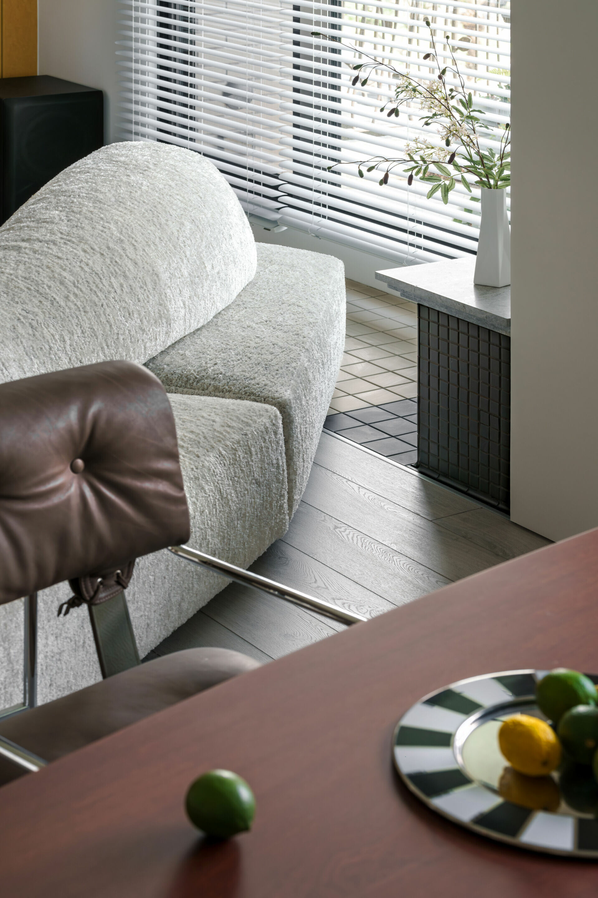
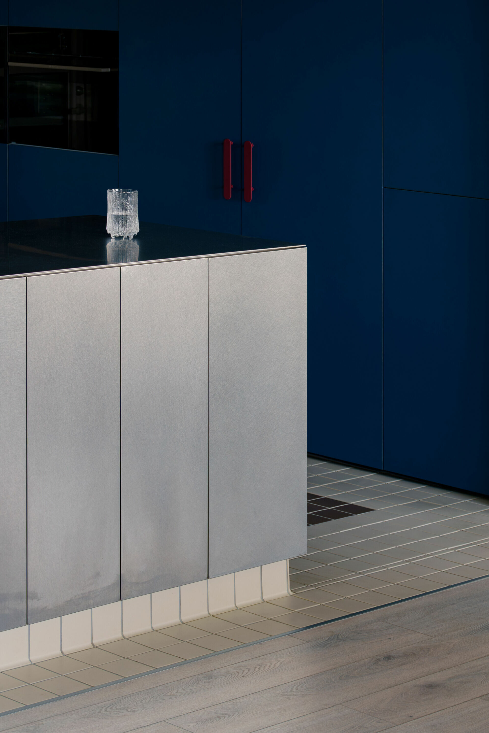
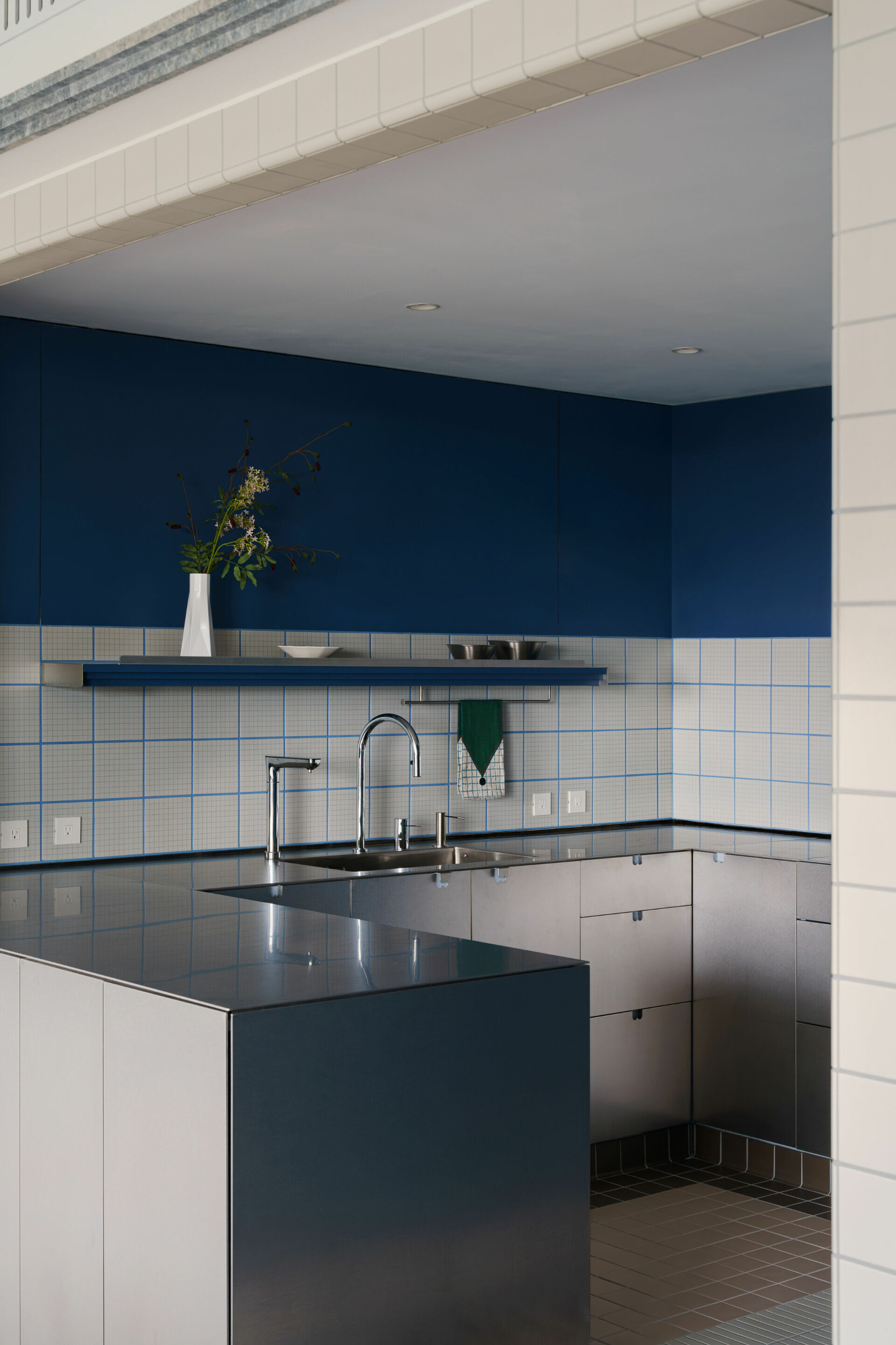
Working with the revised floor plan, the designer then considered how to extend and sustain a clear circulation route leading to the primary bedroom at the far end of the home. The answer lies in the small-format tiles that run from the entrance hall to the edge of the corridor and around the door frames of each zone. Conceived almost as an inlaid composition, these finely calibrated divisions introduce playful variation within the larger field while bringing the overall picture into focus. Mosaic tile also serves as a backdrop to the furnishings, while the living room, kitchen and study are keyed respectively to yellow, blue and green, echoing the owners’ yellow speaker, blue refrigerator and green semicircular table. Through layered colour and carefully articulated details, these gestures unfold across the spatial structure, the forms of the furniture and the logic of their placement, heightening everyday comfort while sustaining a sense of harmony and balance. Chen offers a succinct summary of the project: putting the right thing in the right place. The phrase speaks not only to his close observation of the homeowners’ lives, but also to his command of design and sharp sensitivity to order, resulting in a scheme that feels both authentic and finely nuanced.